

DESTRUCTIVE STEPS 14
Creative Direction and Branding
The DS14 design project involved rebranding the annual three-day festival that celebrates street dance through dance battles, workshops, and performances. This large-scale, international event attracts over 300 attendees and aims to raise awareness of street dance while elevating the scene here in Sydney.
For an event like Destructive Steps, it was crucial to create materials that resonate with the street dance community and reflect the energy, creativity, and culture of the event.
Key Deliverables
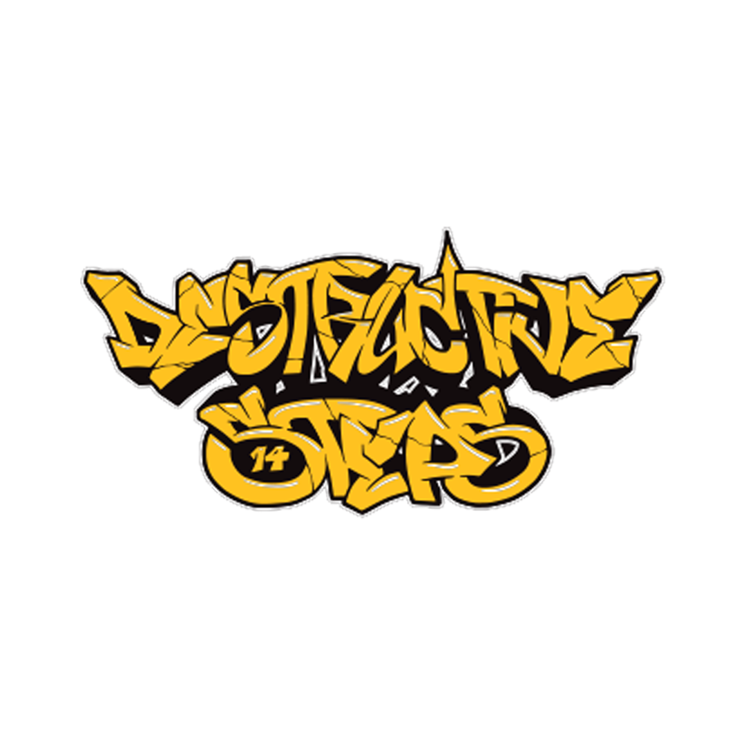
Incorporating the existing logo into a fresh, new theme
Creating social media marketing assets
Designing social media posters to announce special guests
Developing an essential run sheet for event participants and staff
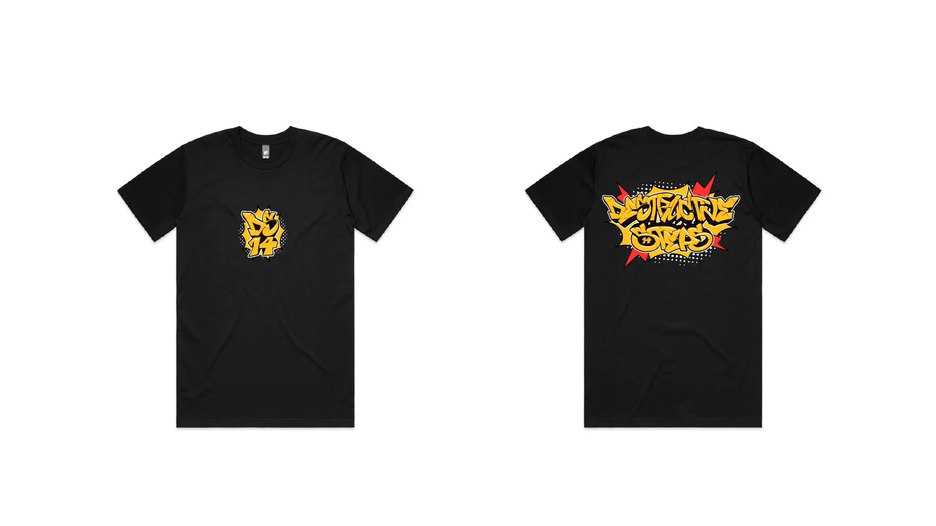
Crafting event merchandise
The Team
President of DSDA: Alice Tauv
Vice-President of DSDA: Amelia Duong
Lead Graphic Designer: Laura Huynh ☆
Graphic Designer: Beatriz Fernandez
ABOUT
Exploring Hip Hop Through a Design Lens
I also wanted to explore influential artists from the rise of Hip Hop in the 90s to draw inspiration from their design ideologies and color schemes.
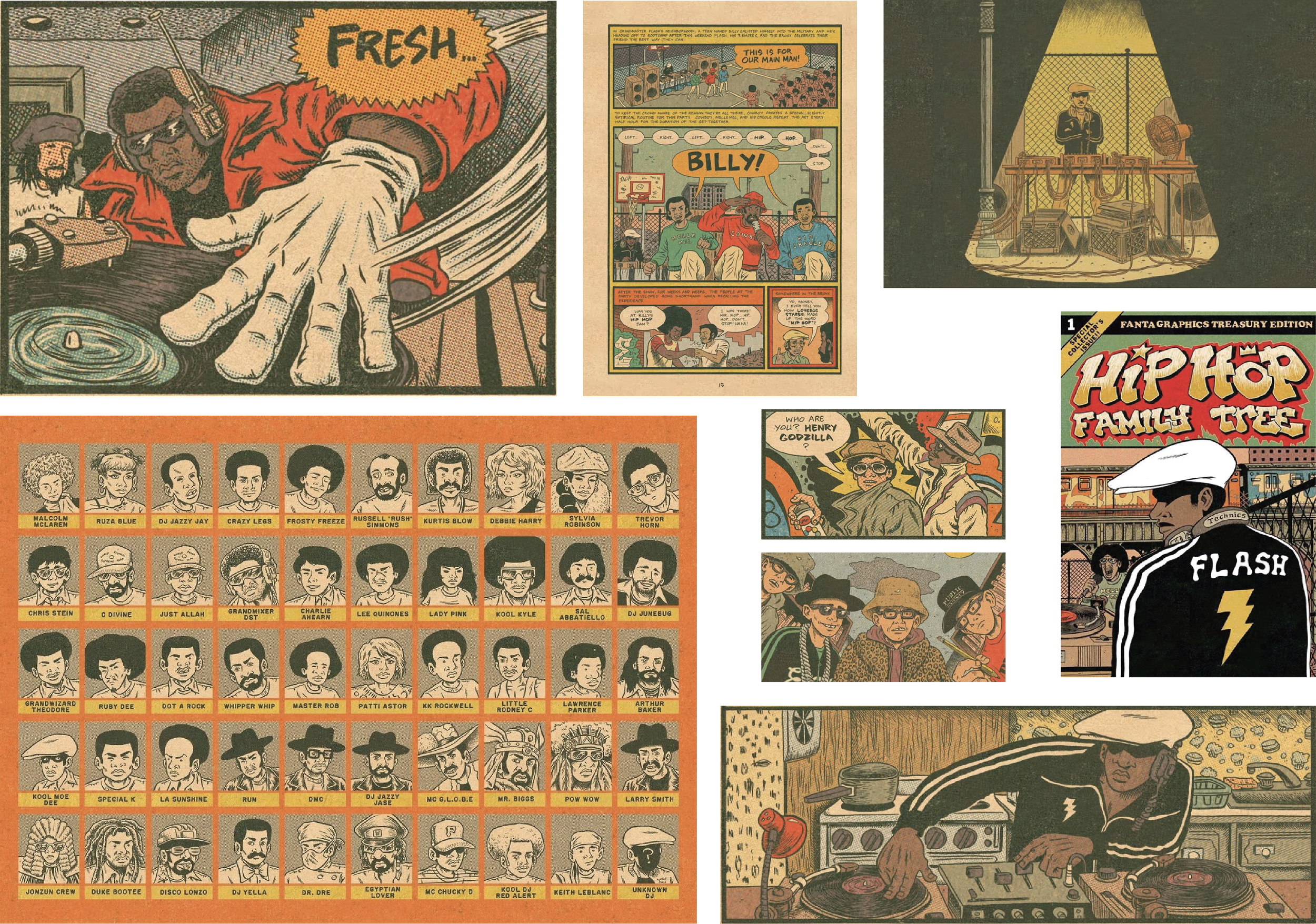
During my research, I discovered Ed Piskor’s "Hip Hop Family Tree," a comic book series that chronicles the birth of Hip Hop in the Bronx and its evolution, highlighting key figures in the culture. Piskor’s detailed illustrations and vibrant retro color palette vividly capture the era's energy and nostalgia.
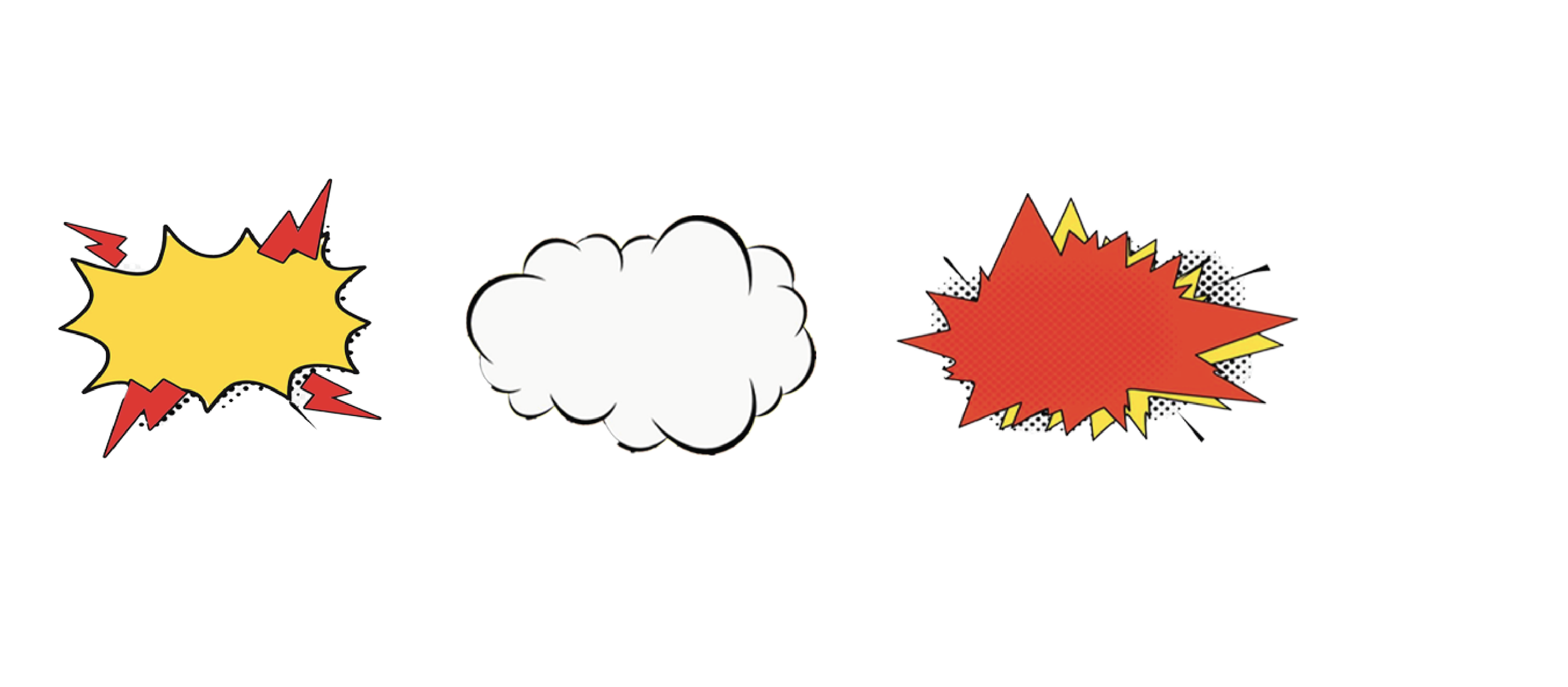
I was inspired by Piskor’s use of bold lines, dynamic layouts, and expressive characters, which effectively convey the rebellious spirit of Hip Hop.
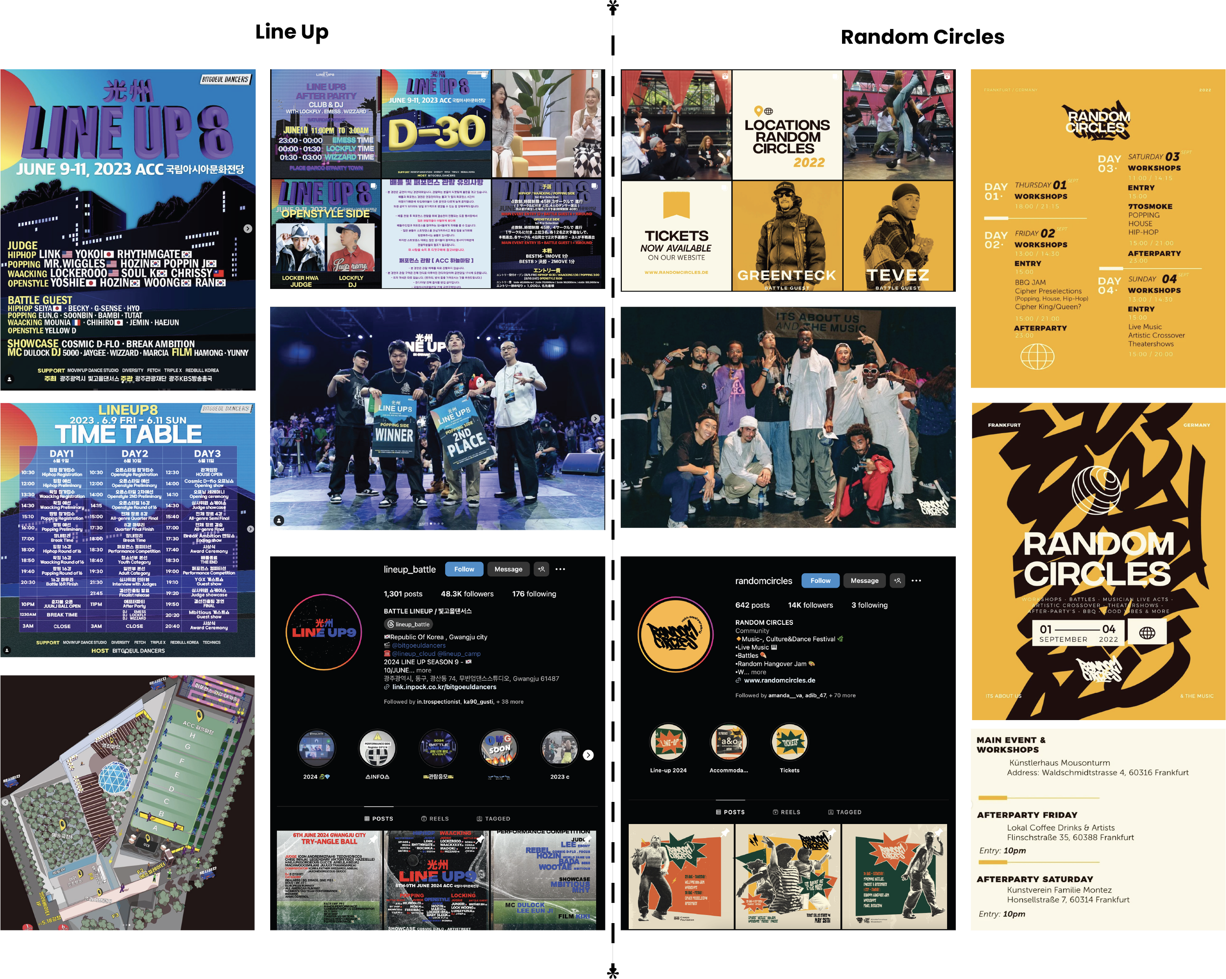
Line Up
✅️ Clear and straightforward information
✅️ A nighttime cityscape background was used to evoke a sense of coolness and suggest that the event would be an exciting and enjoyable evening.
✅️ 3D text evokes a sense of fun and takes away from the seriousness of the event.
❌ Some of the posters have too much information and things going on.
❌ The use of San Serif text could be used more playfully
❌ Not really any visual elements that hits towards street dance culture.
Audience
The attendees of Destructive Steps represent a vibrant mix of street dance devotees, encompassing dancers, choreographers, artists, and enthusiasts of Hip Hop culture from diverse backgrounds. Notably, the event attracts international participants, highlighting its global appeal.
This dynamic gathering provides the opportunity to celebrate, compete, and forge connections, uniting through their mutual passion for street dance.
STAGE 1: RESEARCH
To kick off the branding process for Destructive Steps, I began by analyzing successful dance event posters on social media. My criteria for success included clear information conveyance, strong integration of Hip Hop culture and knowledge, and high event turnout in both past and current editions. I focused primarily on two internationally renowned street dance events: Random Circles (Germany) and Line Up (Korea).
Random Circles
✅️ Strong hierarchy in text, as well as contrast capturing attention when user is scrolling on social media.
✅️ Logo has a Graffiti Style, which is one of the fundamental elements of Hip Hop
✅️ Use of geometry and shapes to add an element of fun and excitement towards the event
❌ Designs misses key elements such as the website
❌ The 3 colours used repetitively made the graphics look a bit flat
STAGE 2: CONCEPT DEVELOPMENT
Colour Palette
Based on my research findings, I aimed to infuse Piskor’s vintage and comic-style influence into the event theme's design. This led me to analyze the color palette and use my illustration skills to shape concepts.
Beginning with color analysis, I extracted the primary hues from the comic and then drew inspiration from Random Circle’s design. I enriched the palette with additional tones to enhance contrast and avoid a subdued appearance.
Pre 2020

2020
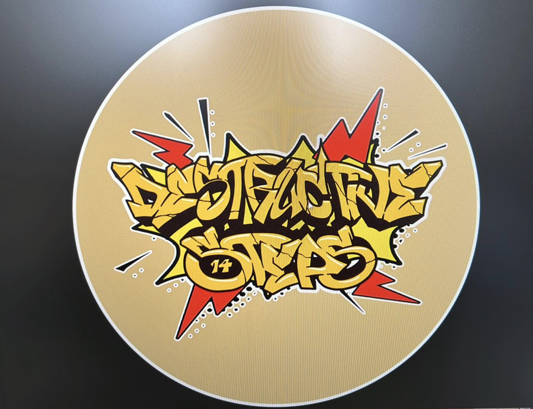
Next, I leveraged the existing logo and sought to seamlessly integrate it with the new theme while preserving its essence. I envisioned infusing playful elements to evoke the comic effect, all while maintaining the integrity of the graffiti-inspired logo.
After experimenting, I narrowed down my options to two fonts: Comic Ink and Comic Shark. Each offered a distinct comic book style, with Comic Shark featuring boldness and Comic Ink boasting an even roundness.
Ultimately, Comic Ink resonated most with the desired design aesthetic. Its clean, simple lines ensured readability, which was crucial for conveying information clearly. In contrast, Comic Shark's varying boldness made it appear cluttered and challenging to read from a distance.
Additionally, it would have been overwhelming for use in paragraphs due to its busy appearance.
2022


Primary hues from comic
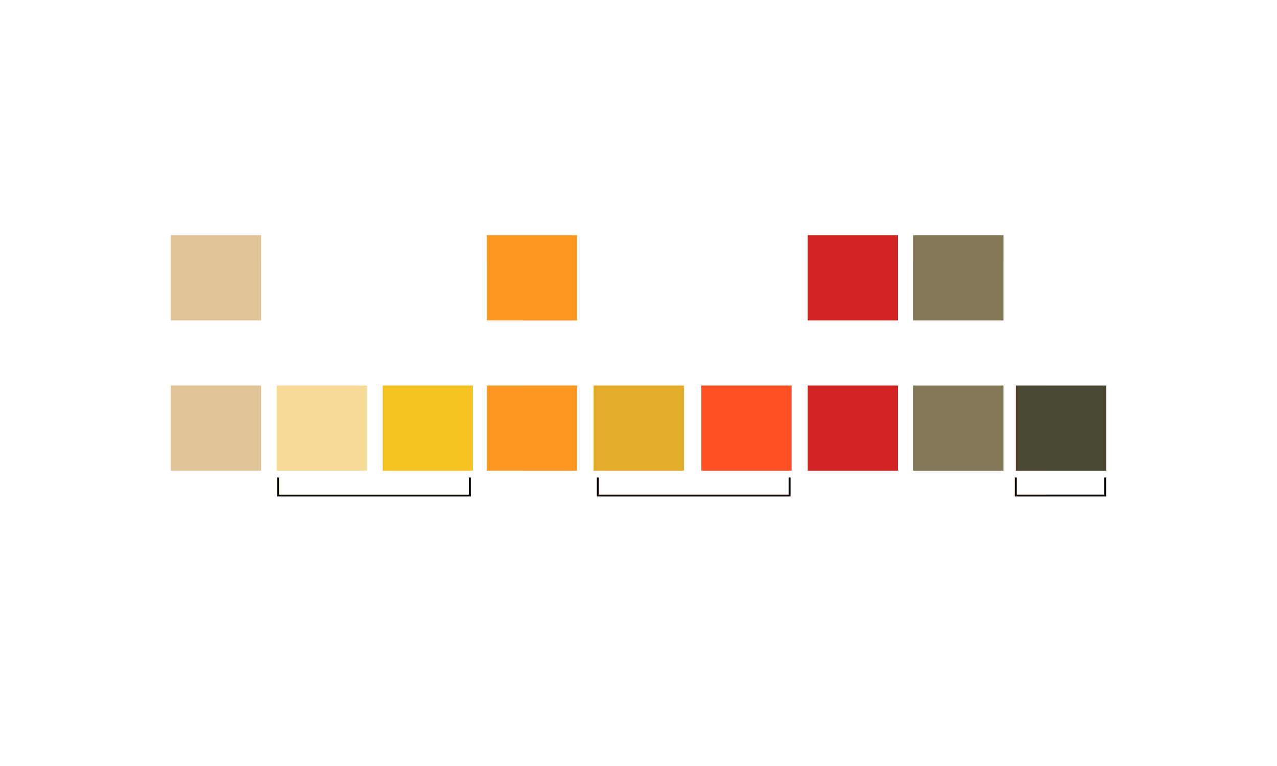
Additional tones to heighten contrast
Illustration
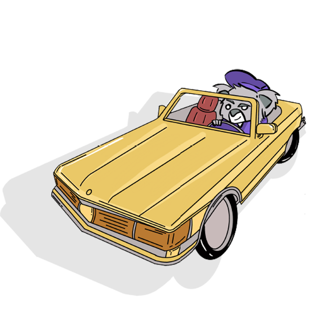
Next, I focused on determining the illustration style for the graphics. I began by exploring various approaches, starting with simplified version of the event’s mascot, Ozzie. Unlike Piskor’s intricate illustrations, I aimed to evoke a sense of childlike delight through simplicity, infusing the designs with a charming and playful essence.
This process proved invaluable in shaping the design direction. By incorporating the new tones from the color palette, I observed how they enhanced the playful nature of the designs.
➜
This variation was chosen as it had the best balance and legibility overall.
Typography
It seemed logical to opt for a comic-style font that remained legible and clear from varying distances.


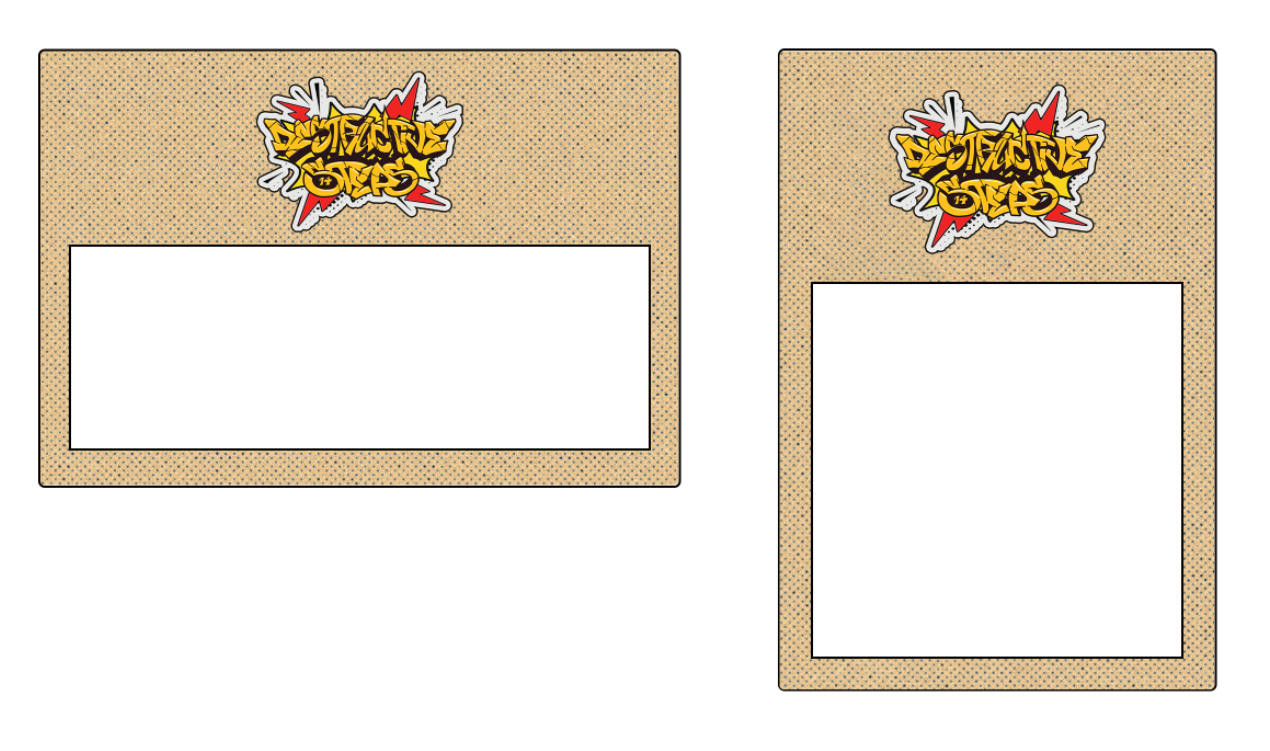
Basic IG Post Template
STAGE 3: DESIGN EXECUTION
Knowing that most of my deliverables were social media posts, I decided to experiment with the simplest form of posts: a plain Instagram post template designed for overlaying informative text.
I experimented with various shades and hues of a cream background inspired by Piskor’s comics and added a halftone overlay to give it a vintage comic feel. Considering that many posts would feature important text and graphics, I avoided bright colors and chose a more subdued background. Ultimately, I settled on the first design, Shade One.
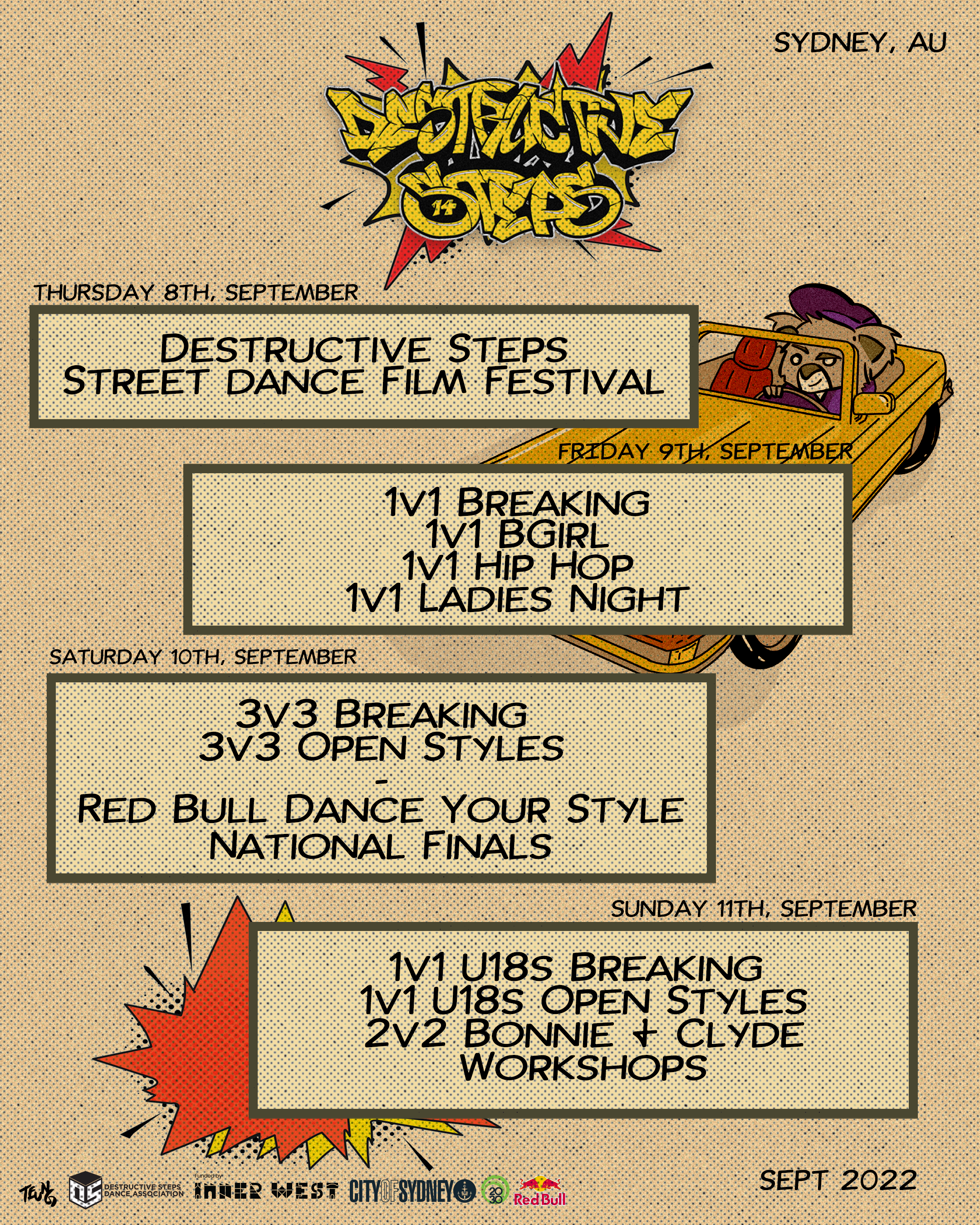
DS14 Schedule
I incorporated a variety of comic effects, yet I deliberately kept them minimal to ensure a harmonious and cohesive brand theme. This approach was particularly crucial in maintaining a consistent color palette, reinforcing the overall aesthetic and visual identity of the brand.
From this point, I had a clear vision for the design direction. I could extend this approach to other designs, ensuring consistency in color, halftone pattern, and font. It was evident that DS14 would follow this unified theme. With this clarity, I outlined the necessary graphics and delegated tasks to my colleague, Beatriz, who joined the project to assist with the designs (woohoo!).

Shade Three

DS14 Schedule Cover Image

Shade Two

Plain IG Story

Shade One
Next, I experimented with the text boxes that would be placed over the background design. I aimed to keep them simple to minimize visual clutter and ensure clear communication, given that the halftone already introduces a pattern-like element. I outlined the text boxes with a dark green tone to complement the vintage color scheme I envisioned for the graphics.
Text Box with Halftone
This resulted in the creation of the initial set of informational posters, which included the schedule, 3-day event timetable, basic Instagram story posts, basic Instagram posts, and registration dates. Although there was much more design work ahead, this theme served as the foundation for all subsequent designs.
Plain Text Box
CHALLENGES
To be candid, navigating through the ideation phase of this theme posed its fair share of challenges.
1_Animating Judge/MC/DJ Reveals
There was the task of crafting captivating "Animations" for the Judge/MC/DJ Reveals. These reveals were pivotal moments during the event, boasting internationally renowned dancers like Leese from Korea and Angyil from the US.
Not only were they major highlights for our social media traction, but they also significantly impacted our event turnout. Eager to push the boundaries, I opted for an ambitious animation approach for the reveal graphics. Wrangling with layering graphics, inserting them into Premiere Pro, and ensuring clarity in their presentation posed quite the puzzle.
With roughly 30 reveals to conceptualize, the workload surged. Each image had to undergo rendering for a comic cartoon effect, coupled with the signature green outline, and seamlessly integrated into the textbox. Implementing two images per reveal to enhance the comic panel effect and make the smaller image pop out added an extra layer of complexity, demanding additional time and attention.
2_Maintaining Consistency of Designs
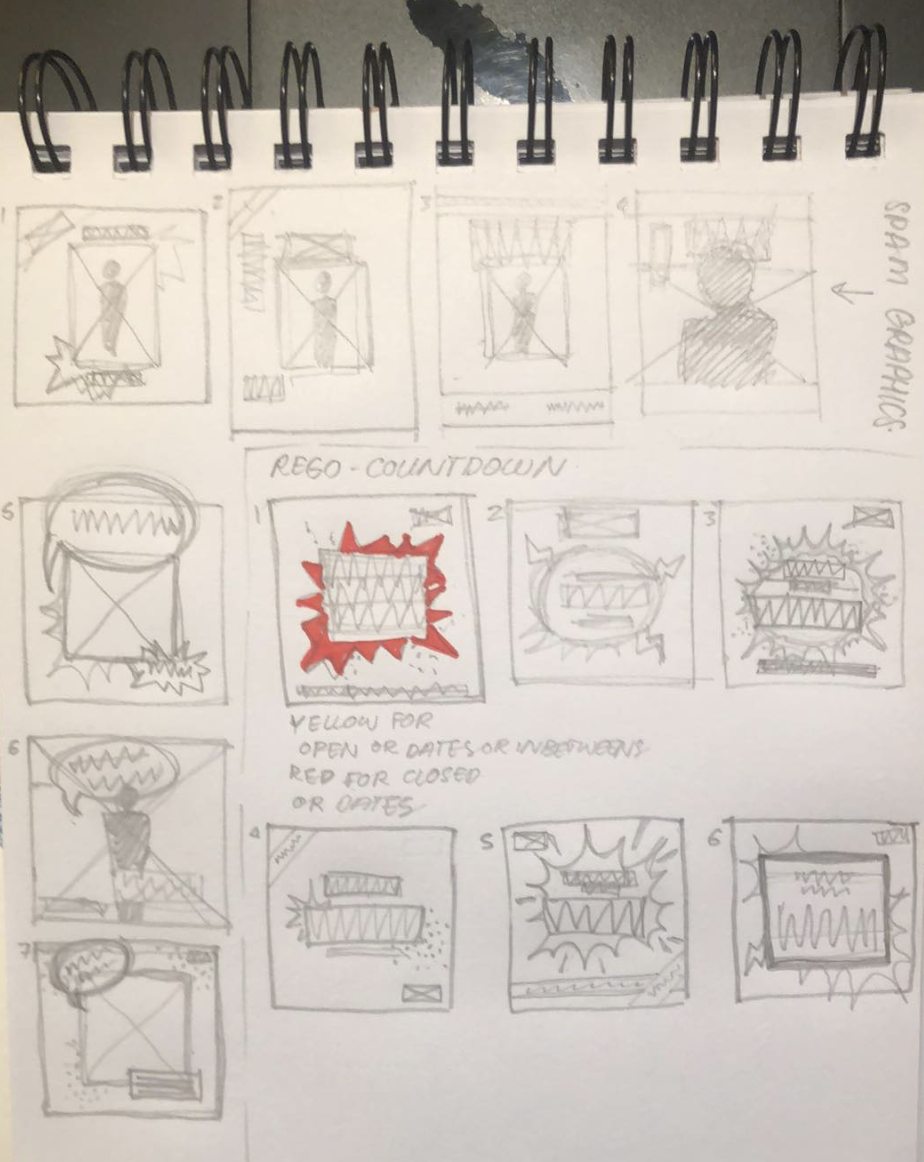
Screenshots, Images and Sketches of Design Ideas from Myself and Beatriz
Additionally, maintaining consistency across designs emerged as a critical concern. Collaborating with a colleague necessitated clear communication and meticulous attention to detail to uphold uniformity. Establishing a group chat among myself, Beatriz, the president, and vice-president facilitated constant communication and real-time updates, enabling us to maintain a cohesive design approach. Given the dynamic nature of event details, such as judges' preferred names or updated runtimes, ongoing revisions to graphic text were imperative to ensure accuracy.
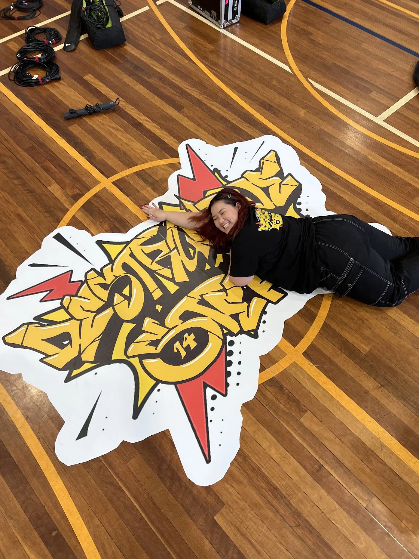
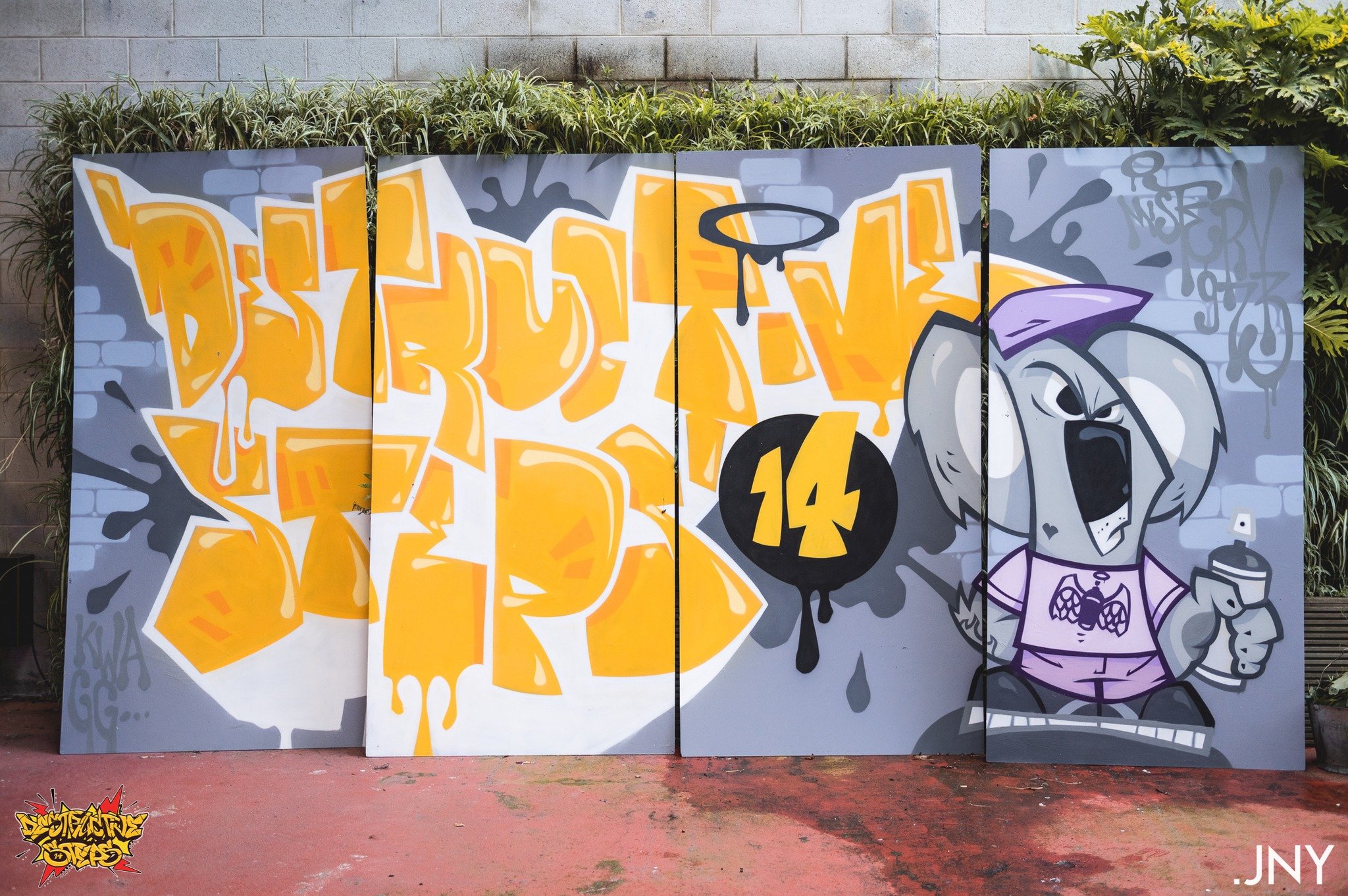
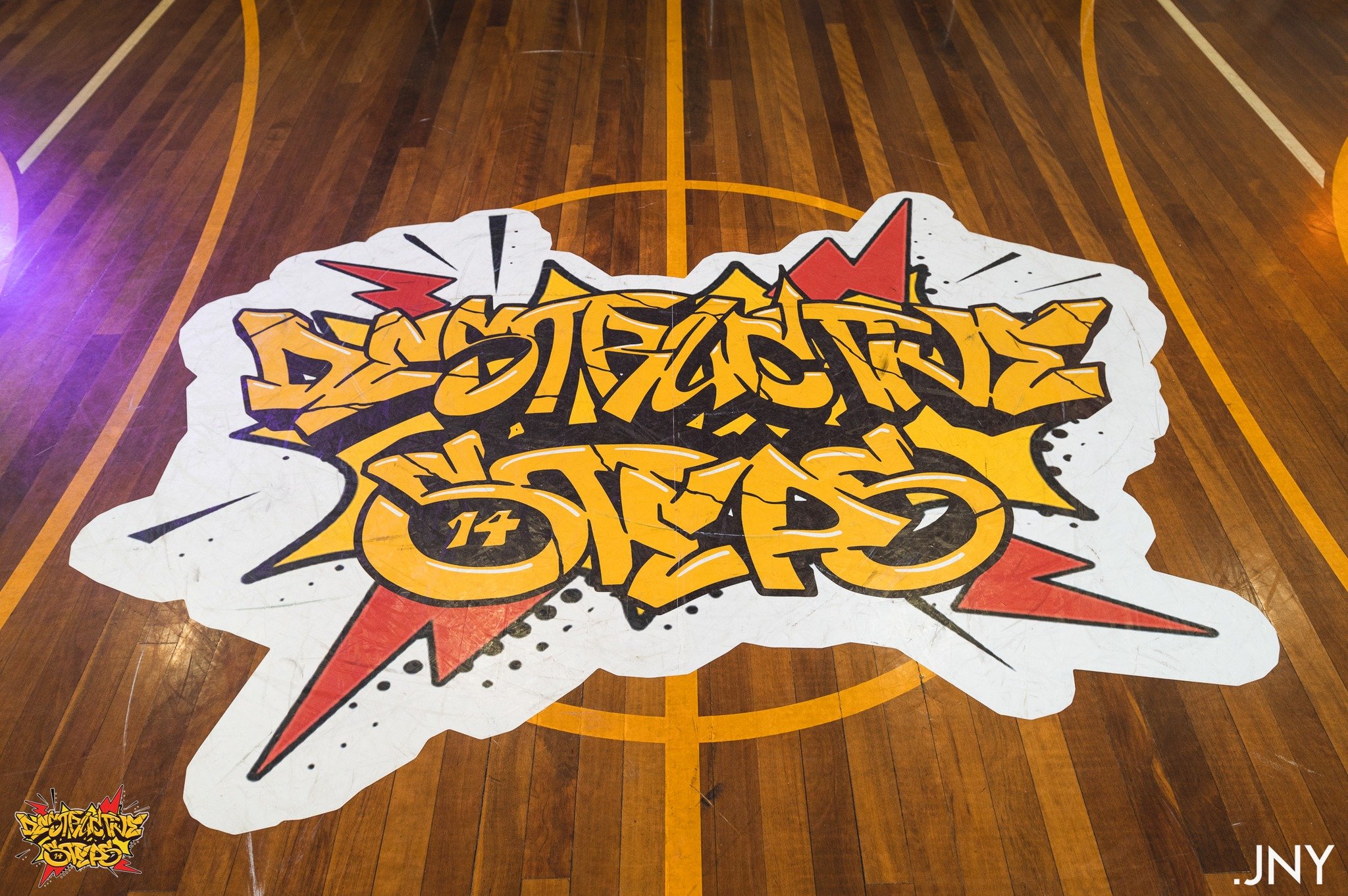
3_Creating a Floor Decal
Horizontal Vs Vertical Layout for Number Stickers
First Attempt at Comic-fying a Photo
To overcome this, I allocated specific days to tackle each stage of the reveal process methodically in bulk. Cutting people out of images, applying cartoon effects, adding outlines, arranging layers for the video, crafting the video itself, exporting all necessary layers into organized folders, and finally assembling the videos and animating them each had their designated time slots. Although laborious and time-consuming, the invaluable assistance of my colleague, Beatriz, afforded us the luxury of extended time for completion. Organization played a pivotal role throughout, ensuring each stage was executed flawlessly to minimize the need for rework.
Choosing a Layout for the Floor Decal
Here I am with our newly printed and installed floor decal!
Beatriz’ Sketch Ideas for IG Posts
Beatriz’ Sketch Ideas for T-Shirt Merchandising
Lastly, the challenge of creating a floor decal loomed large. Tasked with designing a logo for a sizable 3x3m floor sticker to adorn the battle area in the main hall, the stakes were high. Vectorizing the design in Illustrator aimed to enhance clarity, yet the intricacies of floor sizing eluded me. On the day of unveiling, while the decal made a striking impression, a closer inspection revealed slight blurriness.
Admittedly, delving deeper into optimizing logo clarity and liaising closely with the printing service would have been prudent. However, constrained by time and limited resources as part of a two-person design team, the outcome was deemed satisfactory, albeit with room for improvement.
Undoubtedly, it served as a valuable learning experience, marking my inaugural foray into physical design realms.
STAGE 4: IMPLEMENTATION AND LAUNCH
After extensive collaboration and feedback with the team, we reached the finalization stage for the designs. It then became a matter of applying the approved designs in bulk, customizing each with specific dates, cutouts of people, images, etc. All the templates were completed and ready for use.
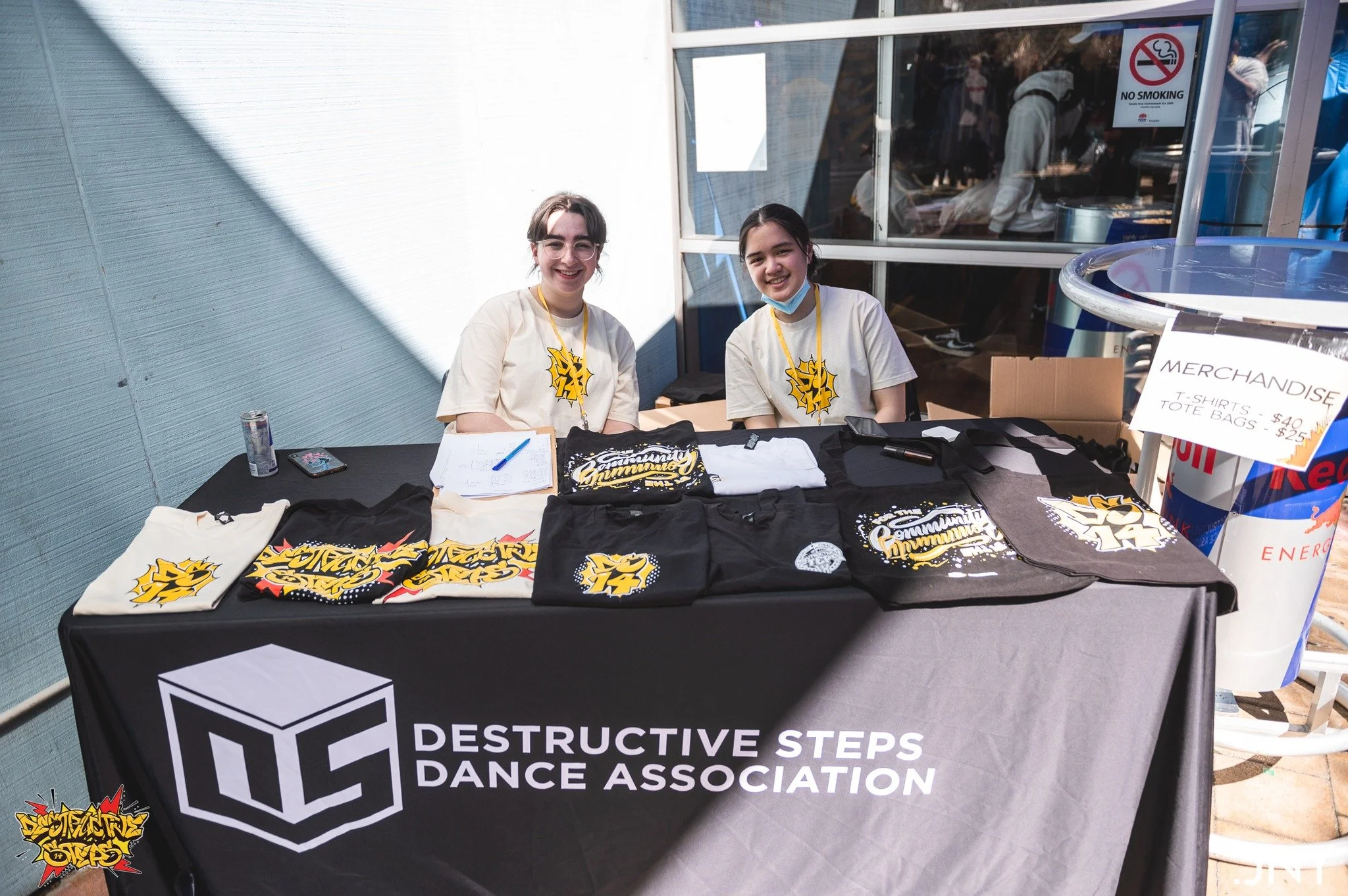
We also commenced the printing process, managed by Arisse and Amelia. The printables included the floor decal, number stickers for battle participants, and merchandising for t-shirts and tote bags.
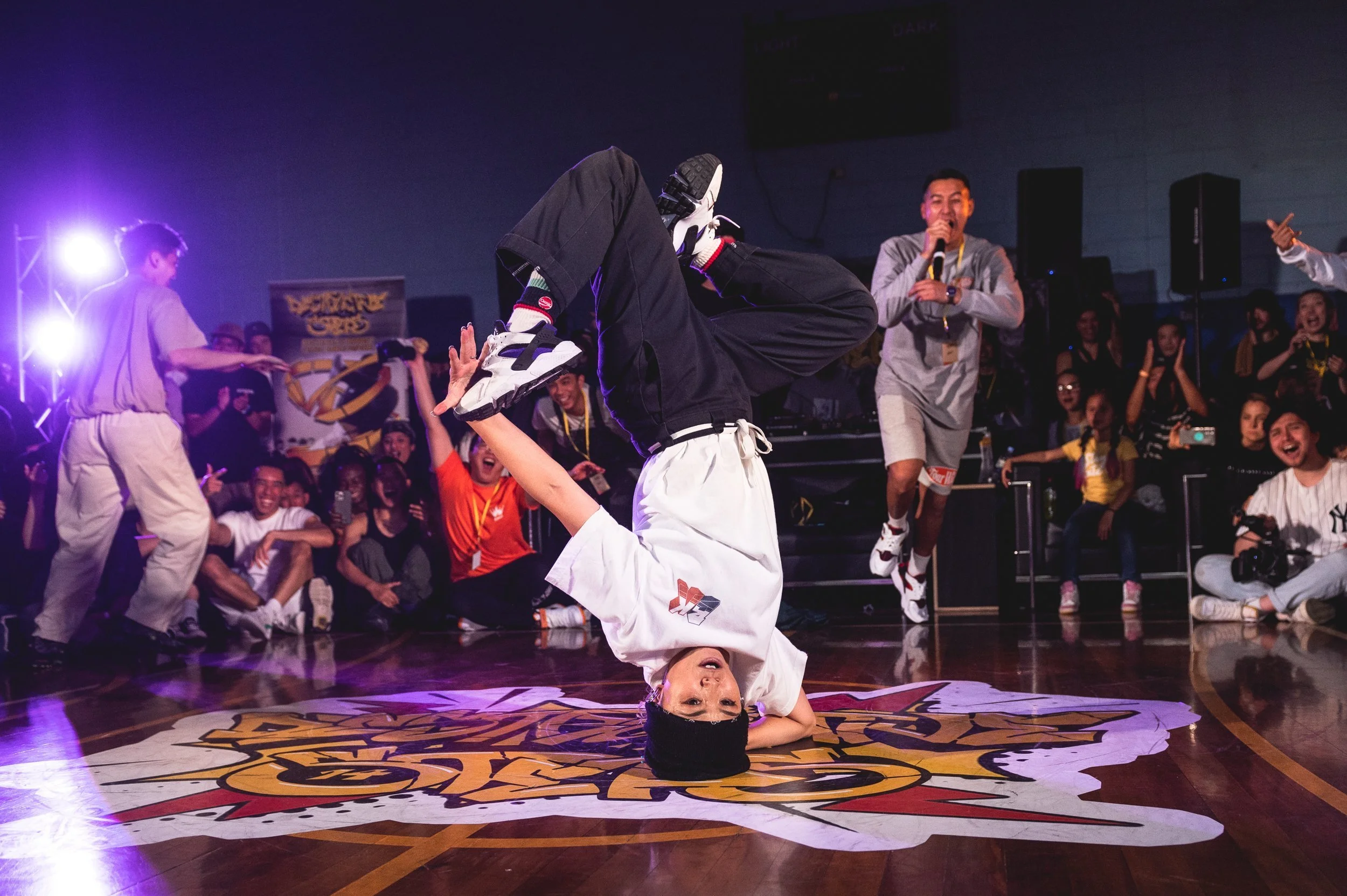
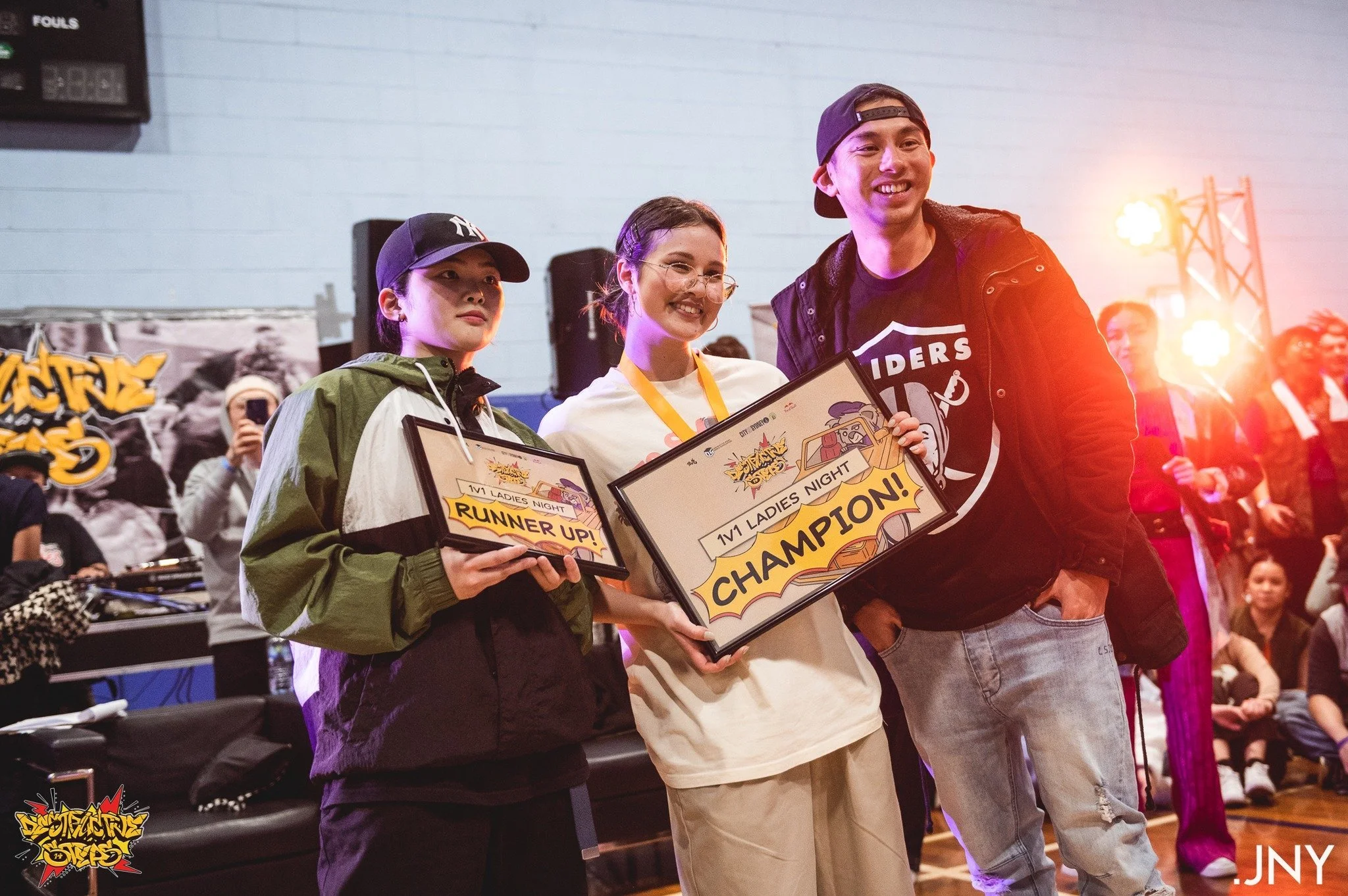
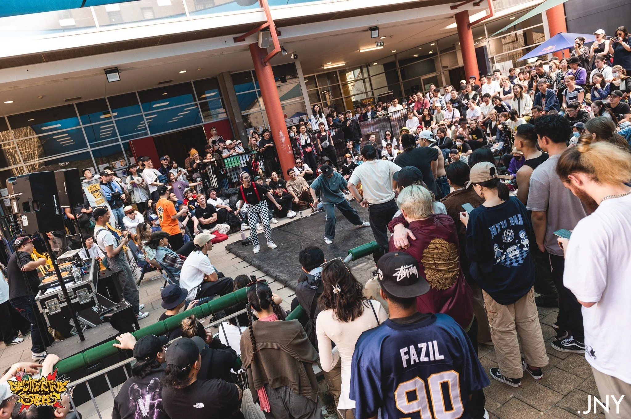
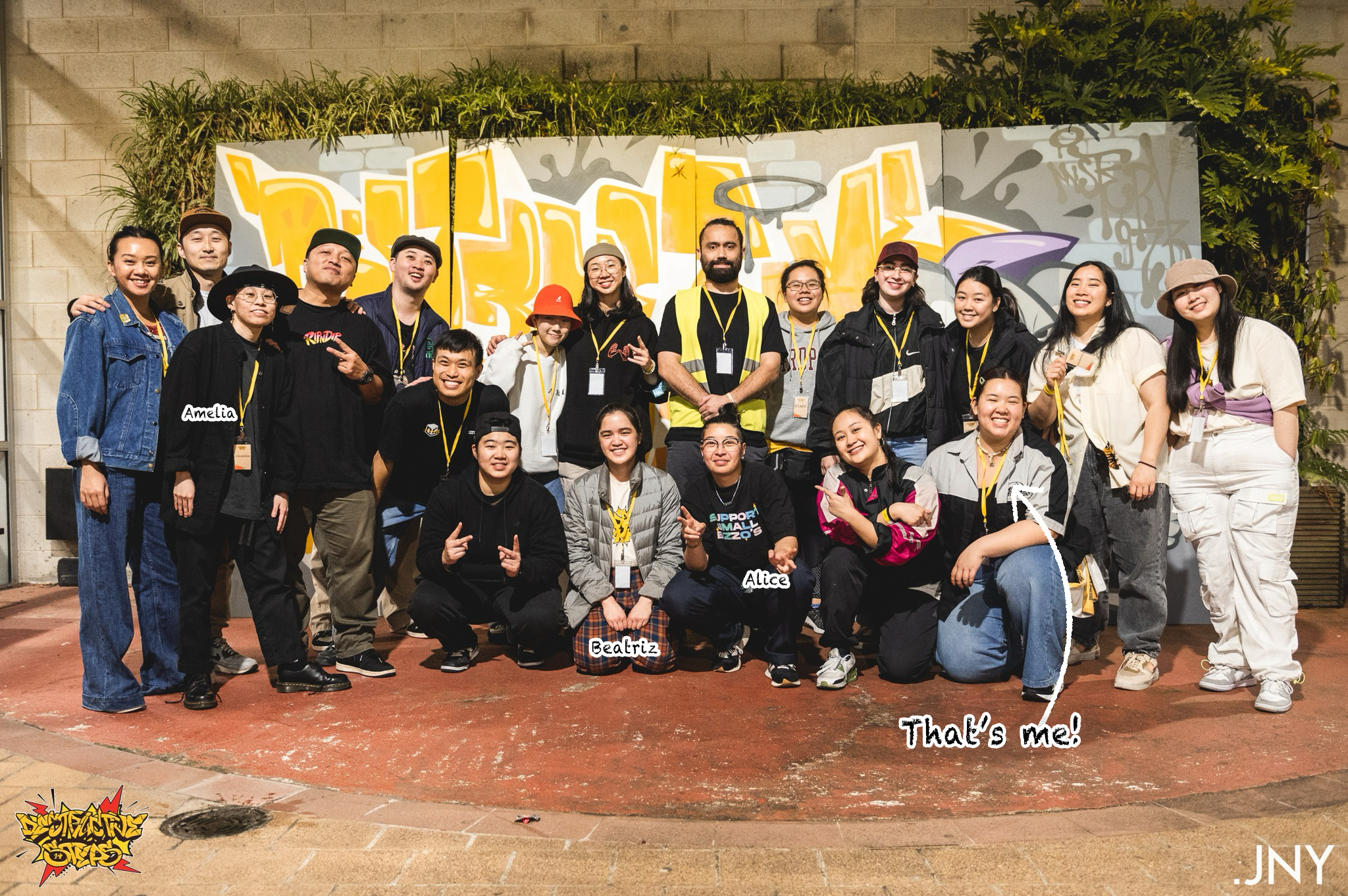
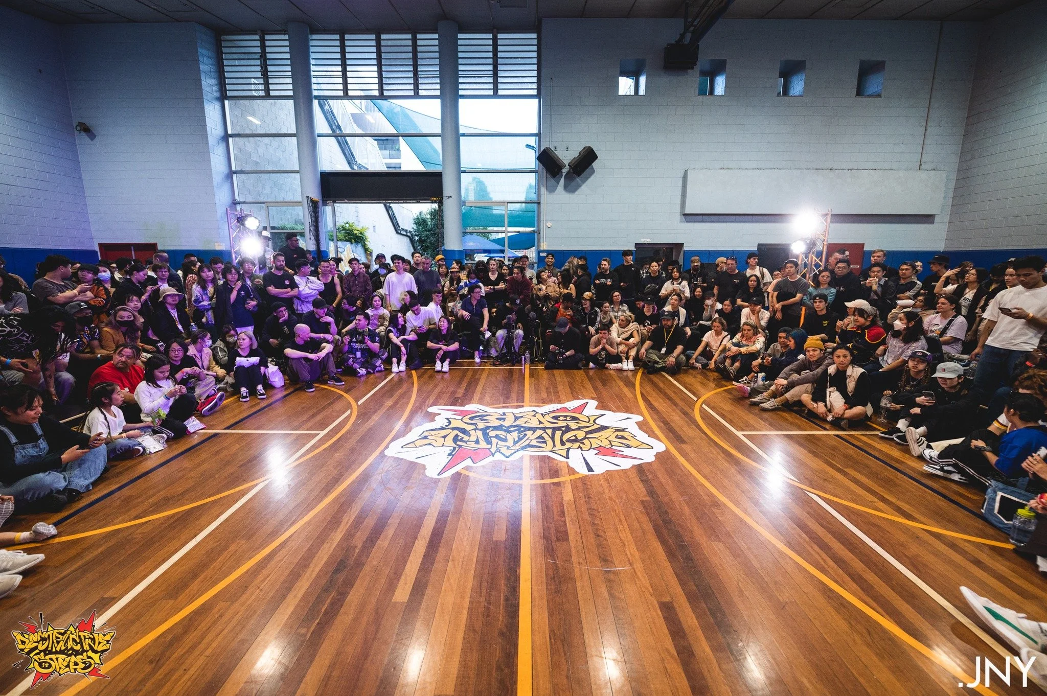
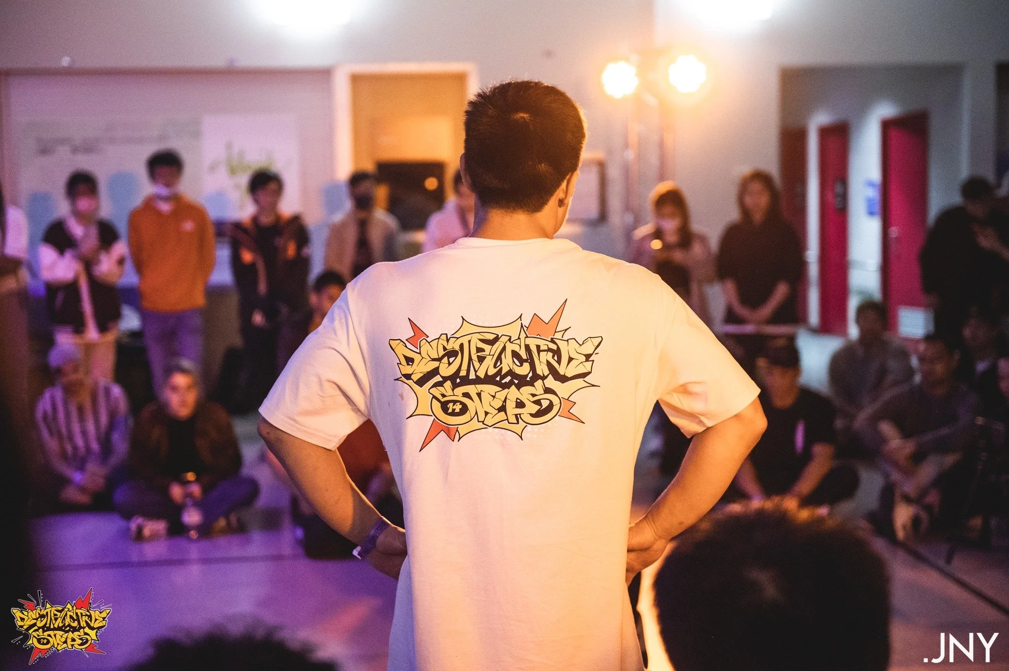
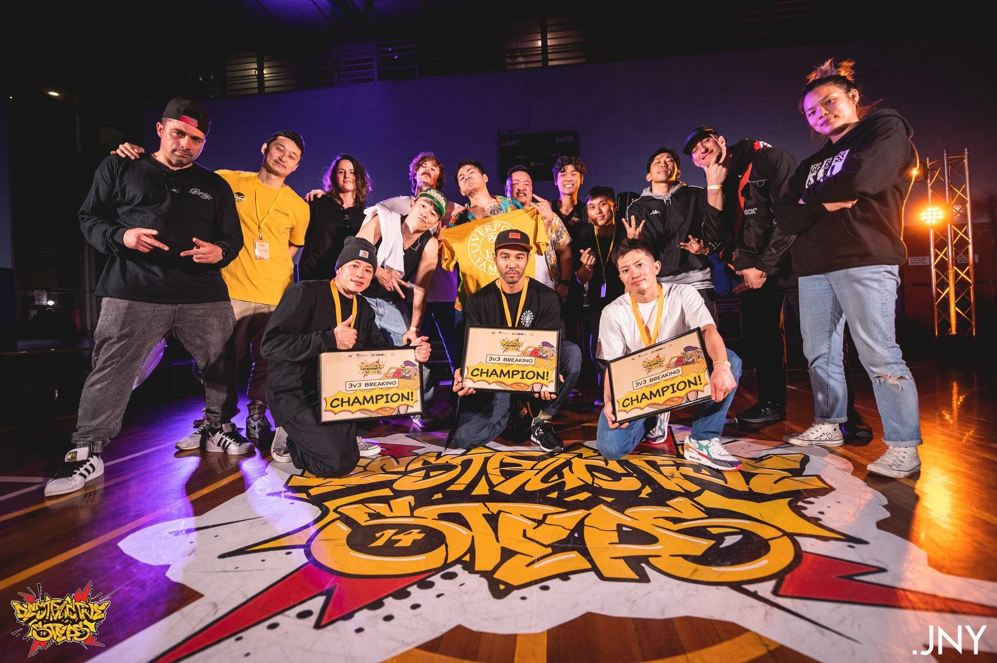
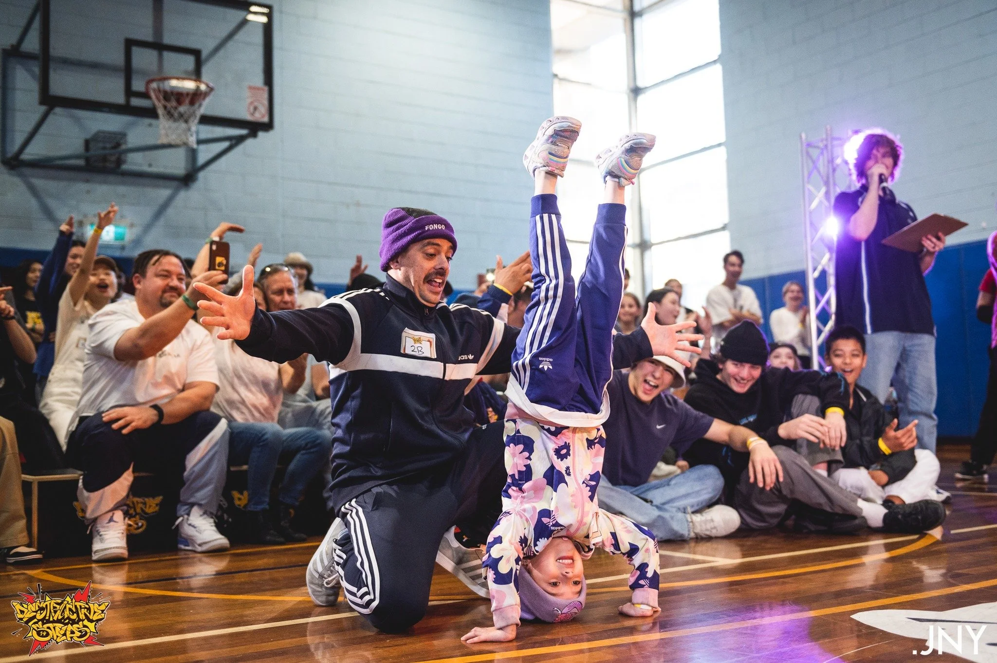
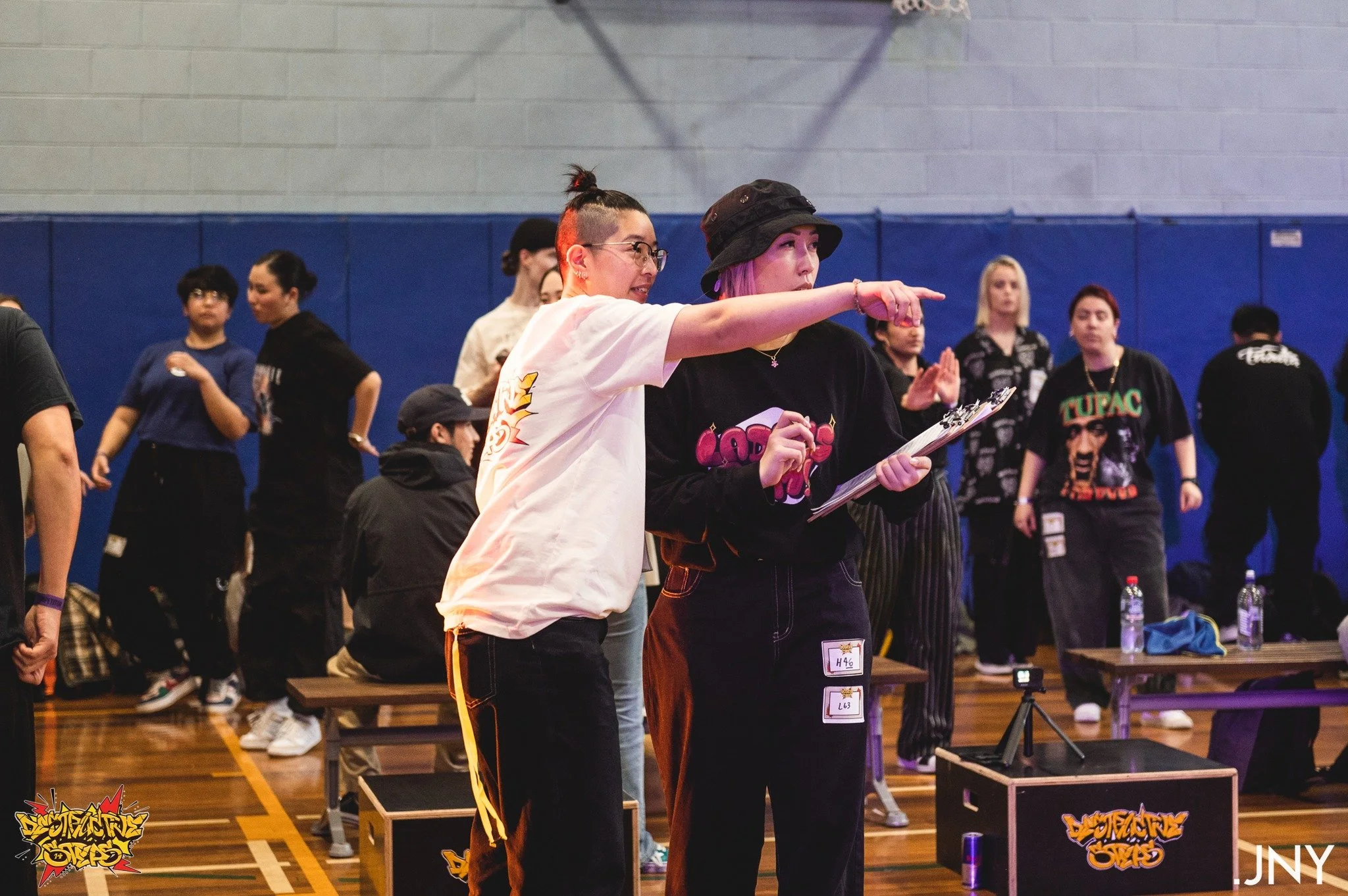
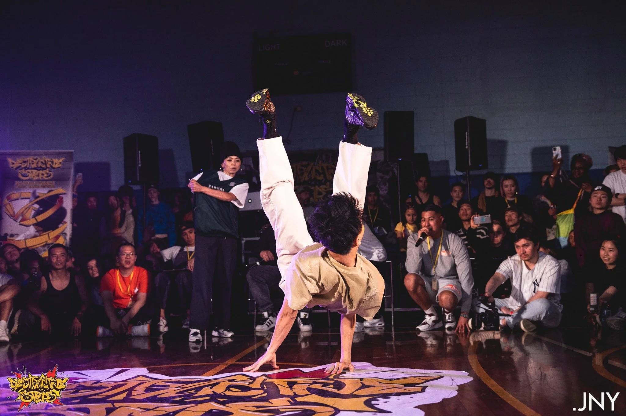
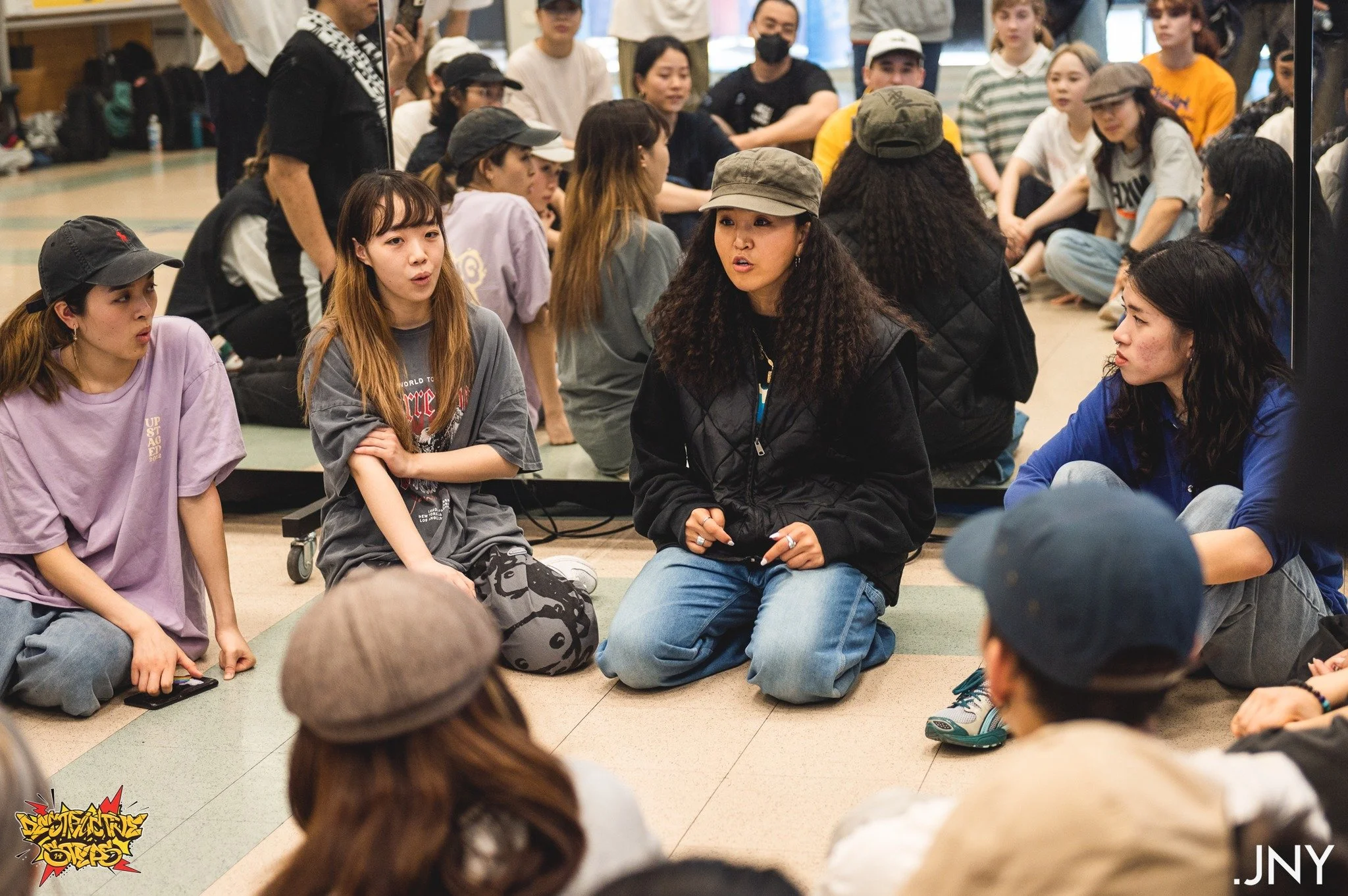
See below for images of our DS14 event taken by our amazing photographer, Johnny, and our highlight reel that recapped our awesome 3 day festival!
Destructive Steps 14 Highlight Reel by Studio Bounce
SPECIAL THANKS
This project stands as one of the largest I've undertaken. I'm incredibly grateful for the positive feedback from both the team and the public. A heartfelt thank you to DSDA Inc. for believing in my vision and giving me the opportunity to lead this amazing project—definitely one for the books!
All photographs featured on this page was taken by Photography JNY.
“Laura was amazing to work with! She was extremely proactive, worked well within the timeline, and went above and beyond with the design and the finer details. All the assets were to the look and feel and she produced an extremely cohesive event design.”
Arisse Tauv, President of DSDA Inc. and Organiser of Destructive Steps
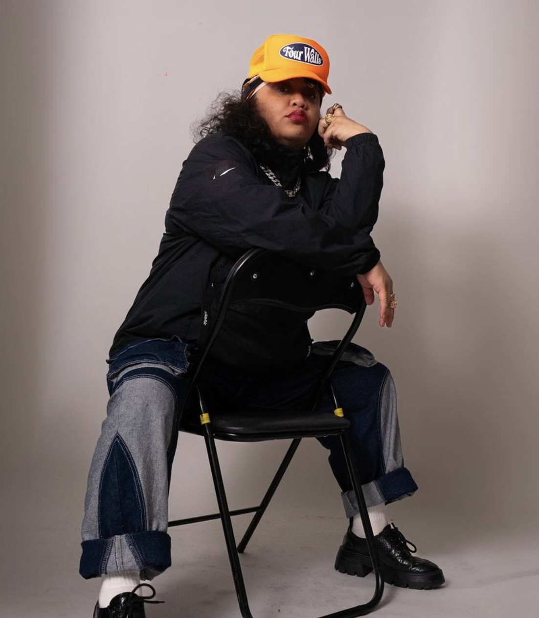
“The graphics for Destructive Steps 14 were spot on and perfectly aligned with the brand's identity as a street event. The design felt very contemporary while incorporating an old-school graffiti element, creating a perfect blend of modern and classic street culture..”
Stacy Peke, Founder of Four Walls, and participant of Destructive Steps 14