June 2023 - March 2024
ClickView Thumbnailing
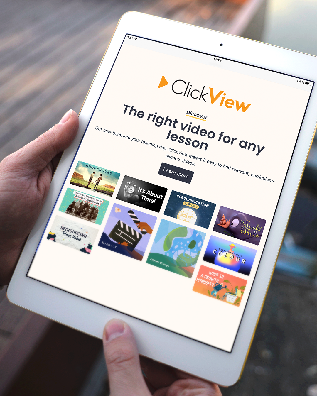
ClickView is an international platform providing high-quality educational videos to schools across the US, UK, and beyond.
During a major website revamp, I was hired on multiple casual contracts to help curate new thumbnails for over 10,000 videos. These thumbnails needed to look premium and engaging, similar to Netflix but for education, enticing both students and teachers to click on them. The designs had to avoid watermarking areas and ensure the titles were clearly legible. As part of a team of five, I contributed to the creation of over 2,000 assets, enhancing the user experience and maintaining the platform's high standards.
Key Deliverables
Premium Thumbnails designs; ~100 per week
The Team
Lead UX/UI: Janice Quach
Lead Graphic Designer & Asset Manager: Ry Abednego
Graphic Designers: Laura Huynh ☆, Pfreya Villarey, Leo Molon Tanguin and Ella Vergara
ABOUT
What Makes a Thumbnail Look Premium?
Understanding Premium Thumbnail Design
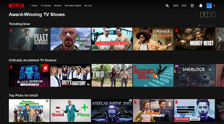
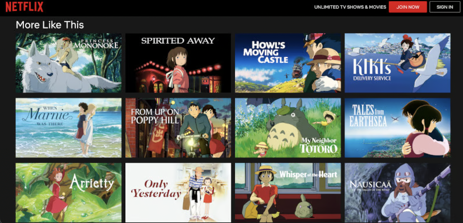
We began by examining movie assets, focusing extensively on Netflix and Studio Ghibli thumbnails to understand their design principles. We noticed that simplicity was key: integrating the title with the main image in a straightforward manner, without heavy editing. For imagery, we sourced from Fanart.com.
Currently, our thumbnails are simply the timestamps from the videos.
Red Zone
Shoutout to AI!
Contrary to the belief that AI is taking over jobs, particularly in graphic design, I see AI as a significant aid in my work.
We started using AI early on, when it was only available in Photoshop Beta. It allowed us to quickly and easily remove unwanted elements from images or replace them with more suitable ones. As an educational platform, we aimed to avoid visual content that could evoke heavy topics, politics, blood and gore, or sensitive issues. AI was invaluable in helping us achieve this.
CutOut.Pro featuring image enhancing, as well as other options such as a backgrouund remover!
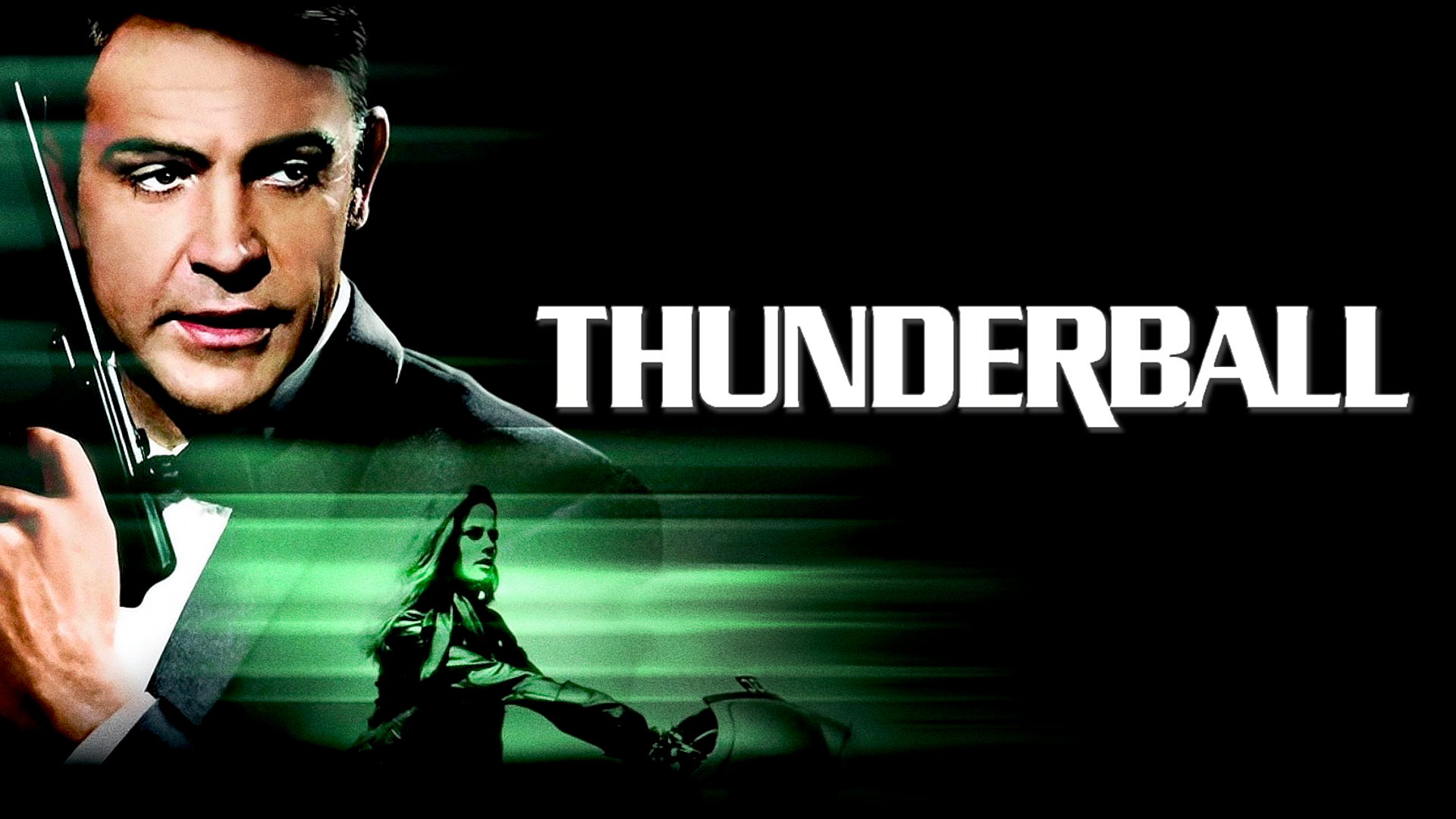
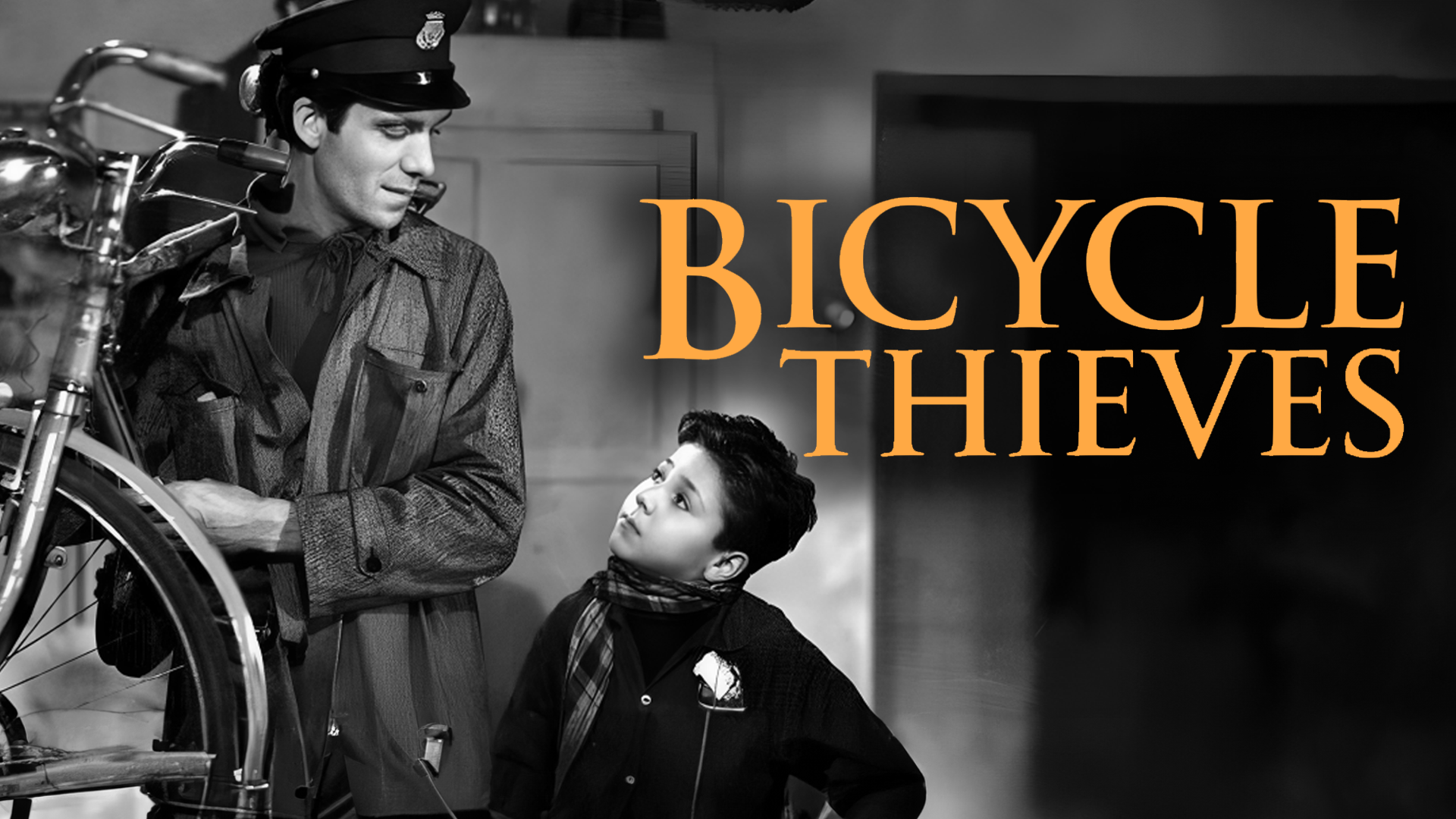
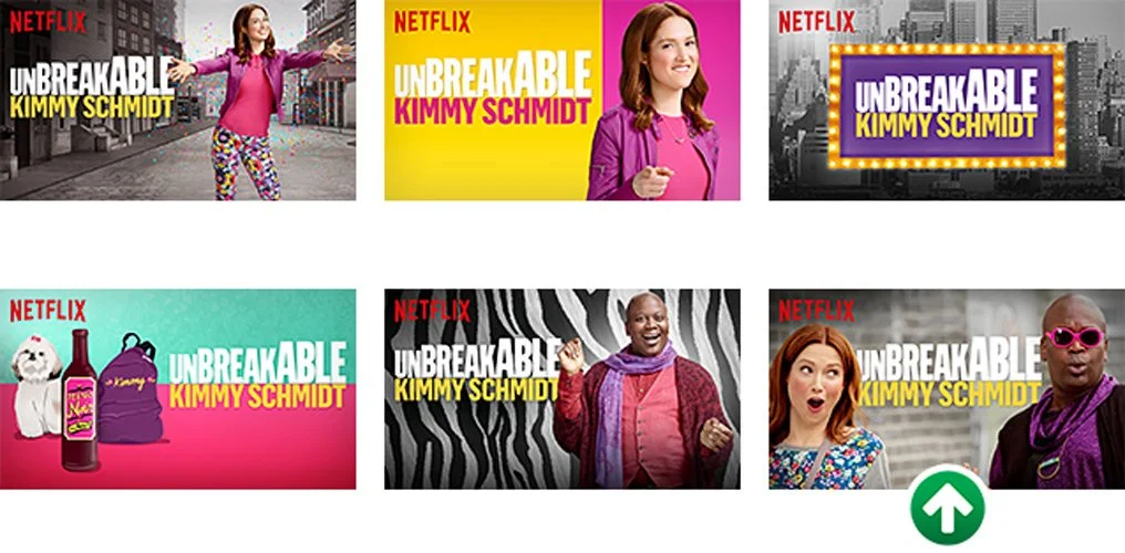
We began by examining six different thumbnails Netflix created for "Unbreakable Kimmy Schmidt." These thumbnails effectively display the title in a clear and readable manner, paired with a compelling visual that enhances the title and highlights key characters from the show.
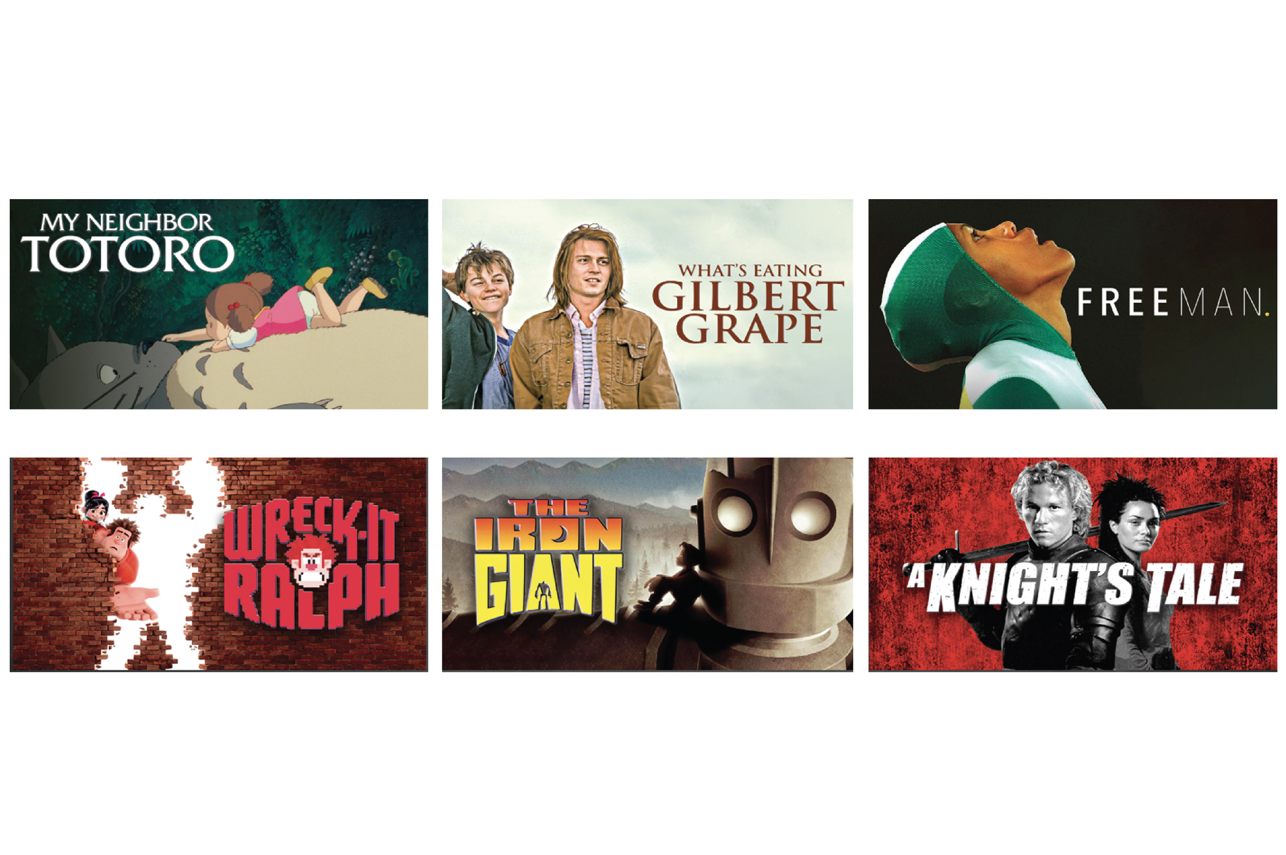
Building on this concept, I designed thumbnails for the movies provided by Clickview. I subtly used shadows and emphasized simple title placement alongside a striking image to engage the audience, all while avoiding the red zone.
Examples of Thumbnails Affected by the Red Zone
Generative Fill Demonstraton
On a smaller scale, AI was useful for enlarging images without losing quality, enabling us to arrange text and visuals without obscuring the main imagery.
For blurry photos, we used an online service called Cutout.Pro, which significantly improved the quality of images that weren’t initially up to standard. This was especially useful when we didn’t have a set image for a thumbnail and used a screenshot from a video instead, which doesn’t result in the best quality. But Cutout.Pro had assisted solving this problem immediately!
Overall, AI proved to be an incredibly helpful tool throughout the process. I believe it can greatly assist and accelerate our creative endeavors.
With all this information in mind, I immediately began working on movie thumbnails. Initially, the process was slow, but I quickly adapted and discovered ways to streamline it. Some of the techniques I used included:
Placing the image on one half and text on the other
Ensuring bright text had high contrast against dark areas of the image, using a shadow effect to make it stand out while blending into the darker parts
Utilizing AI's Generative Fill to assist in the process or to complete an image
What are We Missing?
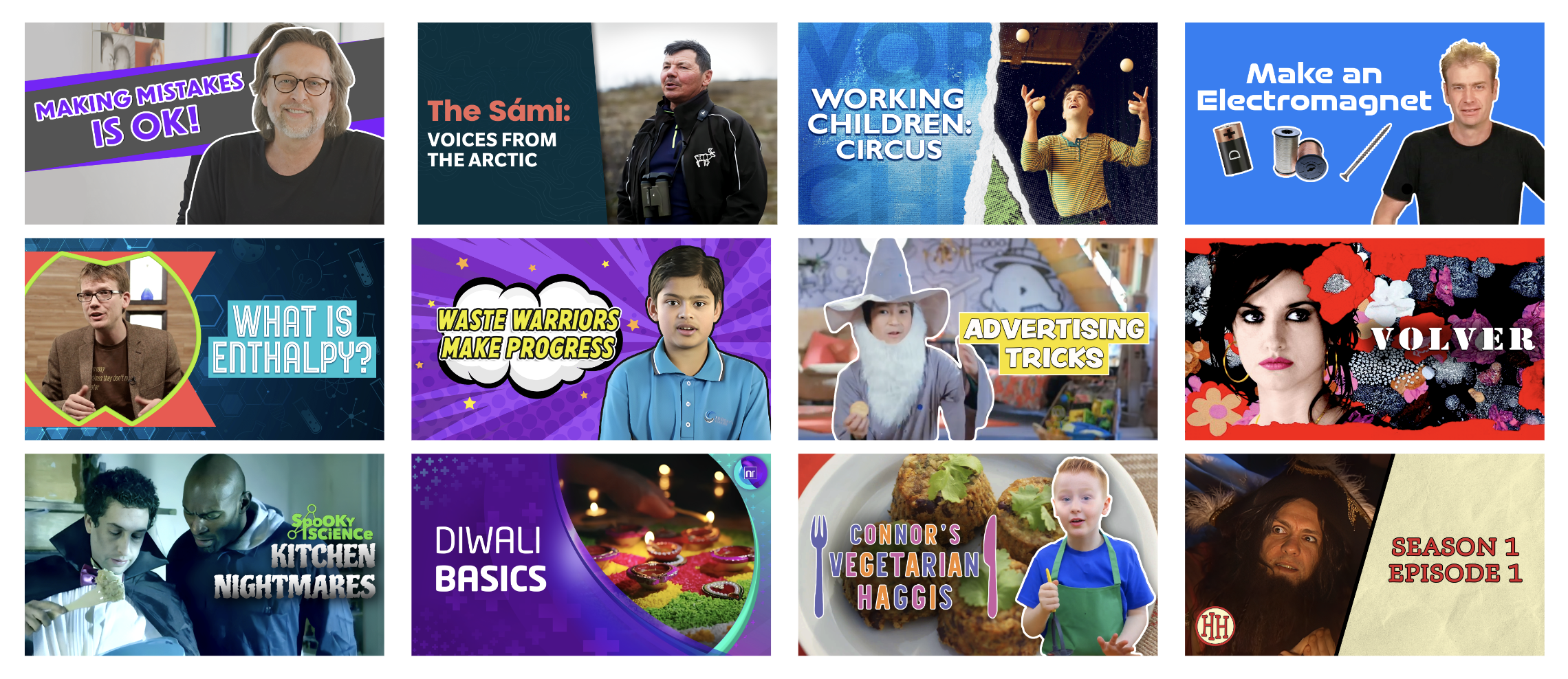
Movie Thumbnails I Made for Clickview
Cirriculum Videos and Series
We experimented extensively with series thumbnails. Initially, we made them all look the same, but soon realized each video needed a unique, curated thumbnail. Thus, videos within the same series followed a consistent design theme but were distinct from one another. We drew a lot of inspiration from YouTube thumbnails, using outlines and evocative images.
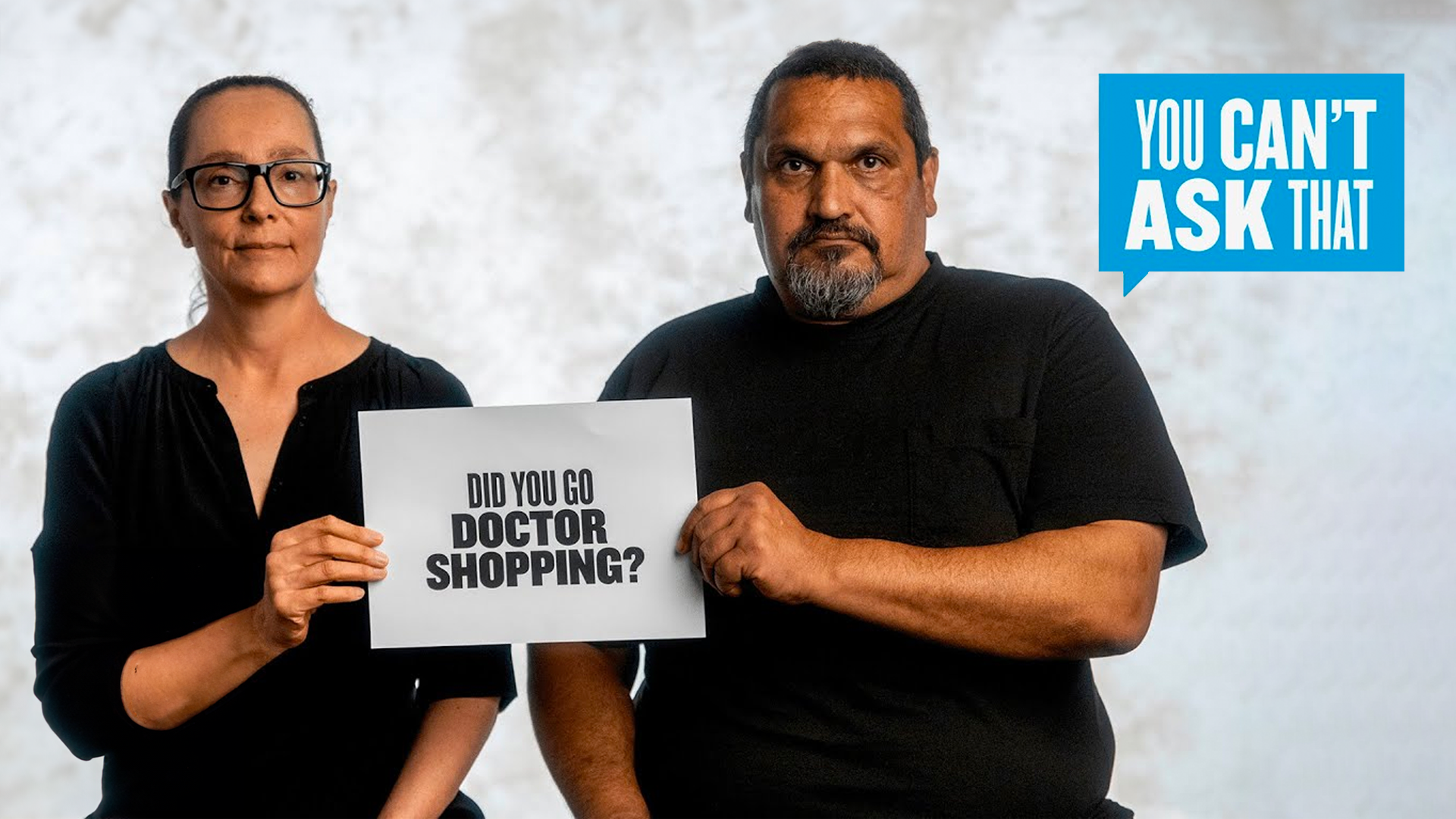
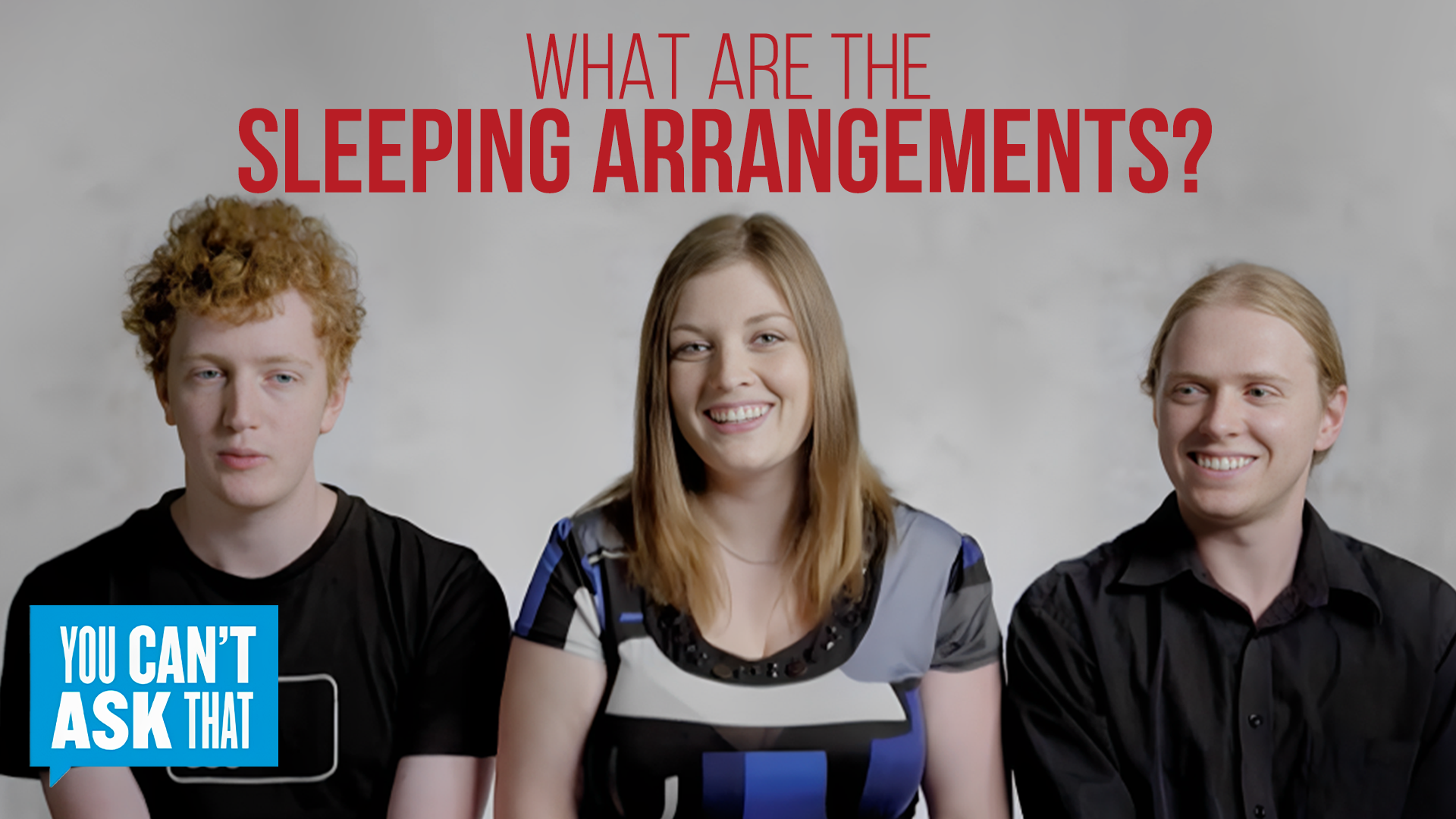
Take a look at the example below from the series I curated thumbnails for, "You Can't Ask That." We opted not to use a template for our series design but instead employed a consistent theme that maintained distinctiveness among the videos.
You Can’t Ask That Season 7 Episode 6: Prescription Drug Addicts
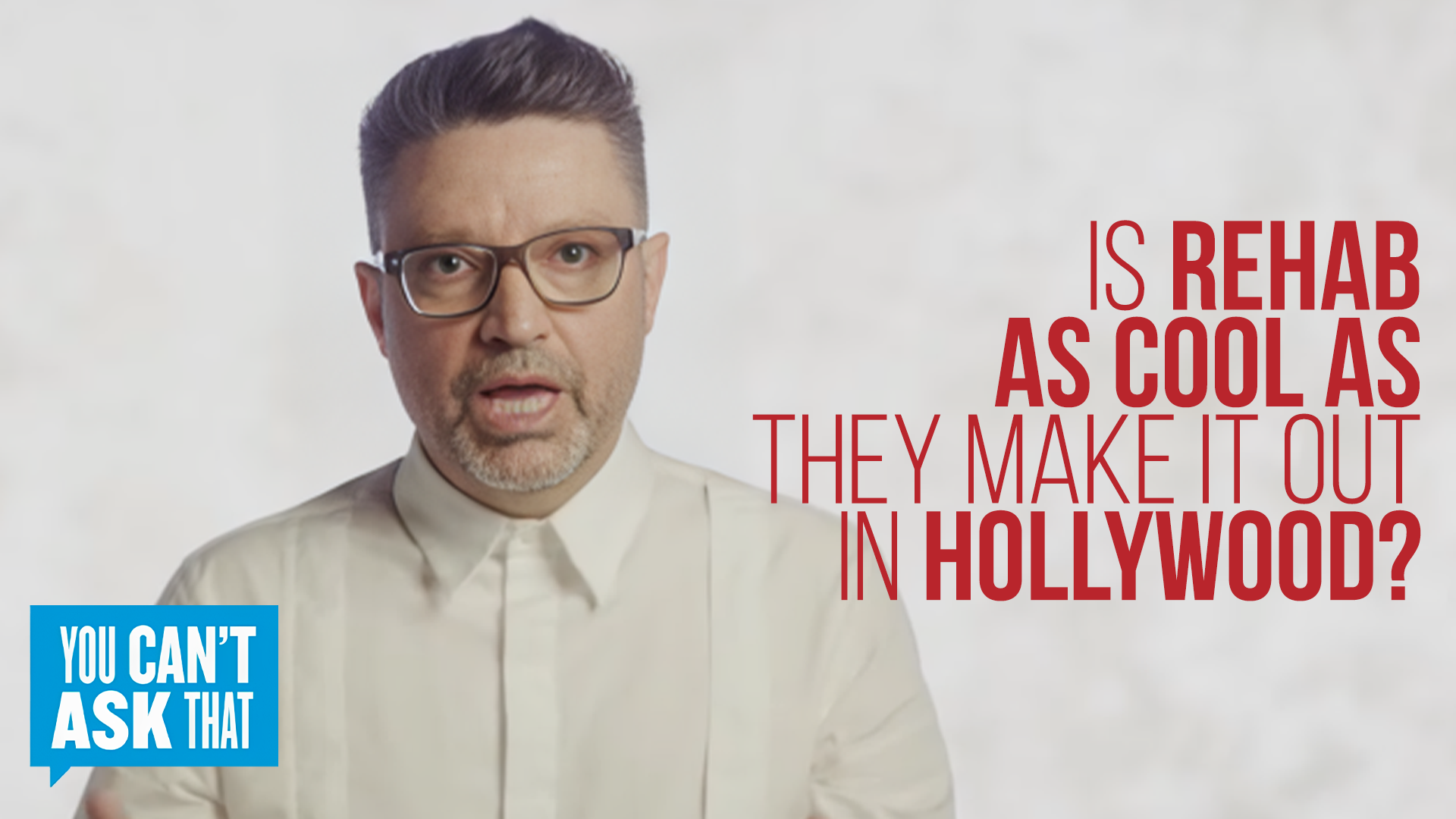
You Can’t Ask That Season 1 Episode 5: Polyamorous
Initially, we aimed for a clear, waist-up shot of the participants from a distance. This included one of the most interesting questions asked, along with the logo.
In the next iteration, we aimed for a less busy thumbnail by featuring a closer shot of a single participant. This was accompanied by one of the questions, written in an engaging manner with varying text thickness.
In the final iteration, we decided to omit the logo for a cleaner look. We felt it unnecessary in the thumbnail since the series name already appears in the video title, further enhancing the thumbnail's cleanliness.
First Draft
Second Draft
Third Draft
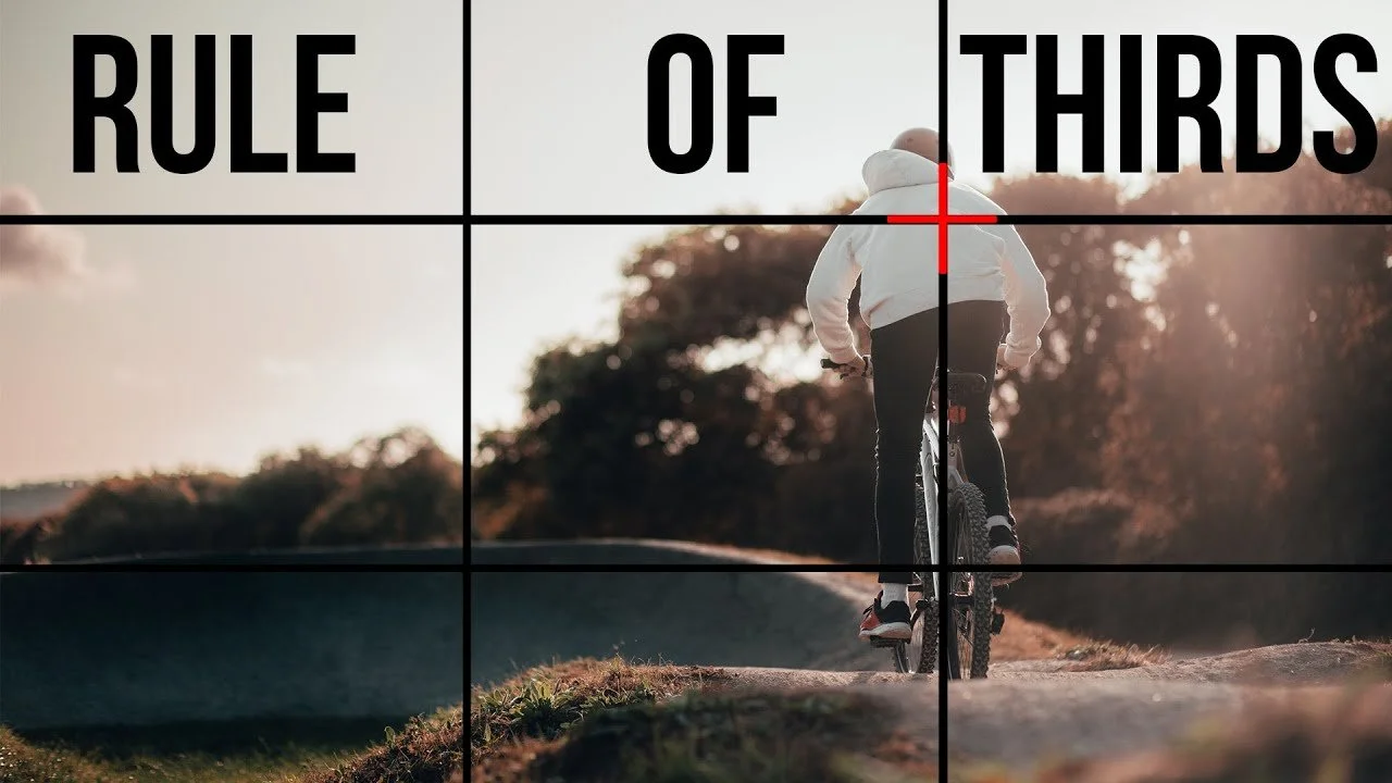
We researched and applied the rule of thirds for attractive thumbnail placement and studied eye-tracking patterns for effective design. Our team regularly held design sharing sessions to exchange tips and tricks learned in Photoshop, enhancing both our learning experience and design skills.
First Draft
Second Draft

Third Draft

Through trial and error, we initially aimed for interesting and eye-catching thumbnails similar to YouTube's style to attract viewers. However, we later learned that the videos were pre-selected based on the curriculum, prompting us to adopt a more premium, Netflix-like presentation for the covers. Throughout this process, we filtered out videos that lacked educational value or were of low quality to maintain a premium and valuable website. The images below were considered to have a 'too Youtubey' appearance, bordering on clickbait. Feedback suggested reworking them to achieve a more premium look.
With exemplary thumbnails from Netflix and each other's work as references, each week brought improvements in making our thumbnails look more premium. It was a process of continuous trial and error, involving numerous meetings and discussions to refine the final product and design scheme of the thumbnails.
Design Revision and Challenges
Constant changes were challenging, but necessary to ensure a high-quality final product. We had many discussions about various design aspects in regards to making our thumbnails look more premium, including:
Whether to use a series thumbnail as a template
Whether to include the series logo
The stroke and its impact on the design
Limiting the use of stock images
The role of gradients and shadows
Embracing the "less is more" philosophy
Compromising image space for legible text, prioritizing legibility above all
Each of these factors required careful consideration and revisions, often involving before-and-after comparisons to determine the best approach. We found that the optimal design depended on the series, the number of videos, and the overall style of the series.
On the left, Figure 1 illustrates the meticulous attention given to each section of the thumbnail by our asset manager, Ry. Figure 2 demonstrates our transition from using numerous strokes to a more minimalist design approach.
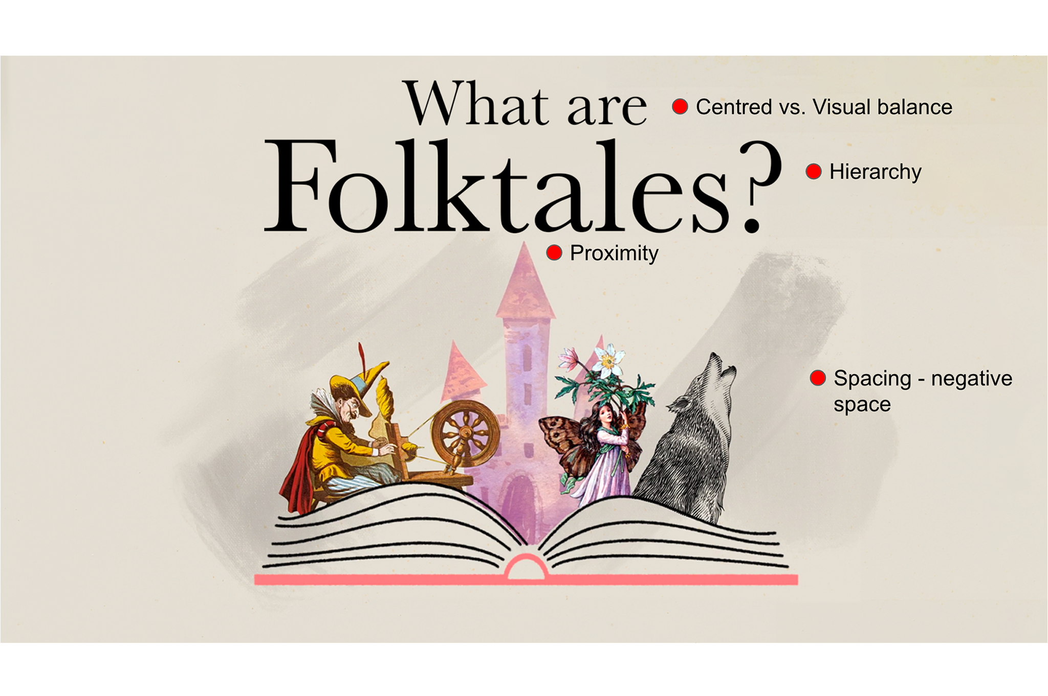
Figure.1
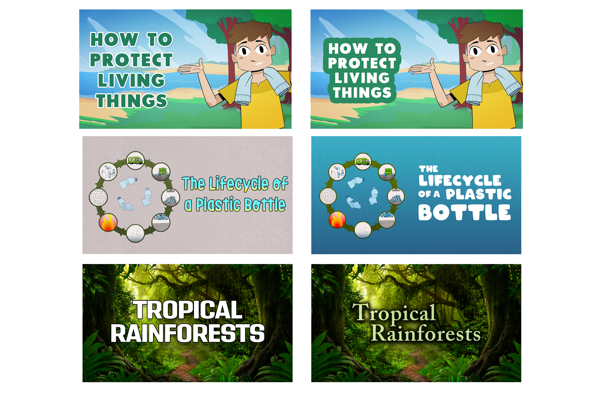
Figure.2
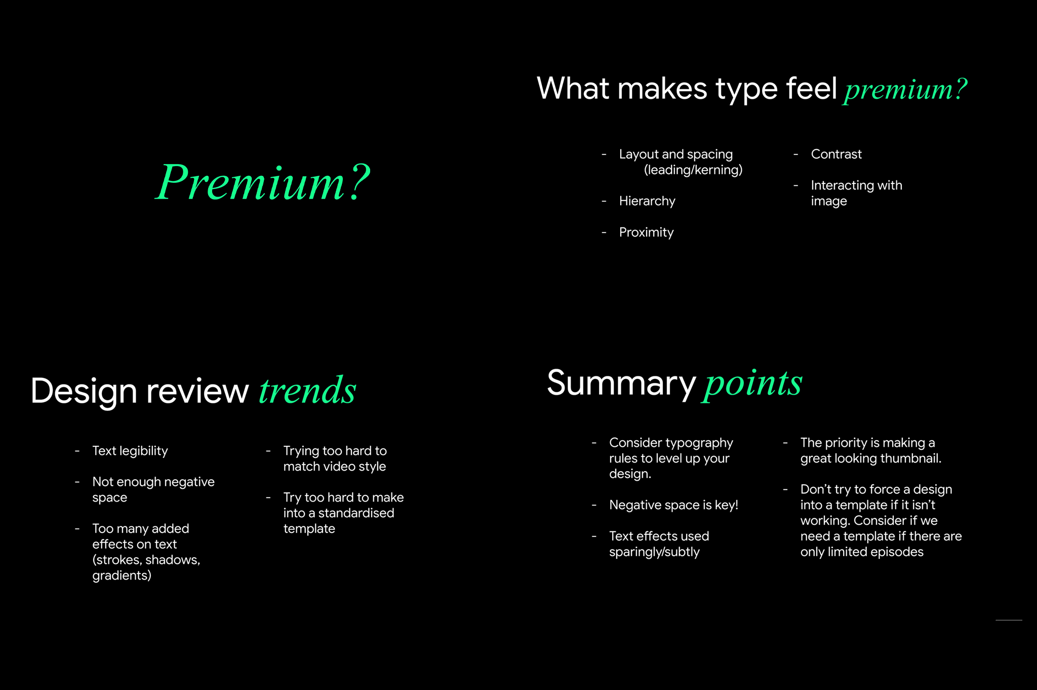
Below is a presentation created by Ry, our asset manager and lead graphic designer, during a feedback session. In it, he summarizes key points on what gives a thumbnail a more premium appearance, guiding the team towards a cleaner and fresher design direction.
During this time, we were also rebranding Streamable Learning, a new asset for ClickView. This project required over 1,000 thumbnails, which I created according to a predetermined branding guideline. Every Friday, we held all-hands meetings where we showcased the progress of the thumbnails and their enhanced premium feel. Mid-year, these improvements were presented to the CEO for approval before being uploaded and launched.
Final Thumbnails
Out of the thousands of thumbnails I made, here are some of my favourites! A big thank you to the Clickview team for being great collaborators and for having me on board, which greatly contributed to my growth as a graphic designer. I'm proud to say I've completed my contract at Clickview with enhanced graphic design skills and increased confidence in my creative decisions!