Event Organising, Creative Direction and Branding
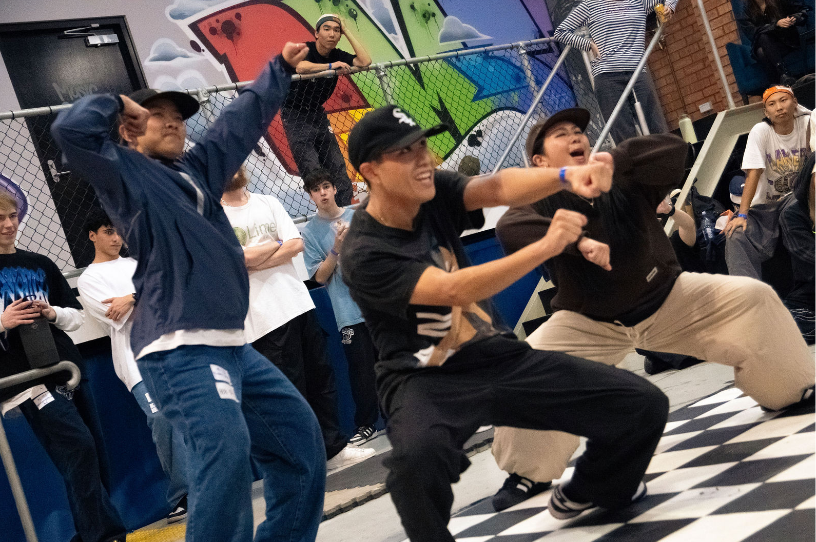
3x3 Dance Battle
ABOUT
3x3 Dance Battle is a dance event organized by myself, Jack Nguyen, Wreidgen Ferrer, and Tina Nguyen. As dancers from the southwest, we often had to travel to the city for dance events and to connect with the community.
To address this, we decided to host an event in the southwest at St Uni Liverpool, a hub for emerging young artists in the area. This venue supports their creative visions with dance studios, recording studios, and ample meeting spaces.
We began planning in November 2023 and successfully held the event in April 2024. My primary responsibilities included providing creative direction, designing engaging graphics to promote the event, and attracting street dancers to participate. With the freedom to explore creative ideas, I enjoyed producing various graphics and even custom lanyards for our dedicated staff to take home.
Key Deliverables
Creating social media marketing assets
Designing social media posters to announce special guests
Crafting event merchandise
Award Certificates, Staff Lanyards, Round Robin Poster, Coupon Awards
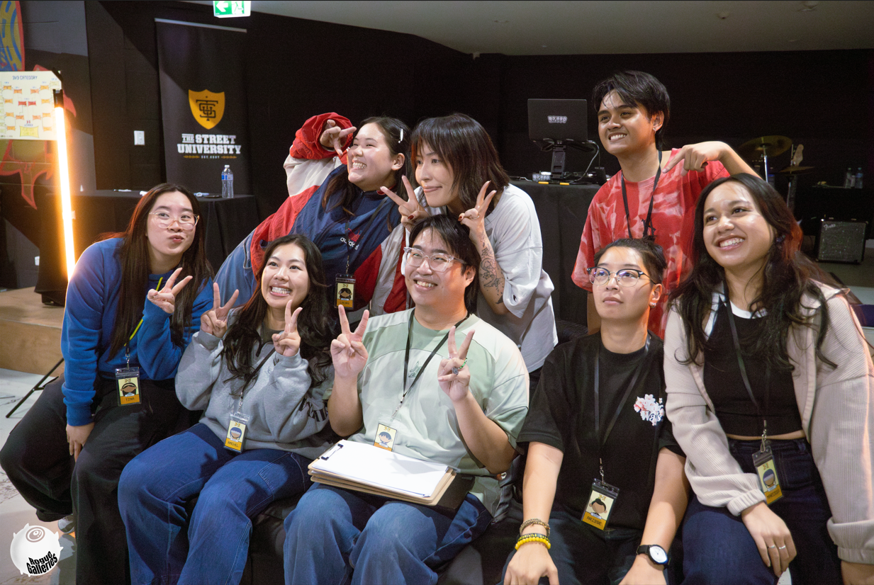
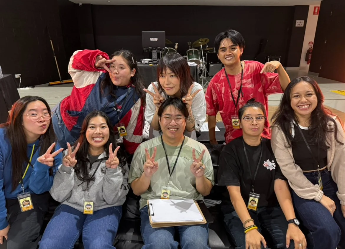
The Team
Admin, Internals: Jack Nguyen
Creative Director and Graphic Designer: Laura Huynh ☆
Marketing: Tina Nguyen
Externals, Event Runner: Wreidgen Ferrer
STAGE 1: RESEARCH
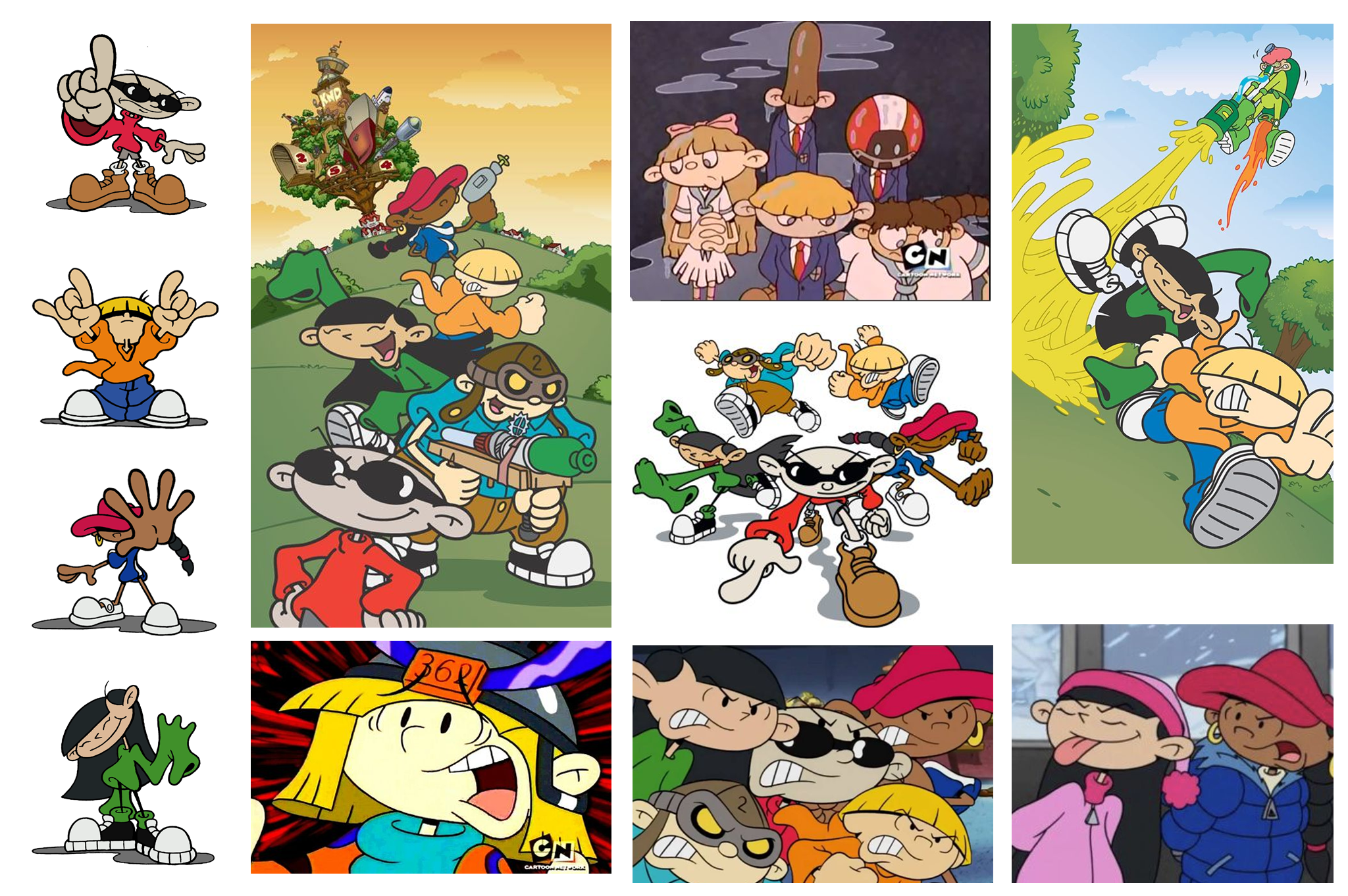
As a big fan of cartoon-style illustrations, I wanted to give the event a game-like, youthful vibe. That's when I discovered Codename: Kids Next Door, an animated TV show that aired on Cartoon Network from 2002 to 2008. Created by Tom Warburton, it follows five 10-year-olds who work from a high-tech treehouse as part of the Kids Next Door, fighting against adult tyranny and protecting kids' rights and freedom.
I found the animation's drawing style inspiring, and the storyline resonated with me as well.
Dance, as a hobby, can feel futile in adulthood when life demands seriousness. Embracing dance feels like a rebellion against adulthood. The show echoed our event's values of bringing people together, regardless of age or background, to express themselves on the dance floor.
In terms of animation, I love how Codename: Kids Next Door uses simplistic lines to highlight the protagonists' main characteristics. The wide, football-shaped heads and out-of-proportion limbs and hands/feet give the style a unique, street-like element that I found engaging.
Target Audience
Our target audience were lovers of street dance, especially in Hip Hop. As the Australian Sydney dance scene has not hosted a purely Hip Hop dance event in a while, we wanted to go off this idea
STAGE 2: CONCEPT DEVELOPMENT
3x3 Logo Design
The name "3 By 3" (3x3) was chosen because we wanted to highlight our focus on the 3v3 Hip Hop category, which is quite rare compared to the more common 1v1 Hip Hop battles held in Sydney. By incorporating 3v3 into our event name, we aimed to draw attention to this unique aspect.
I created several versions, aiming for the 3 to be prominent and easily recognizable while integrating it in a unique way. I wanted to maintain a doodle-like, cartoonish appearance, but avoided making it too bubbly, as that style felt overused. My goal was to achieve a more original look.
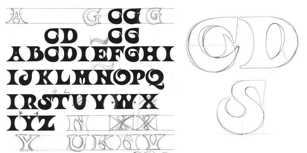
Origins of the Ouroboros Font
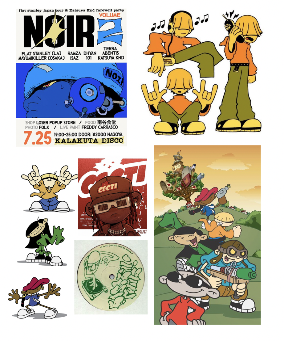
Illustration Moodboard sourced from Pinterest
The exaggerated proportions of the bodies highlighted the bagginess of the clothing, aligning perfectly with the hip hop style I had in mind. I added accessories, varied hairstyles, and dynamic street-style poses to transform them into street dancers. I wanted to maintain the KND-inspired essence of the drawings, paying homage to the inspiration that shaped many childhoods. By incorporating Number 1’s sunglasses as accessories, the drawings not only connected to street style but also carried an element of ambiguity and a spy-like coded aesthetic.
Testing Logo Colour Iterations
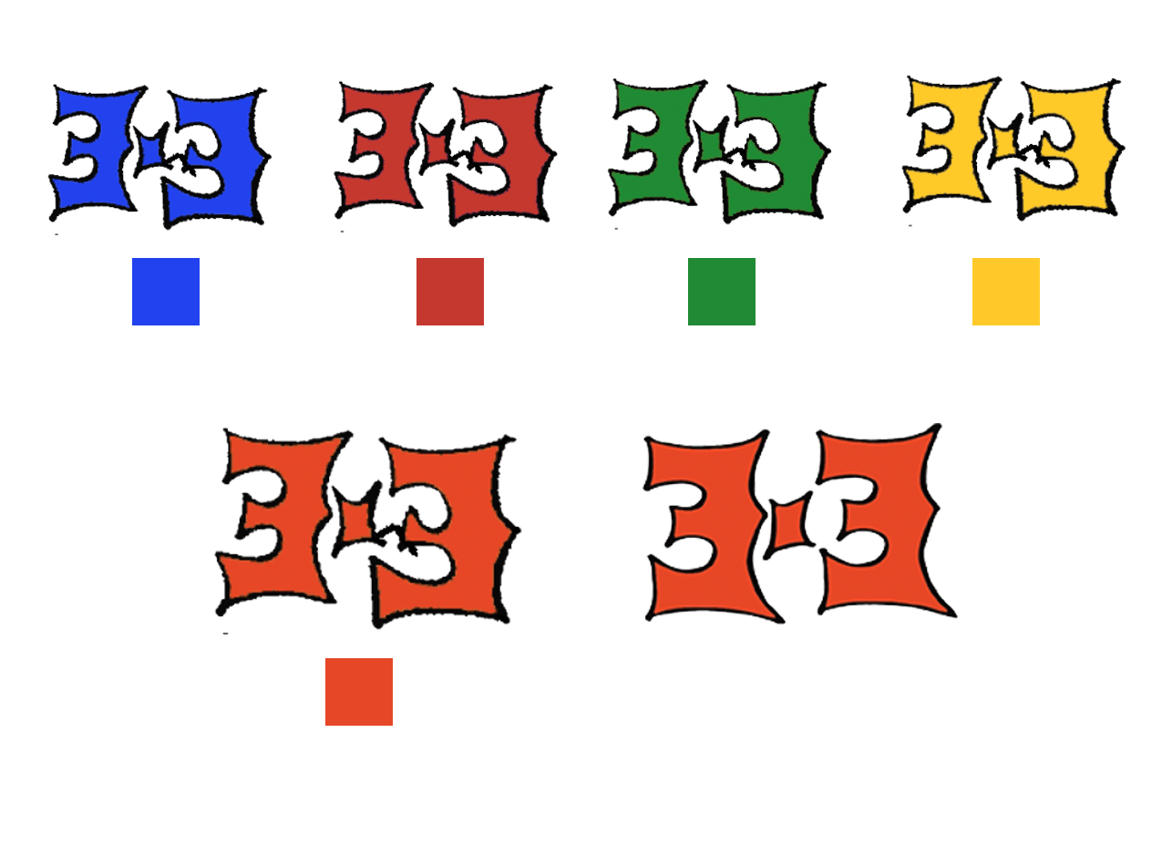
Colour Palette
Inspired by KND, I wanted to use a vibrant and colorful palette to evoke the fun and childlike nature of the event. I experimented with the main primary colours; blue, green, red, and yellow.
In the end, for the logo, I liked the red colour to be the most striking out of the other primary colours, but found it to look a bit too alarming, I wanted to add warmth to it by incorporating more yellow in it, therefore ending up with an orange tone for the main logo colouring.
Testing Colour Iterations
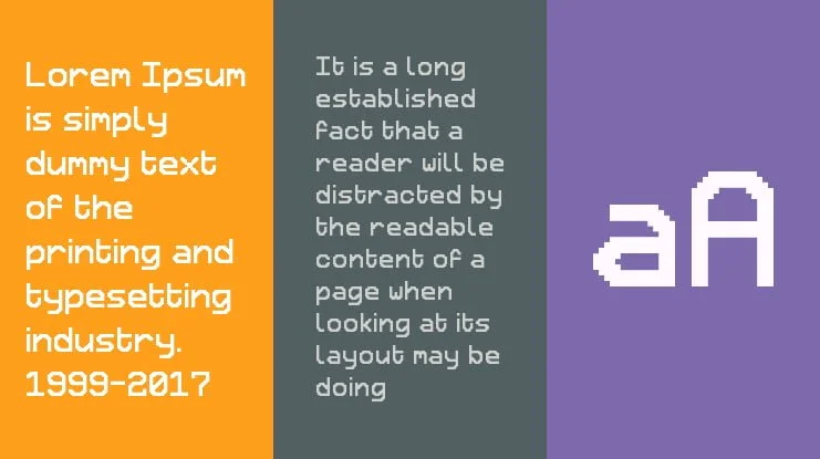
Retron2000 Font
→
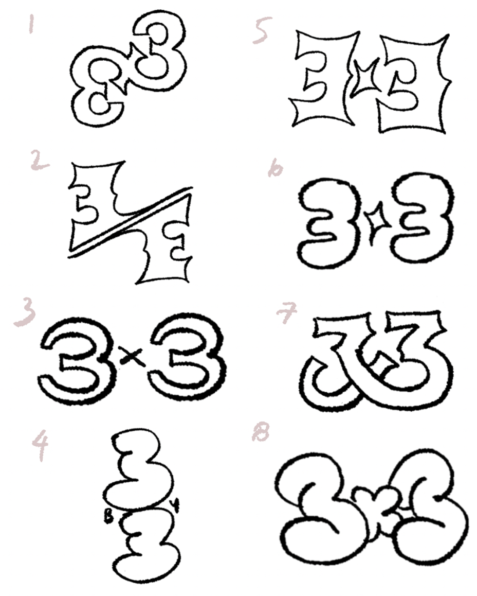
Logo Design Iterations
I presented this to the team, and it seemed we liked No. 5 the most. It was clear and straightforward, yet still had its own personality. This design was inspired by a font called “Ouroboros”, which I admired for its curves forming vertices, almost resembling an apple that had been bitten into.
Illustration
I envisioned my event with a game-like aesthetic, featuring a simple and playful design that evokes childhood memories. Much of my inspiration came from KND, as mentioned in the research stage. I admired their characters' football-shaped heads, out-of-proportion bodies, and baggy clothes, which resonated with the hip hop fashion of oversized clothing influenced by Caribbean and African American cultures.
Initial Character Design for Social Media
First Row: Mixed Colour Palette
Second Row: Monochrome Colour Palette
I explored both mixing colors and using a monochrome palette, where I played with different shades of a single color. I found that the monochrome palette was simpler and more effective for conveying information on the graphics. In contrast, mixed colors worked well for promotional materials.
Here, you can see that using a monochrome palette makes the text easier to read, while a mixed palette adds visual interest and draws the eyes towards the illustration.
Incorporating my drawings enhanced the characters, with colors highlighting aspects of their personalities. I also subtly made the characters resemble us organizers, adding a personal touch and a hidden Easter egg in the artwork, referencing back to the team.
Typography
I wanted the text to be simple yet playful and game-like, inspired by KND. In many spy movies, monospaced text is used on computational devices, and I found that Retron2000 had the simplicity of a sans-serif font while maintaining a fun, game-like character. It also furthered the event’s fun theme, for participants to be engaged and encouraged to join in the "game."
For headings and paragraph texts, it was easy to establish a hierarchy using different thicknesses and sizes, keeping the layout simple and avoiding excessive text on the screen.
STAGE 3: DESIGN EXECUTION
SOCIAL MEDIA
SOCIAL MEDIA PROMOTION
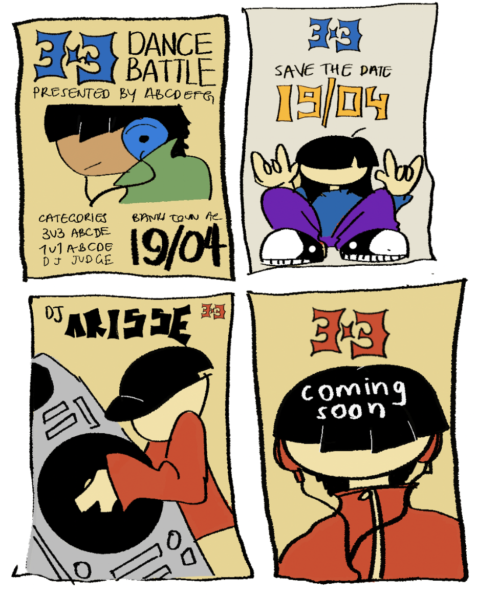
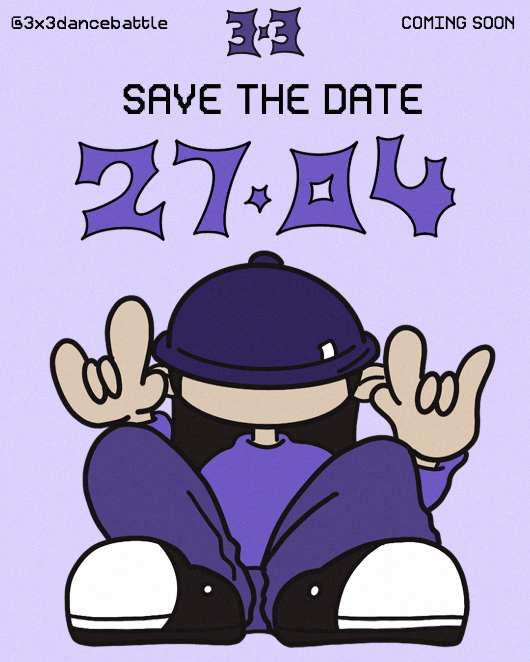
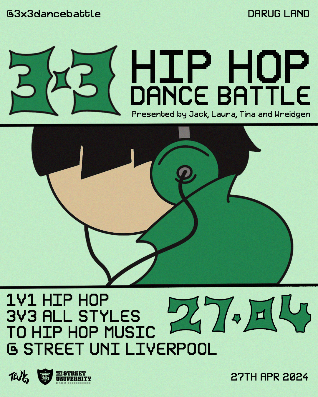
As event preparations progressed, we released mini previews with exciting promotional material featuring key event details (date, location, time, categories). As discussed in Stage 2, we used monochromatic colors to make the text stand out more.
Key posters and their purposes are as follows:
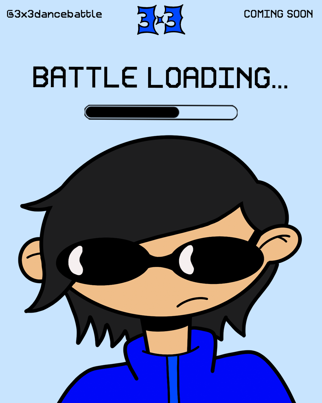
Battle Loading graphic: Announcing that an event is coming soon.
Save The Date graphic: Informing the public of the event date to build excitement.
Main Event Graphic: Displaying the essential event information.
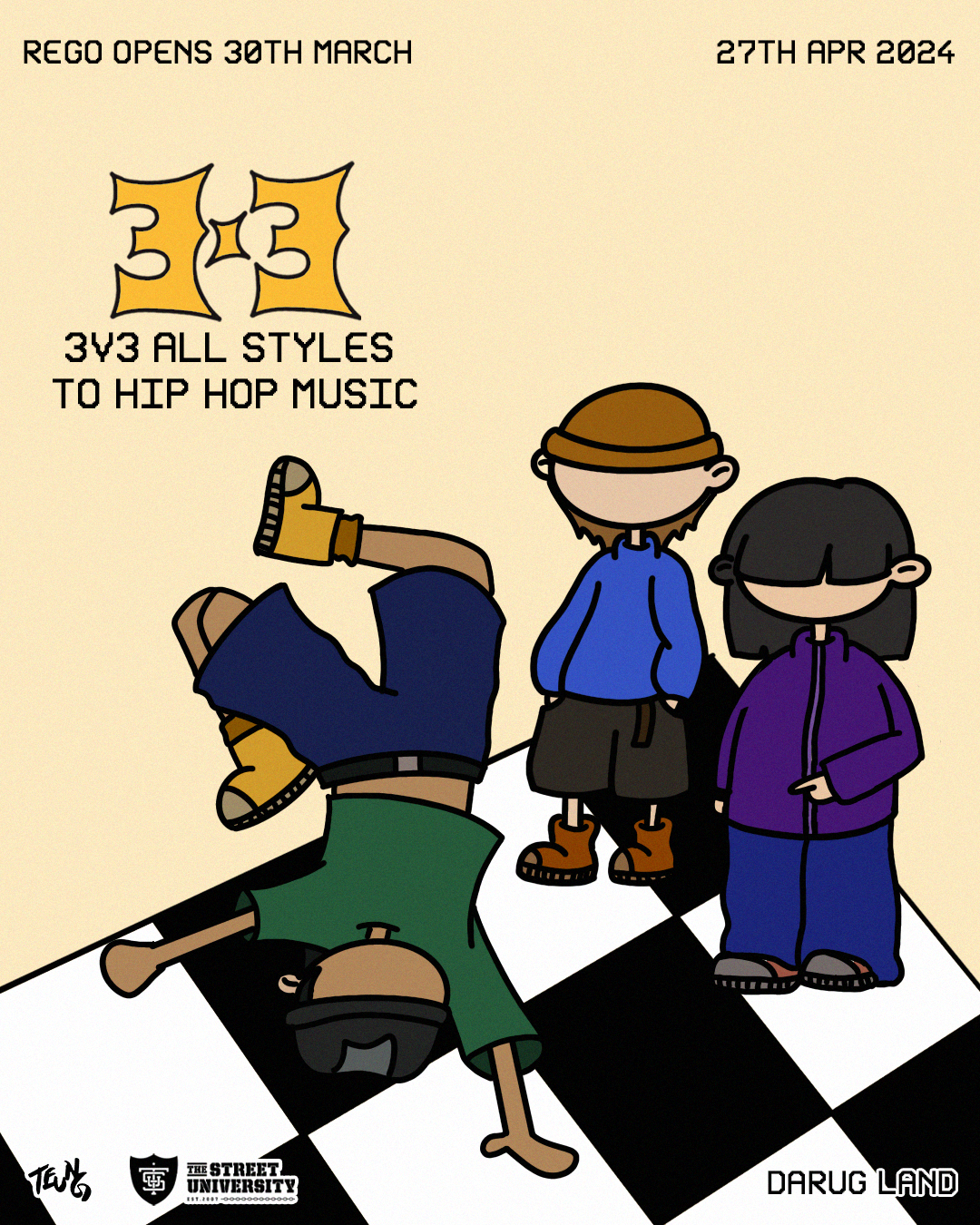
3v3 Category Poster: Announcing the 3v3 all styles to Hip Hop music category.
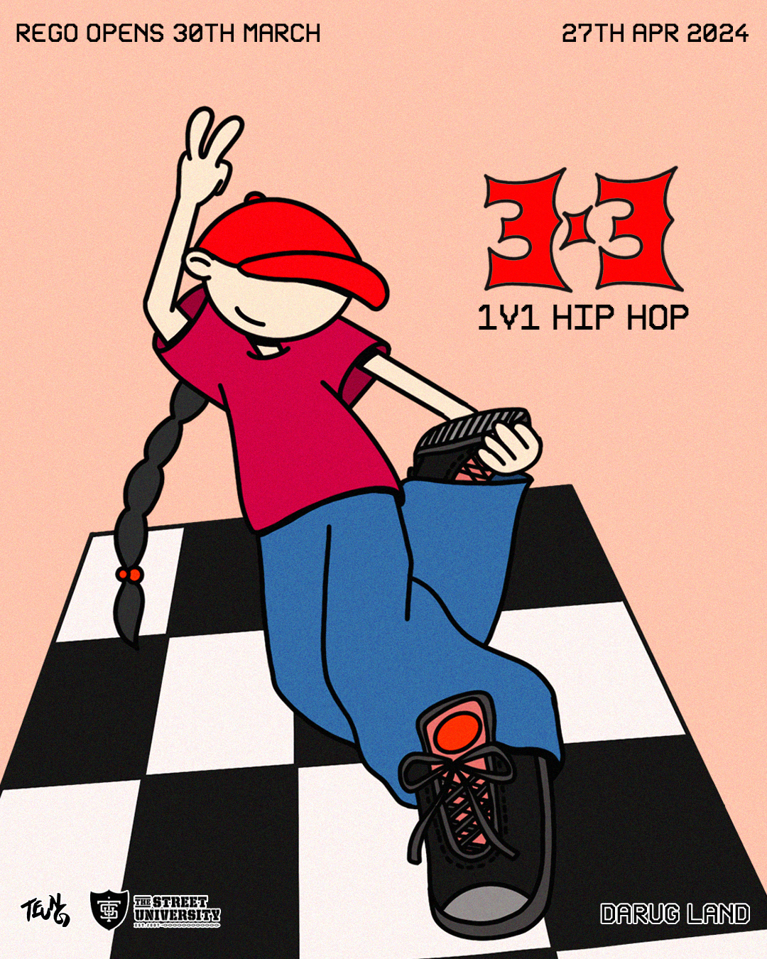
1v1 Category Poster: Announcing the 1v1 Hip Hop category.
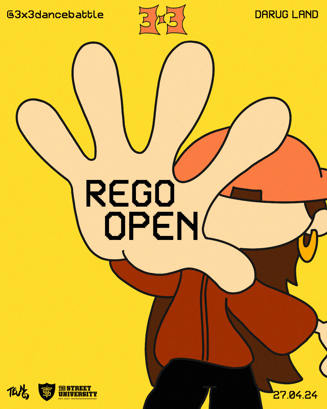
Registrations Open: Informing the public that registrations are open and encouraging sign-ups.
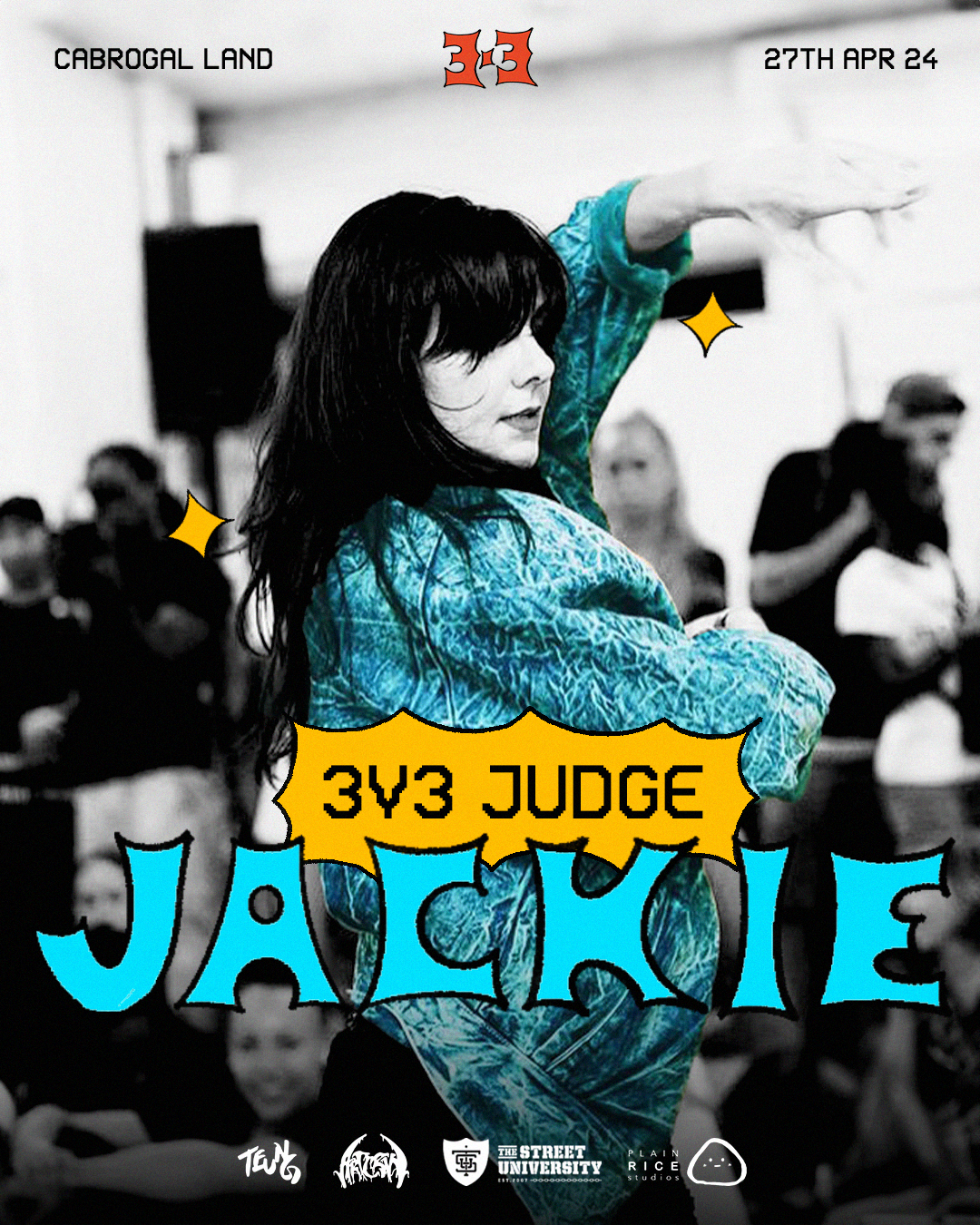
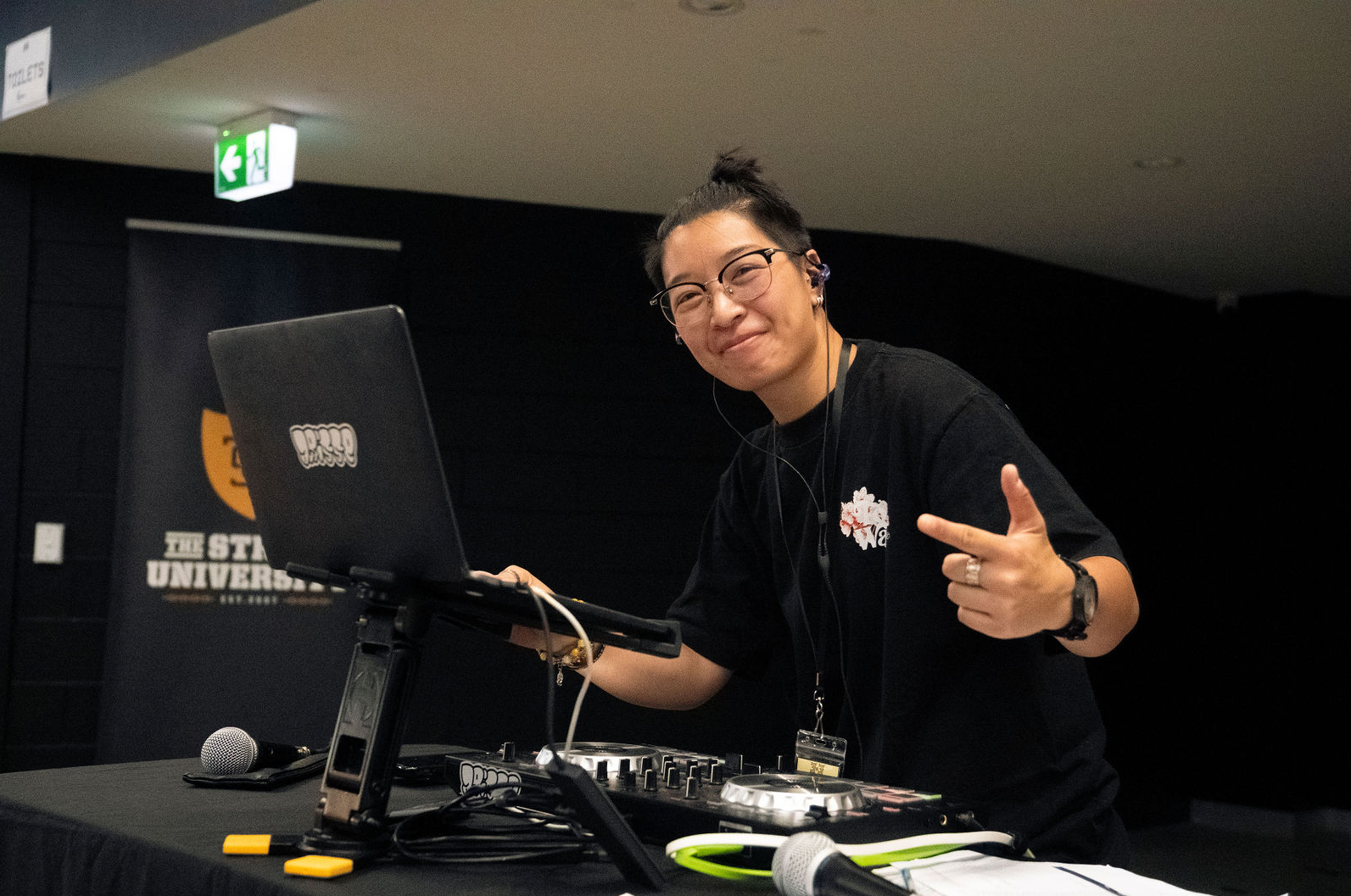
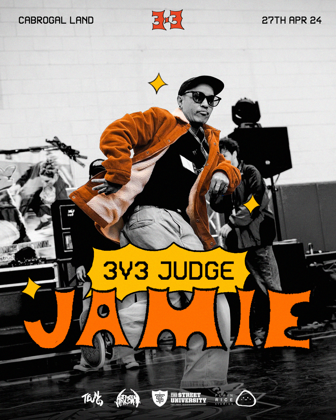
DJ,MC AND JUDGE REVEALS
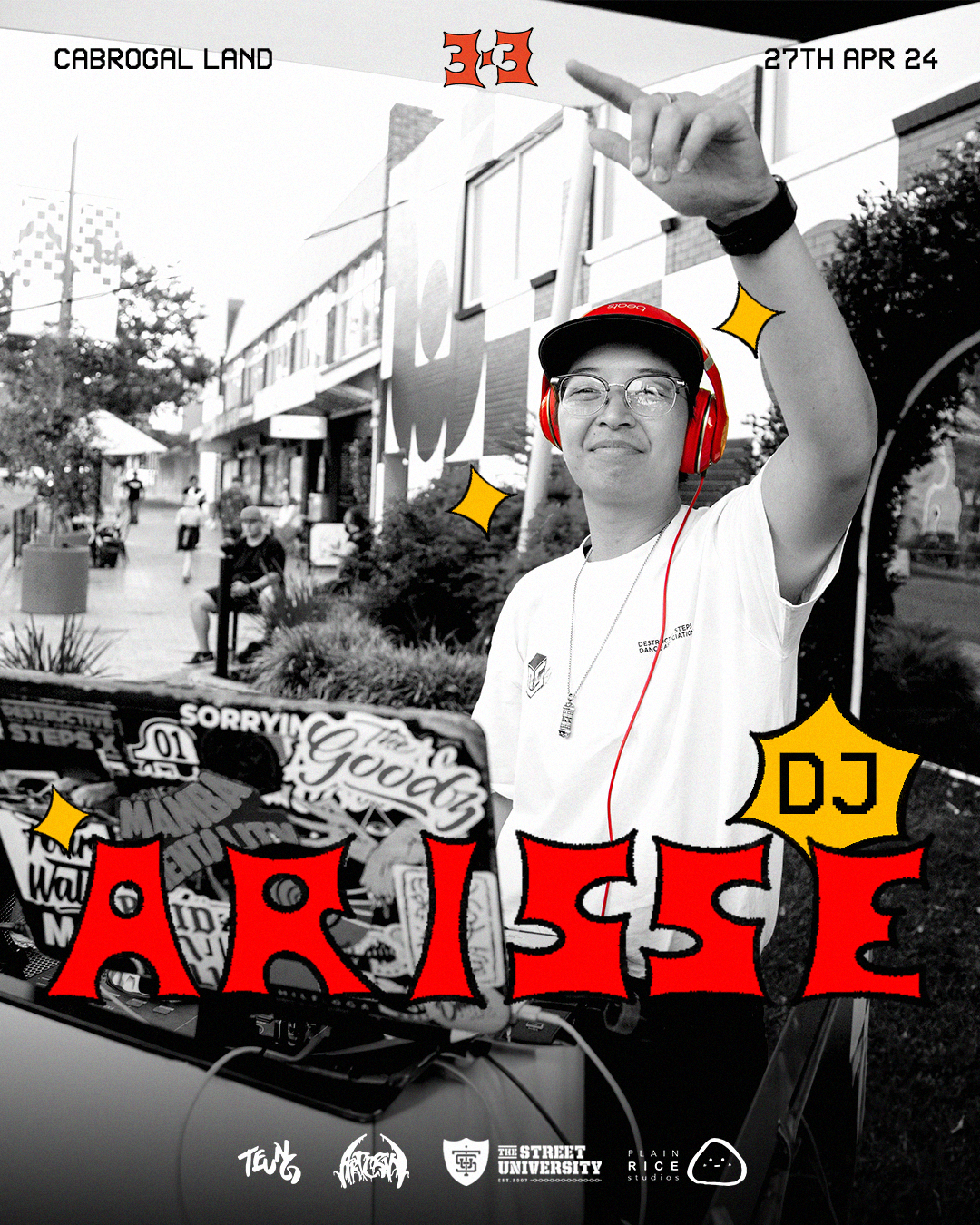
DJ Reveal
Judge Reveal
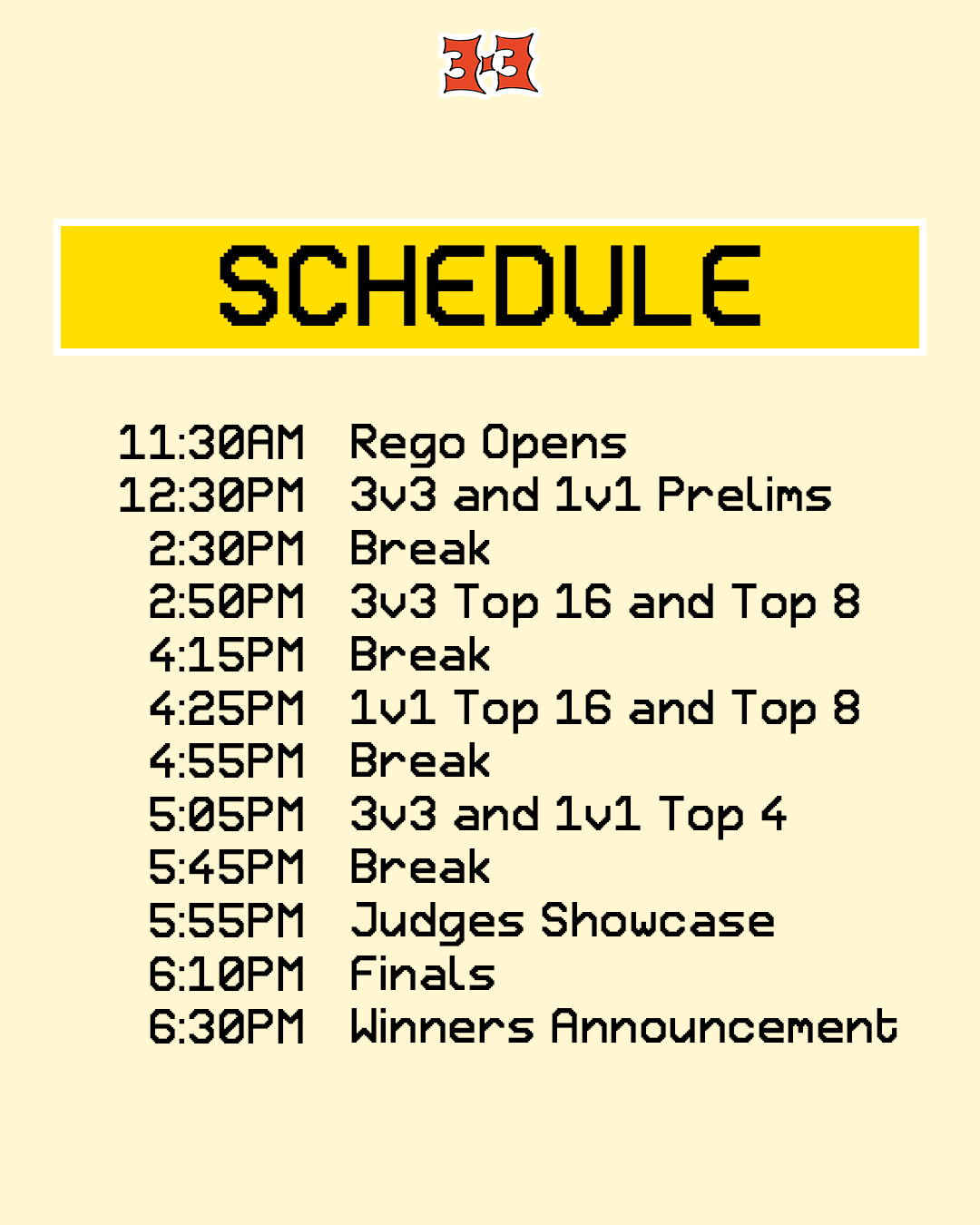
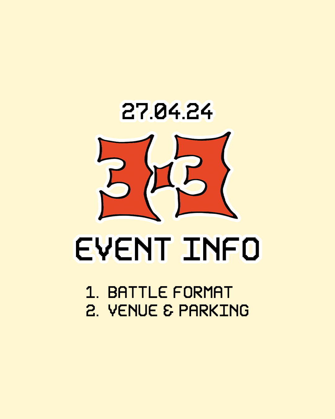
As our key information was announced, we then had to make several carousels to assist participants on the day, and any potential questions needed, this included the: event schedule, battle format, venue and parking, prizes, sponsors involved and the media team which will provide coverage of the event on the day.
Click on any of the below graphics to see more!
Event Schedule
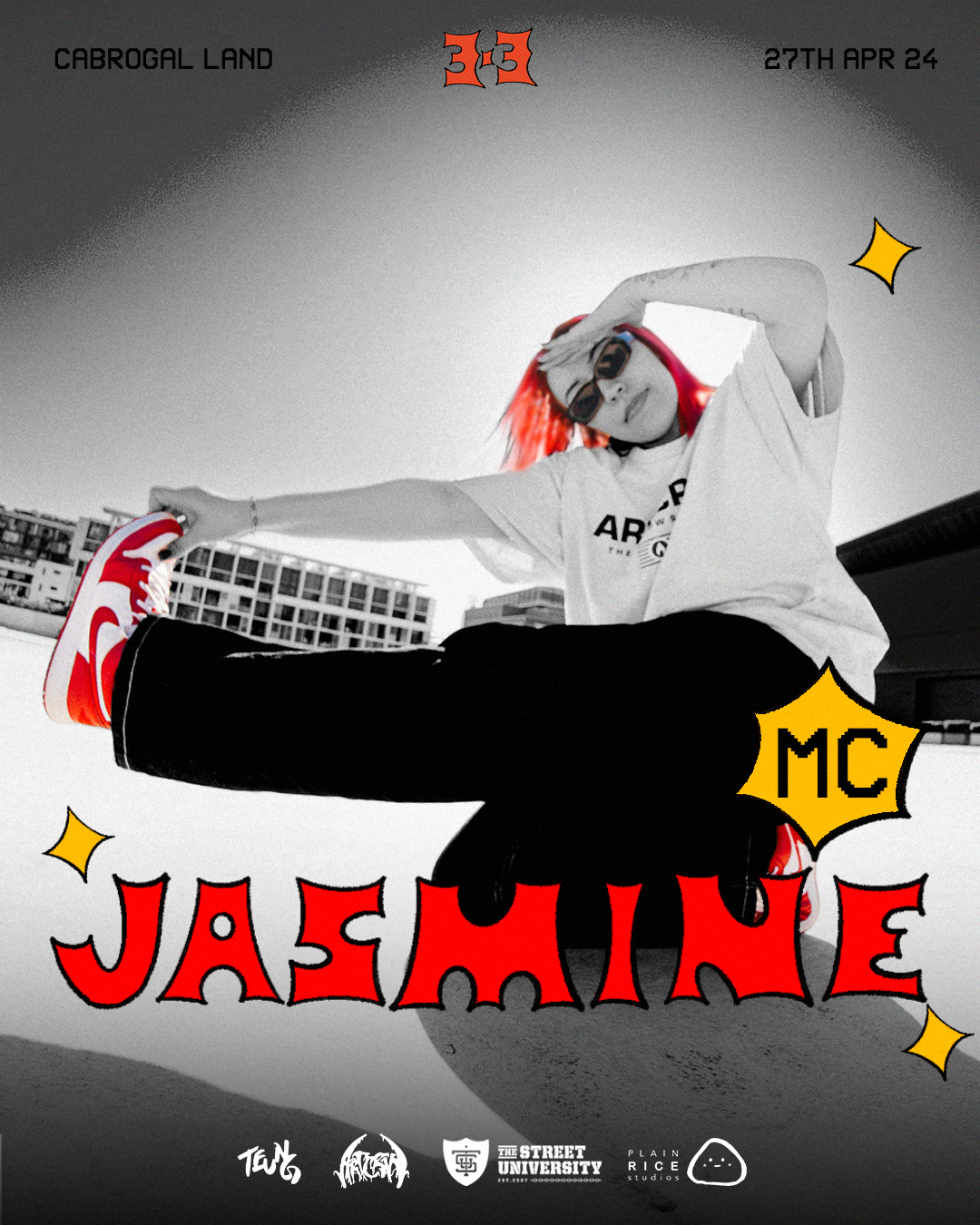
MC Reveal
INFOGRAPHICS
Key Event Information
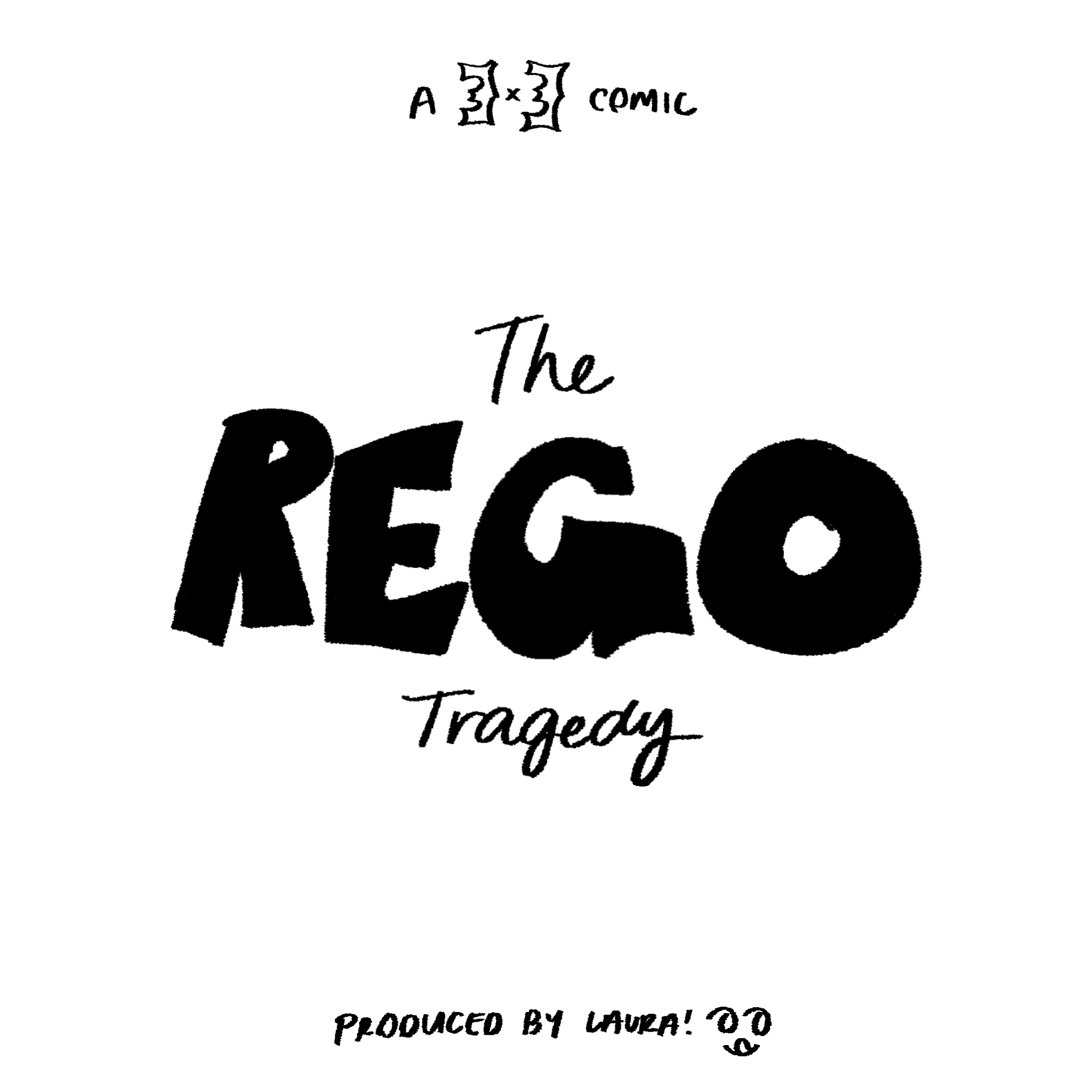
In addition to informational graphics, I wanted to stress the importance of timely registration to all potential participants, as we likely wouldn't accept registrations on the event day due to possible complications.
To convey this in a humorous way that matched the event’s cartoon theme, I created a lighthearted (but very real) comic. This comic was widely shared across various event pages, as many organizers related to the story. Unexpectedly, it also boosted our Instagram page’s reach and audience interaction as many found it humourous and very much relatable!
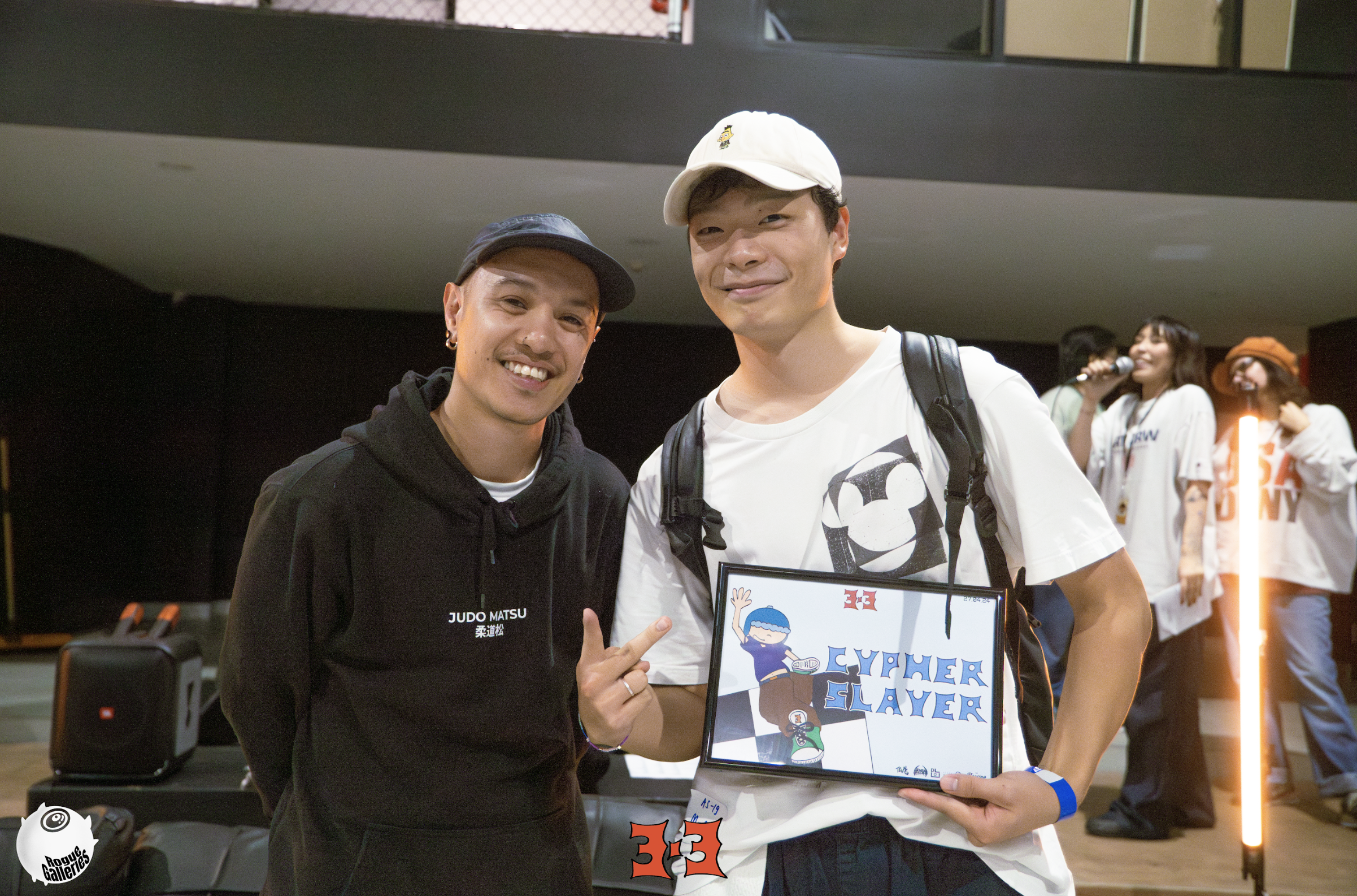
Cypher Slayer Award
Judge Reveal
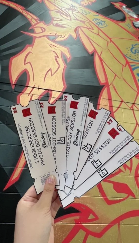
Prizes
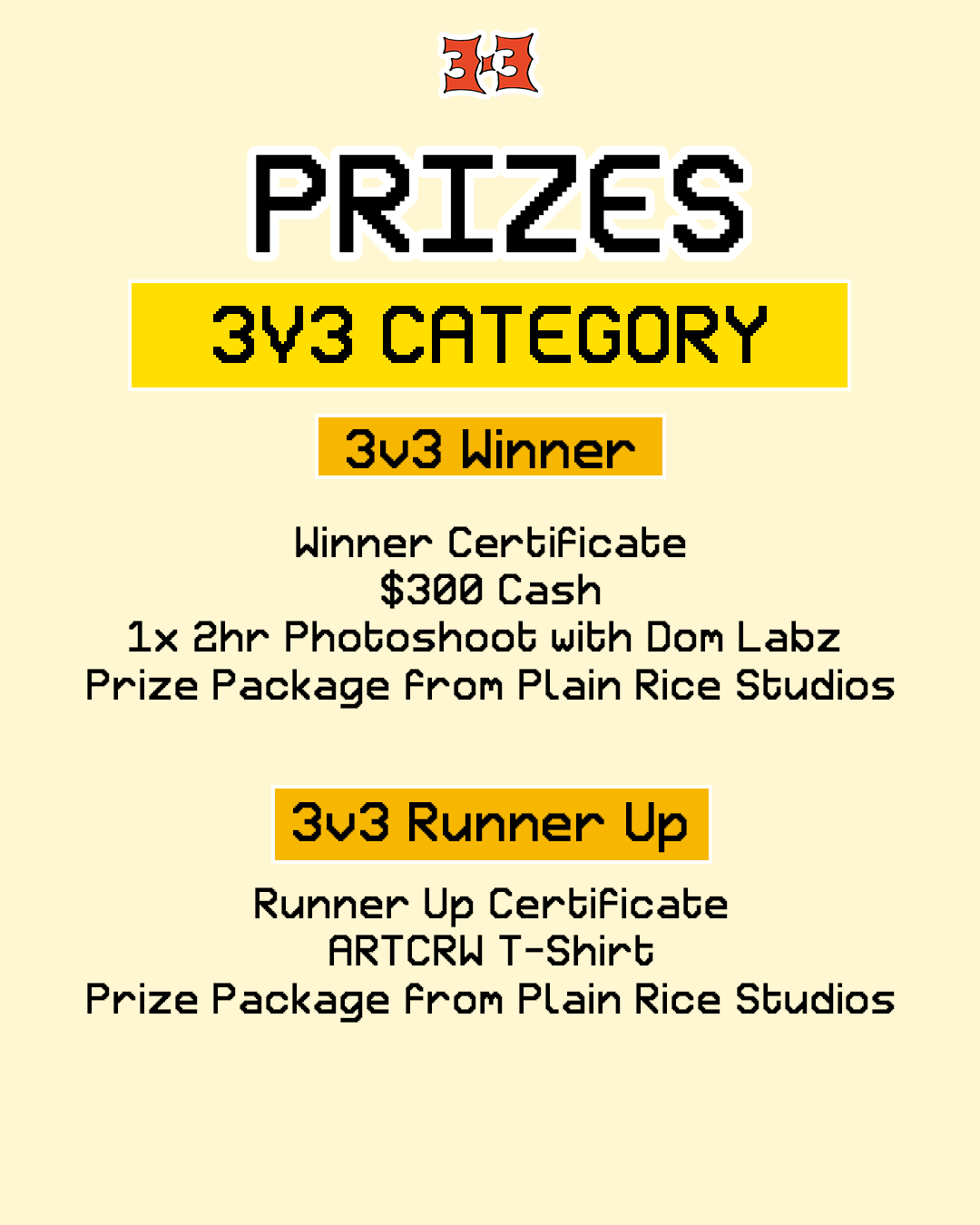
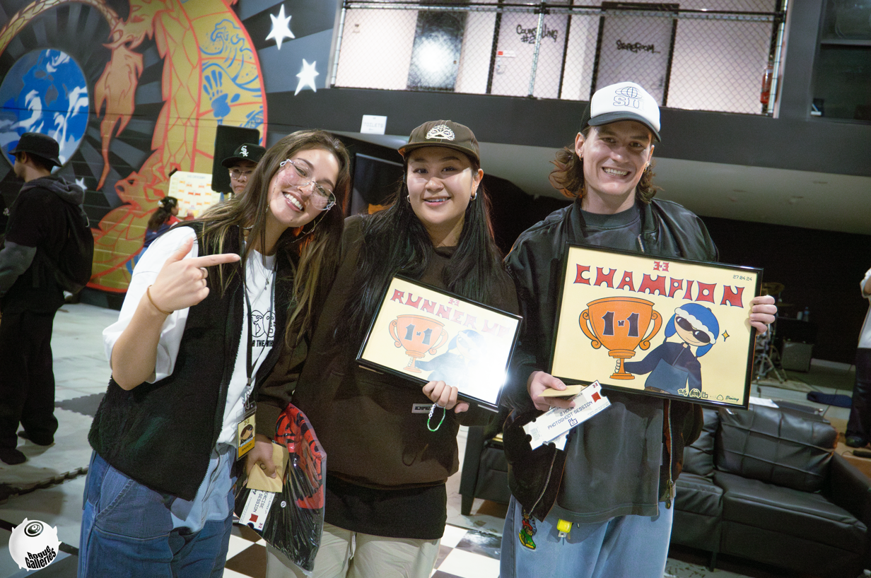
Winner and Runner Up Awards
Synergy Slayer Award
1
4
Judge Reveal
2
5
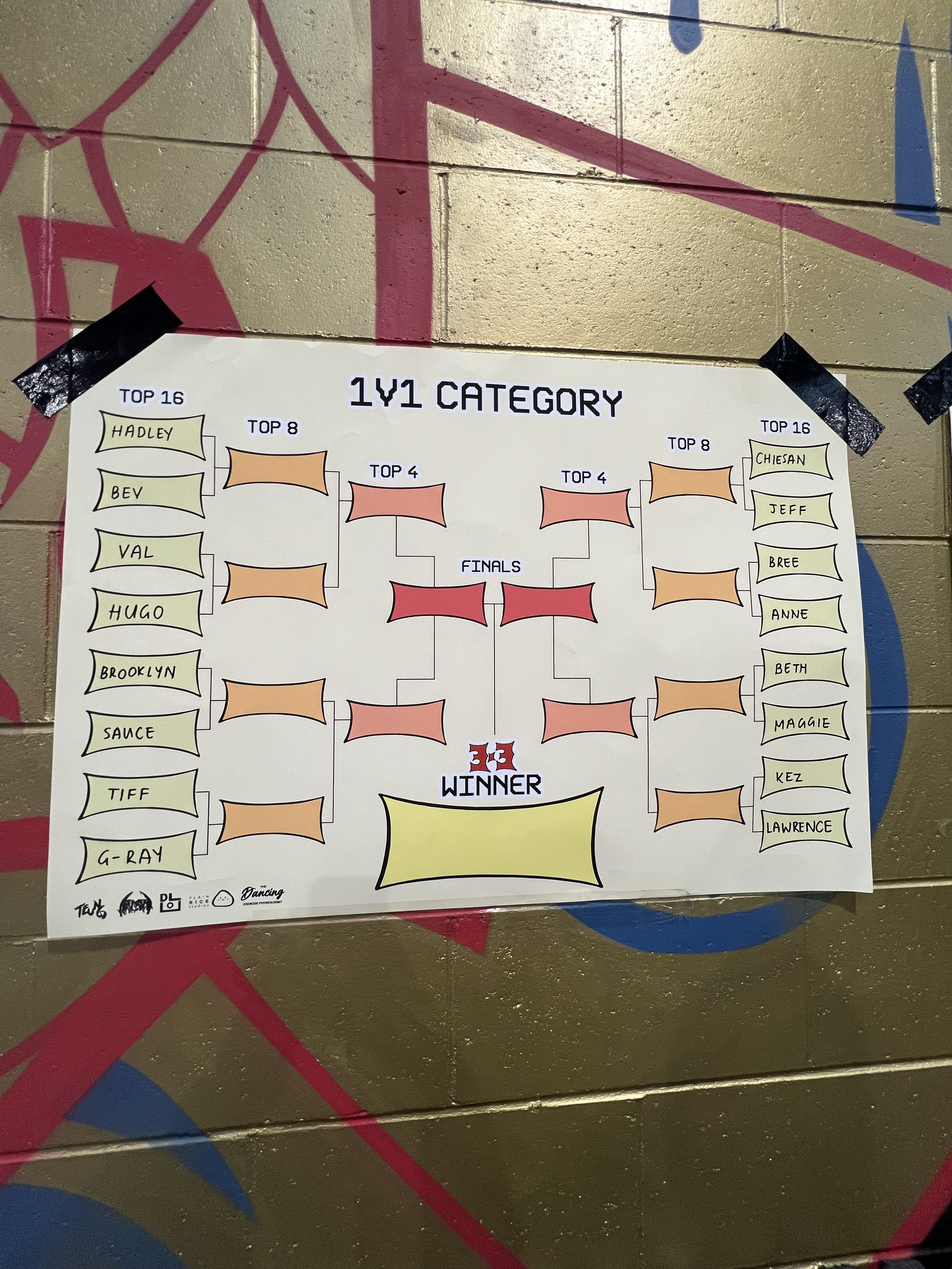
BATTLE BRACKET
3
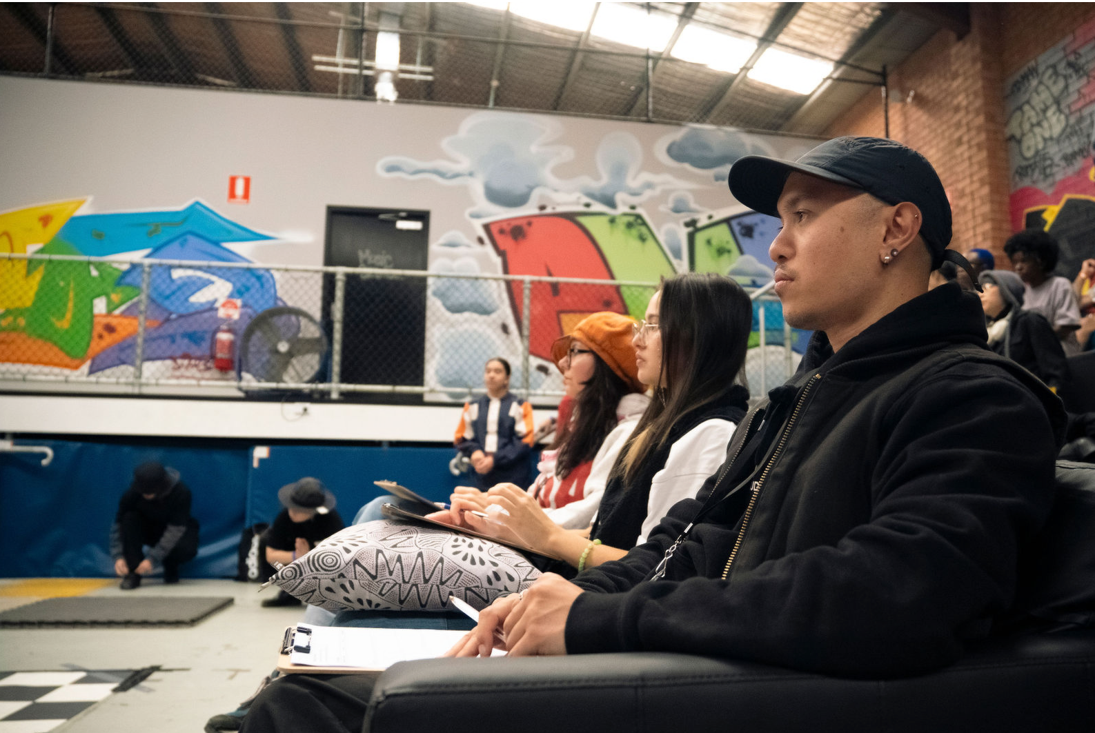
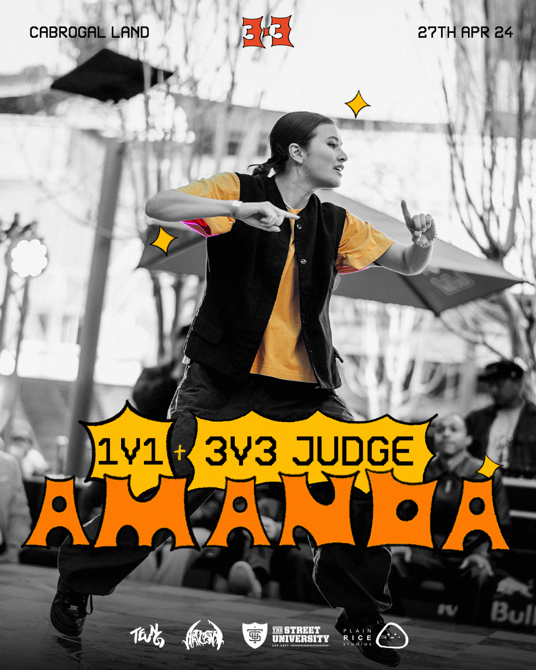
Our Judge, MC and DJ reveals were the most integral part of our event as many of our street dance scene were keen on finding out who was on the panel, who would be providing the awesome music on the day (DJ), and hosting the great vibes (MC).
Initially, I was tempted to draw them as characters to follow the theme, but I also wanted to clearly convey who each person was- so sticking to using the photo was the most important part. To keep elements of my own theme, I highlighted a key colour of their image, and based the colouring of the poster off that. I added little drawn sparkles to make the graphic more playful and fun, as well as hand drawn their name in the same style as our 3x3 logo to keep the theme consistent.
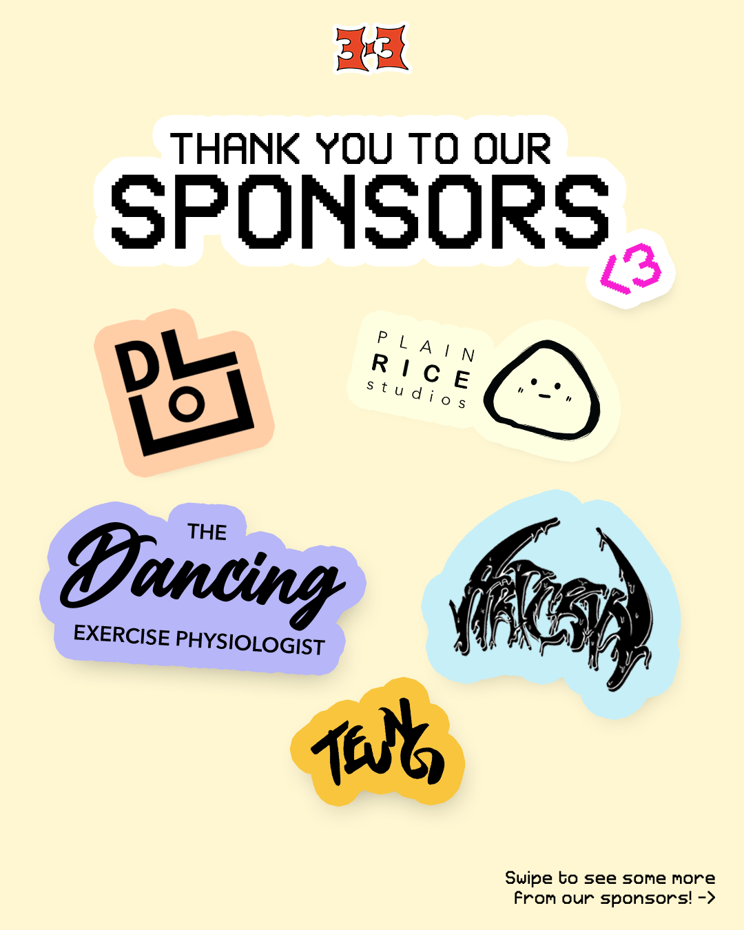
Details on Sponsors
The Rego Tragedy
CERTIFICATES
LANYARDS & COUPONS
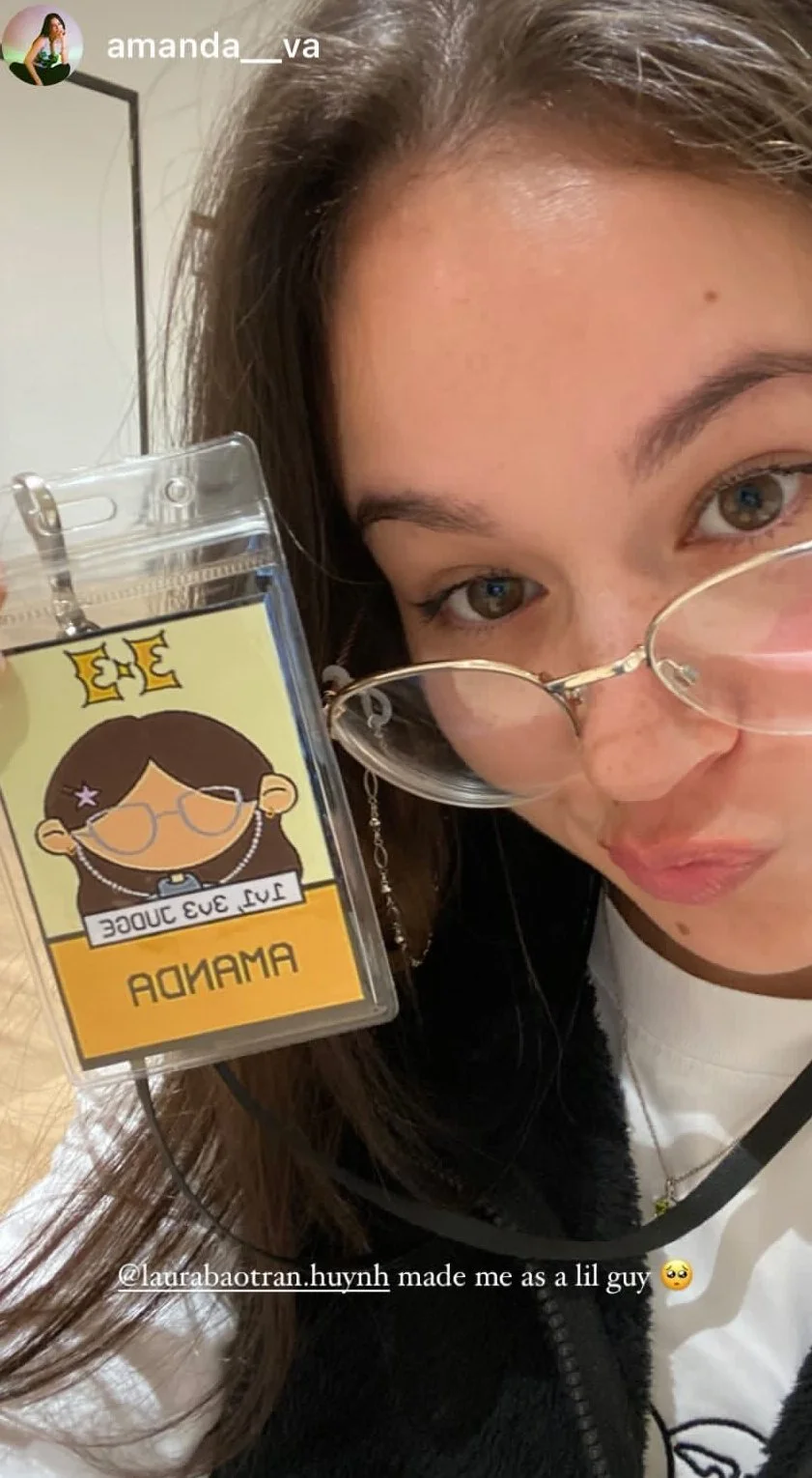
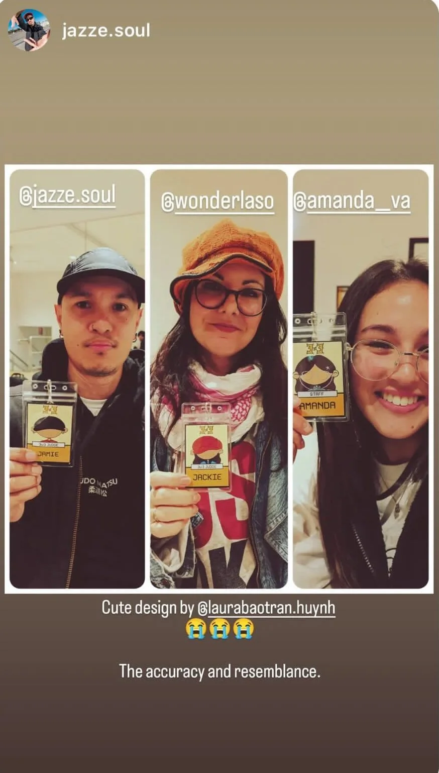
Social Media Posts of the Media team and Judges with their Lanyards
6
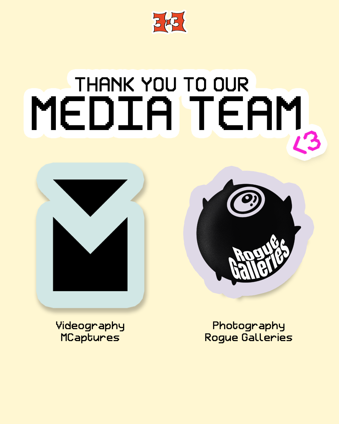
Media Team
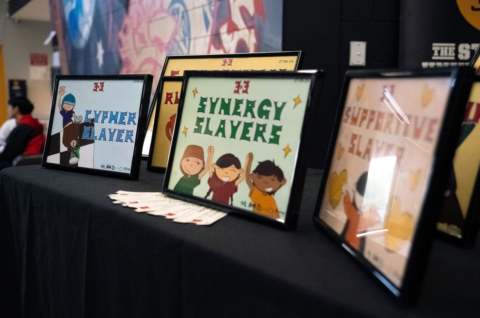
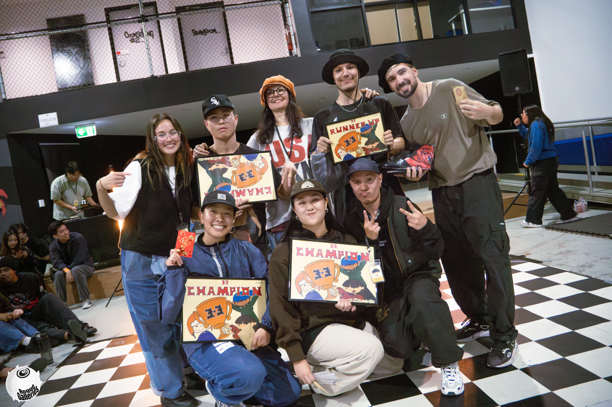
Along with their amazing prizes, the finalists of both categories received certificates. For these awards, I maintained the same style and text, incorporating elements from the logo design into the fonts (this inspired me to potentially create a font pack, which is definitely in the works!).
Additionally, we also wanted to provide awards that emphasized the importance of supporting dancers during the event, ensuring that even if someone didn't advance far in the battle or was just an audience member, they had the potential to achieve something. These awards were the:
Cypher Slayer: Awarded to the individual that participated in dance jams during the break times.
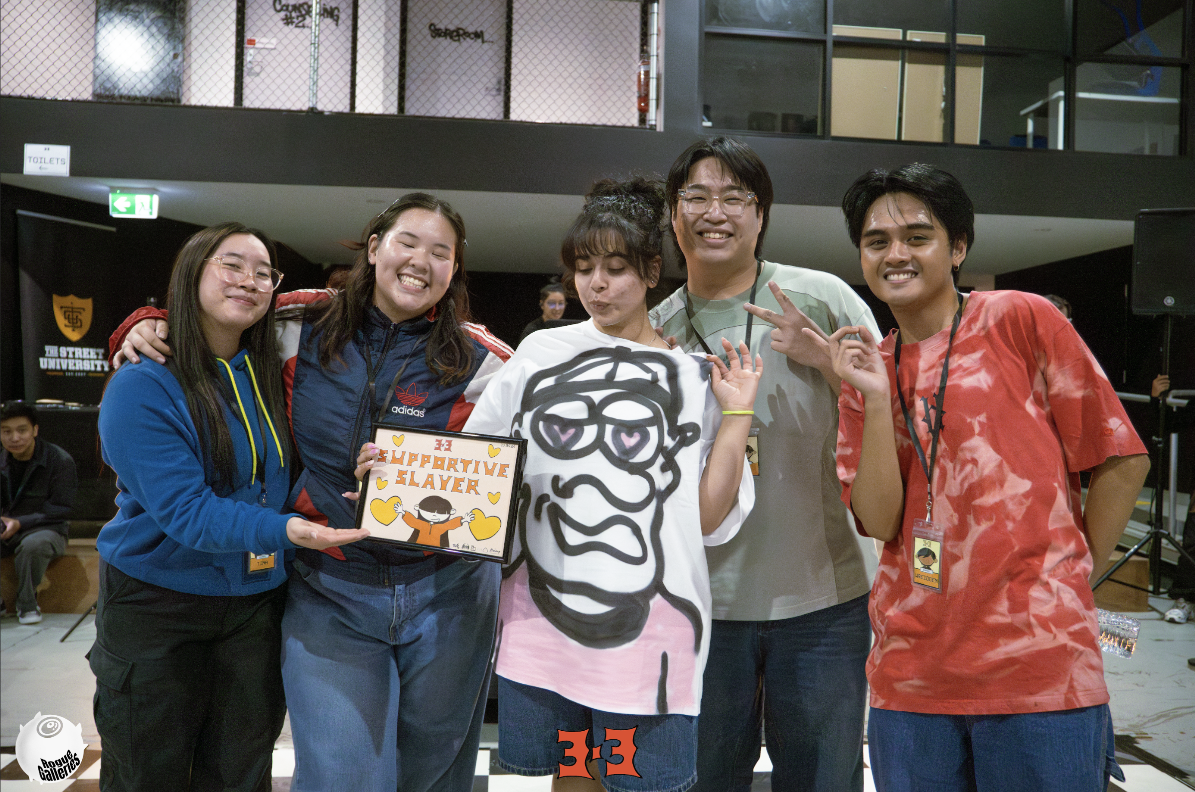
Supportive Slayer: Awarded to the individual that was most present during the event, cheering on participants and was the most supportive throughout.
Synergy Slayers: Awarded to the 3v3 team that showed strong synergy and connection throughout the battle.
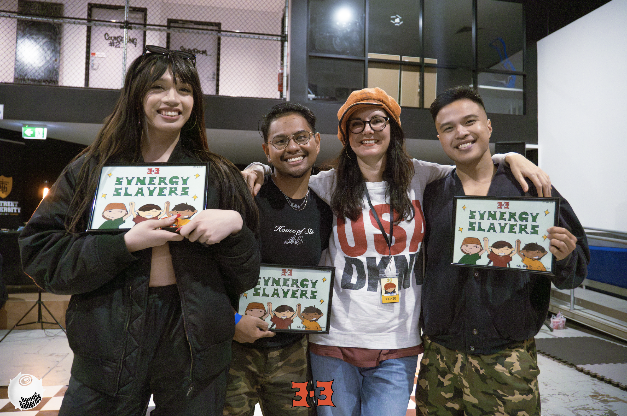
Synergy Slayer Awards
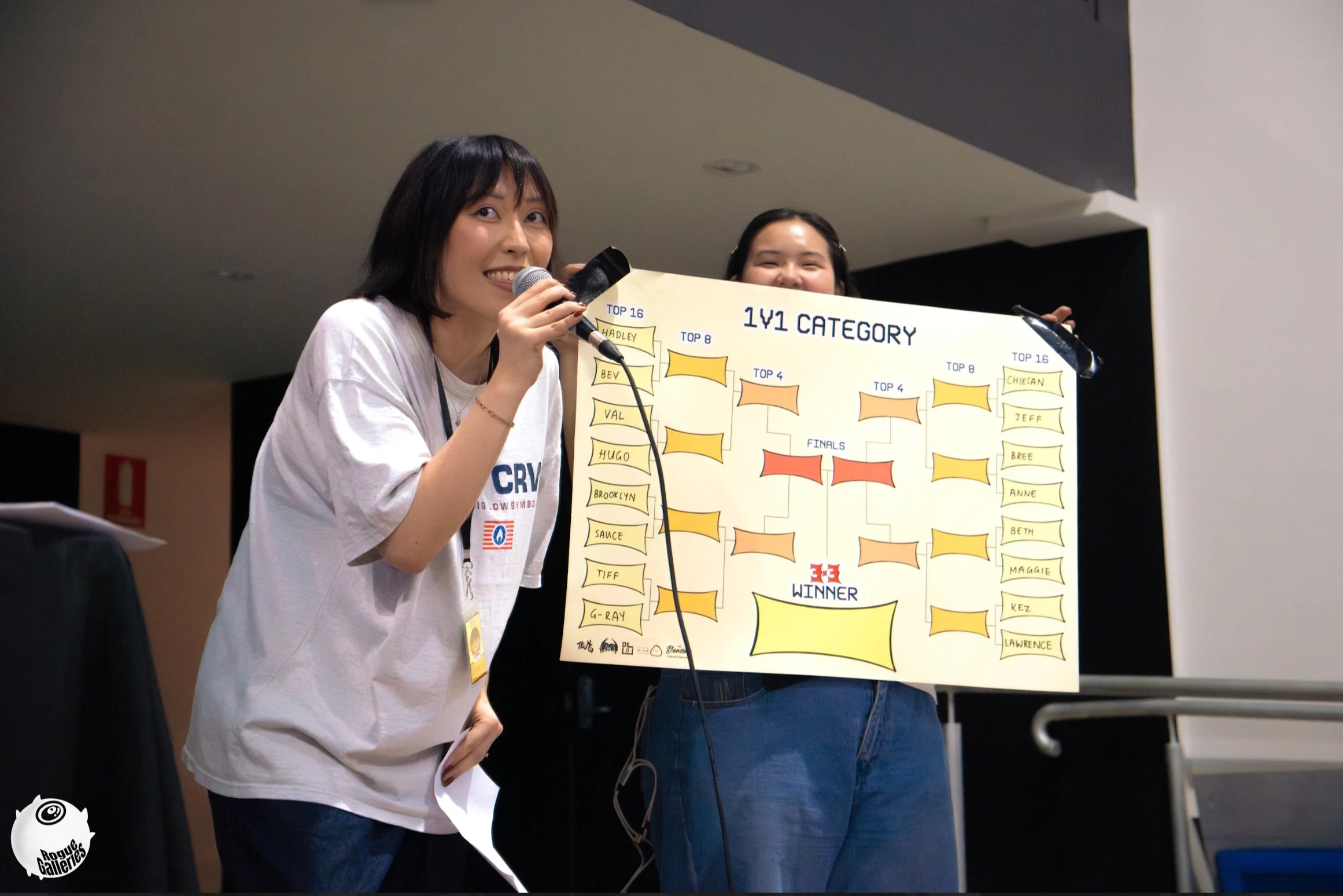
To celebrate our hard-working participants who made it past the tough competition and were selected by the judges into the top 16, I created an A1 battle bracket. This bracket allowed us to note down participants' names and update their progress as the event progressed.
This reinforced the "game" theme we aimed for, presenting the battle as the game itself. The participant who advanced through each round was crowned champion at the end!
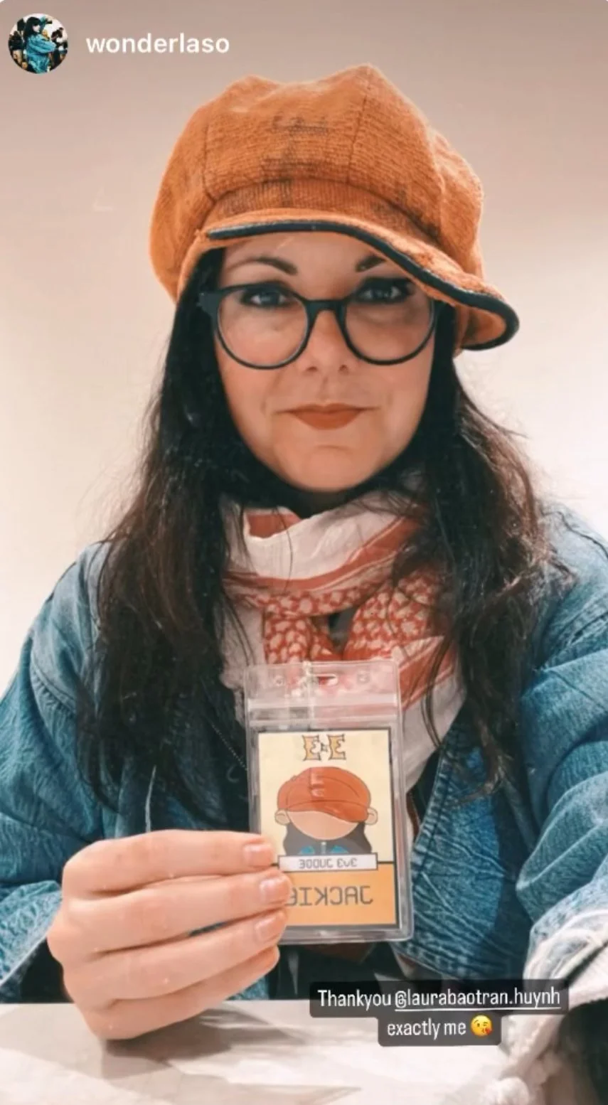
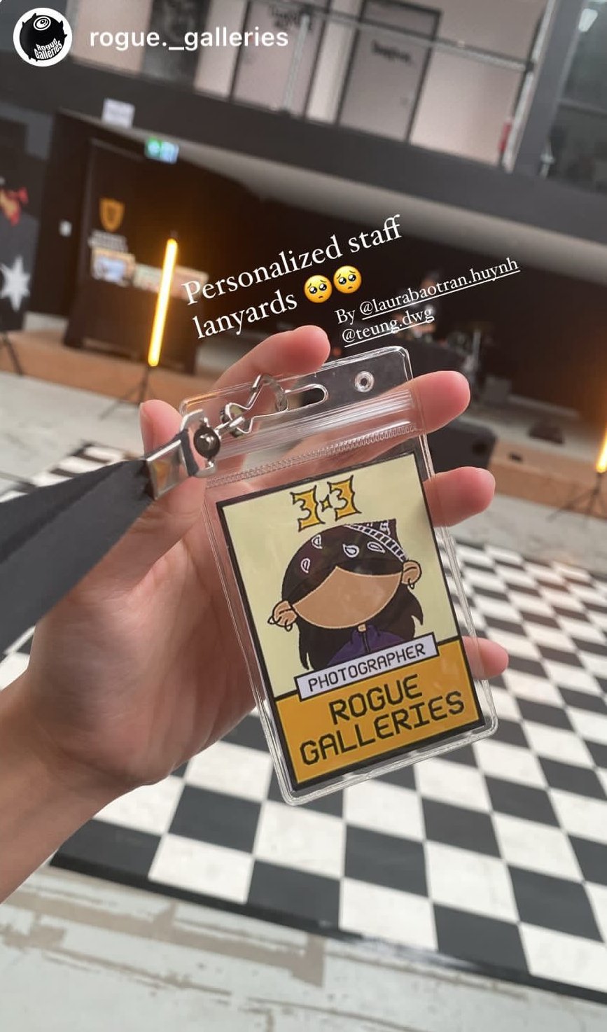
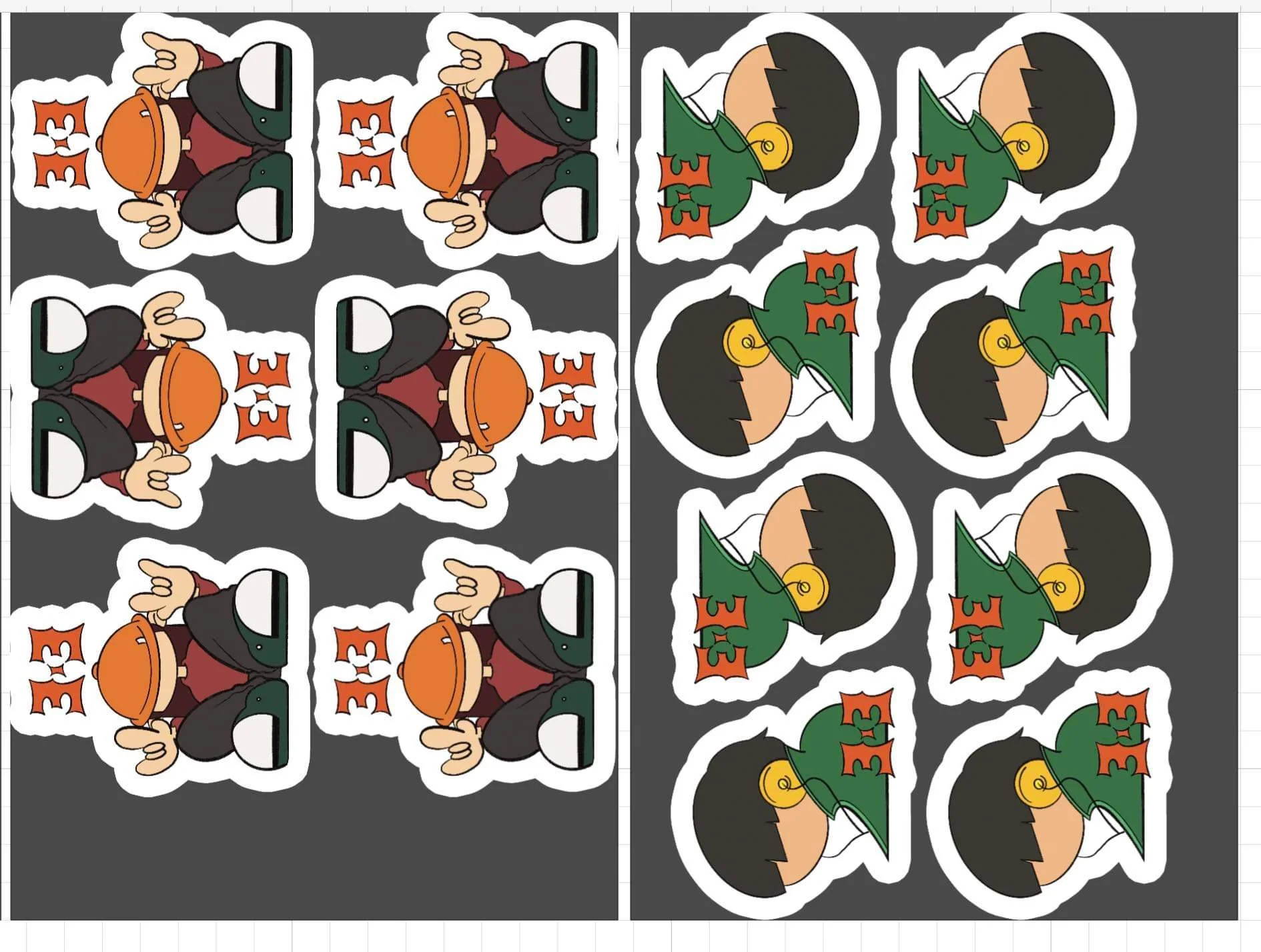
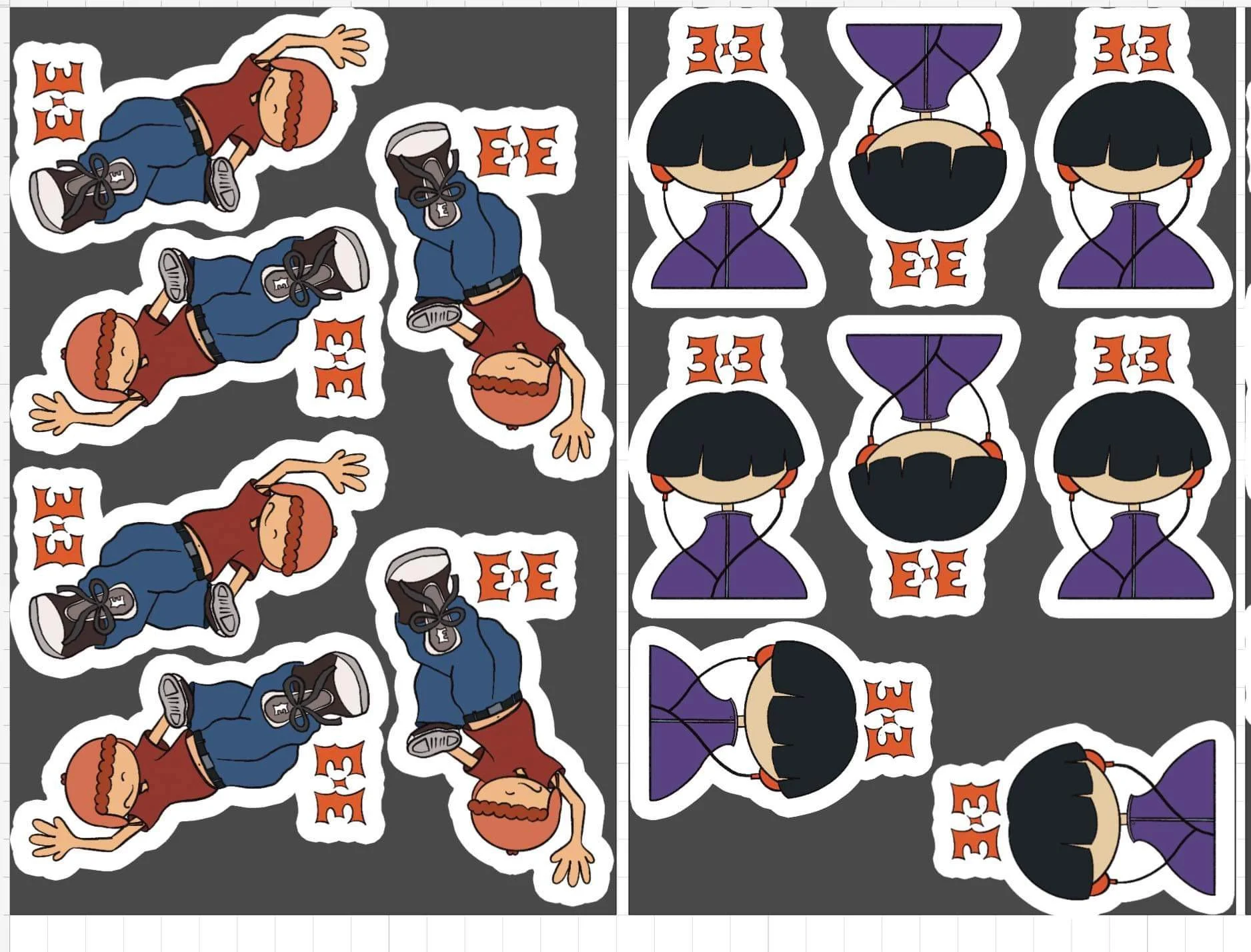
To make the event memorable for all staff members, I drew personalized lanyards featuring illustrations of their individual characters. This was one of my favorite stages of the design process. The staff loved their lanyards, sharing them on social media, and seeing their big smiles when they saw themselves as cute little doodles was incredibly rewarding.
Additionally, our winners and runners-up received multiple prizes from our sponsors, including photography and physiotherapy sessions. Instead of simply communicating with the sponsors to claim their prizes, I created physical coupons for the finalists to use, adding a more memorable touch to the experience.
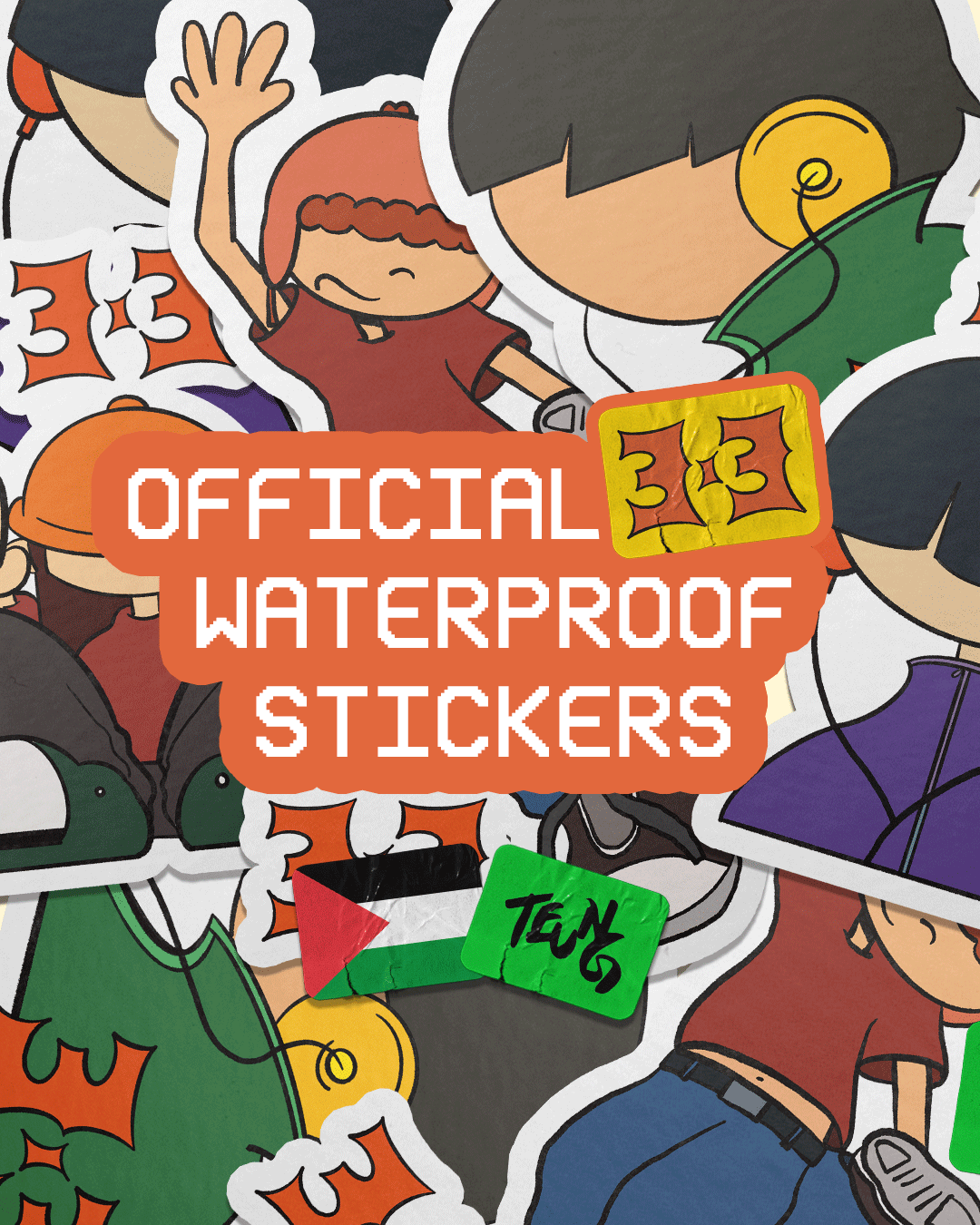
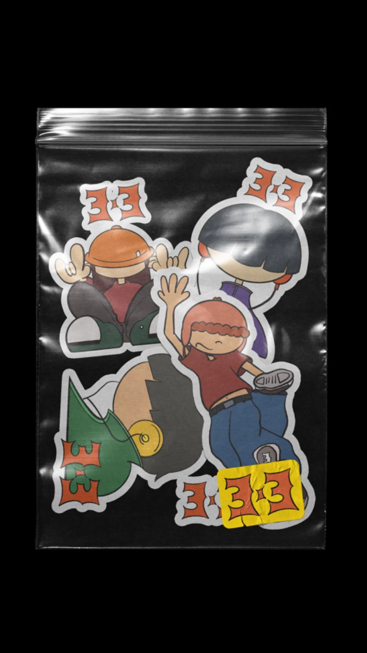
MAKING STICKERS
Addressing the Situation of the Time
As a designer, I wanted to address the ongoing situation in Gaza, where genocide was occurring daily. While our event aimed to bring people together, I also wanted to fundraise and create stickers to sell in support of the cause. This was a significant challenge because we had limited time before the event and were uncertain if it would be feasible. Initially, I considered making patches, but they were beyond our budget and less practical compared to stickers.
Making Stickers
With only two weeks left, I had to act quickly. Fortunately, my friend Siobhan from Plain Rice Studios, who runs a small business selling prints, was able to assist. She had the necessary equipment and supplies, making the process smooth and efficient.
Using Procreate, I designed the stickers, incorporating my existing illustrations from the certificates and promotional materials. Redrawing and color-matching these illustrations helped save time, as they were already well-received on Instagram. This approach allowed participants to take home a memento while supporting the event. After receiving feedback from the team, I got the go-ahead.
Siobhan’s sticker layout pre-printing
The stickers received a positive reaction on social media, with numerous shares across various accounts. Some people who couldn't attend the event still wanted to purchase them to support the fundraiser.
Ultimately, we made a total of $270 in profit, selling 90% of the stickers, and donated the proceeds to two Palestinian fundraisers. We are incredibly grateful for the support in selling the stickers and contributing to alleviating the suffering in the world right now.
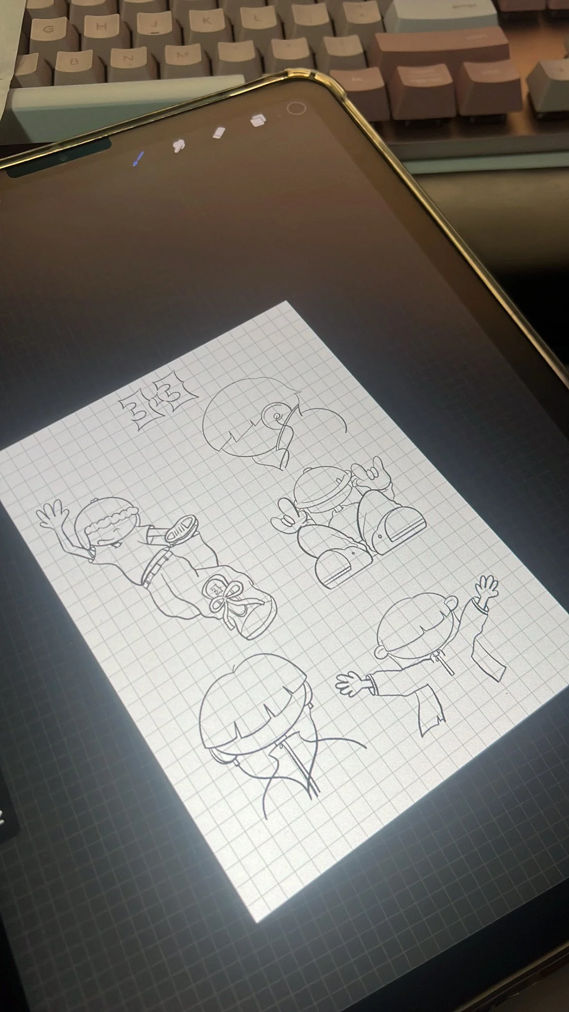
Sketching sticker designs based off past designs.
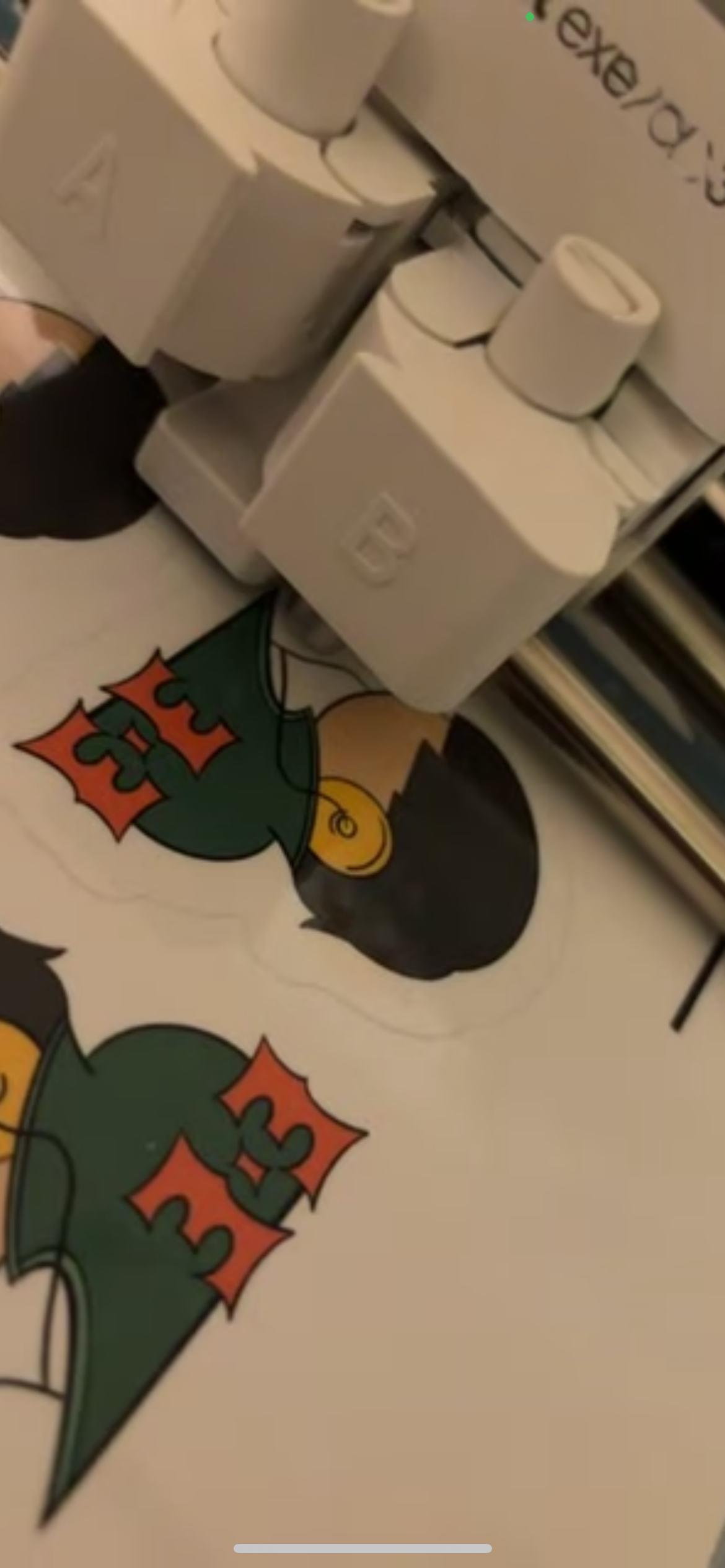
Sticker Printing Process
Social Media Marketing Post
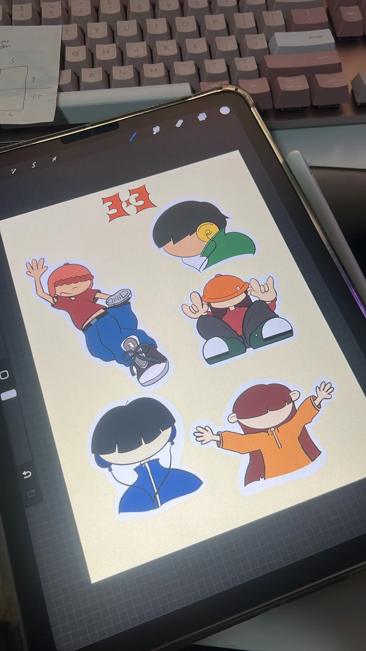
Colouring and finalising look of stickers
Once confirmed, I began to make mock-ups so that we could advertise it on Instagram and let our audience know that all profits go towards GoFundMe supporting Palestinian families that are trying to escape the genocide and come to Australia.
Siobhan printed the stickers using her existent tools and delivered them on the event day.
Mock Up for Social Media
STAGE 4: IMPLEMENTATION AND LAUNCH
Similar to DS14, the remaining tasks were to print our certificates, coupons, battle bracket, and lanyards. Since we had already test-printed our drafts, this was a straightforward process. We carefully placed the certificates into their respective photo frames and inserted the cards into lanyards for our staff.
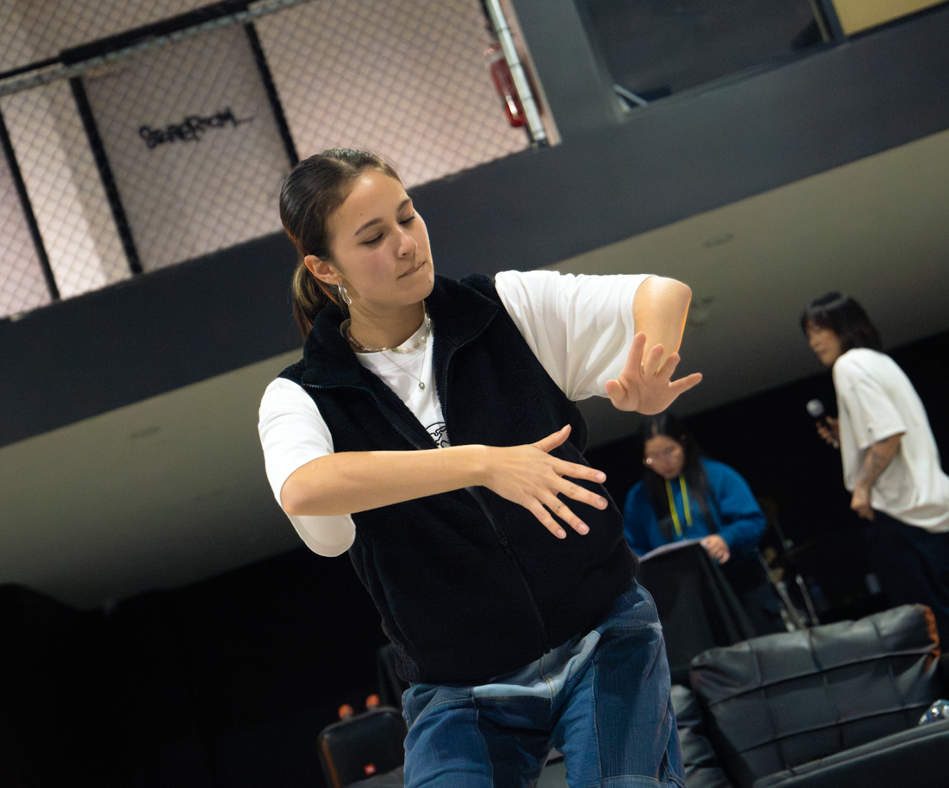
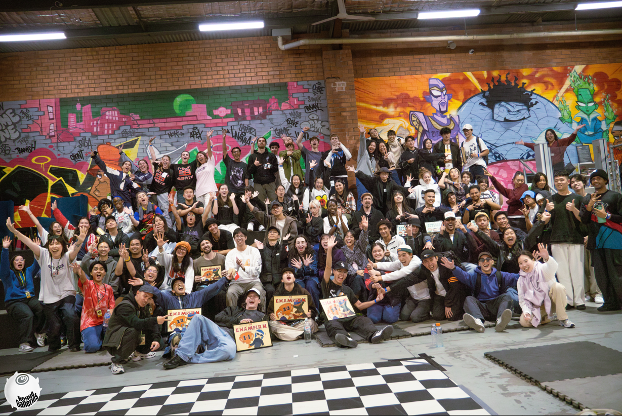
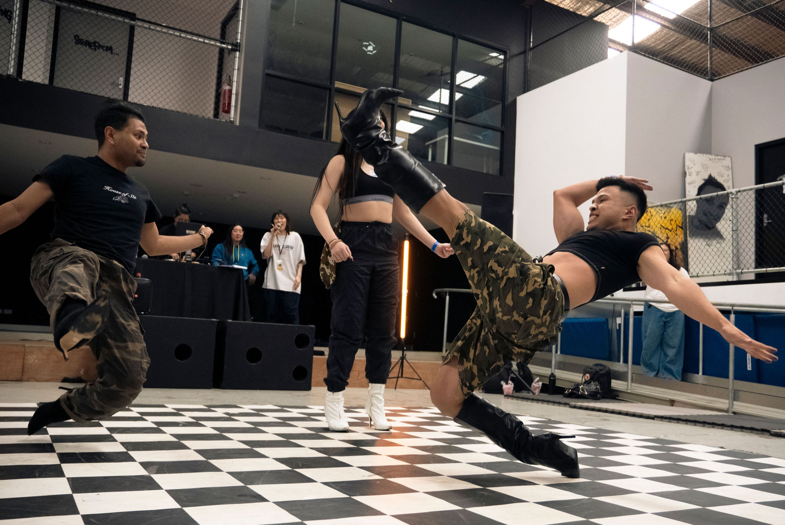
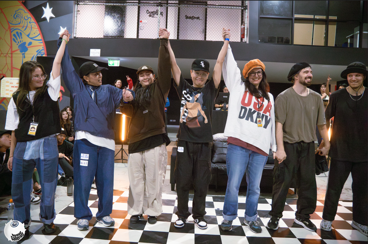
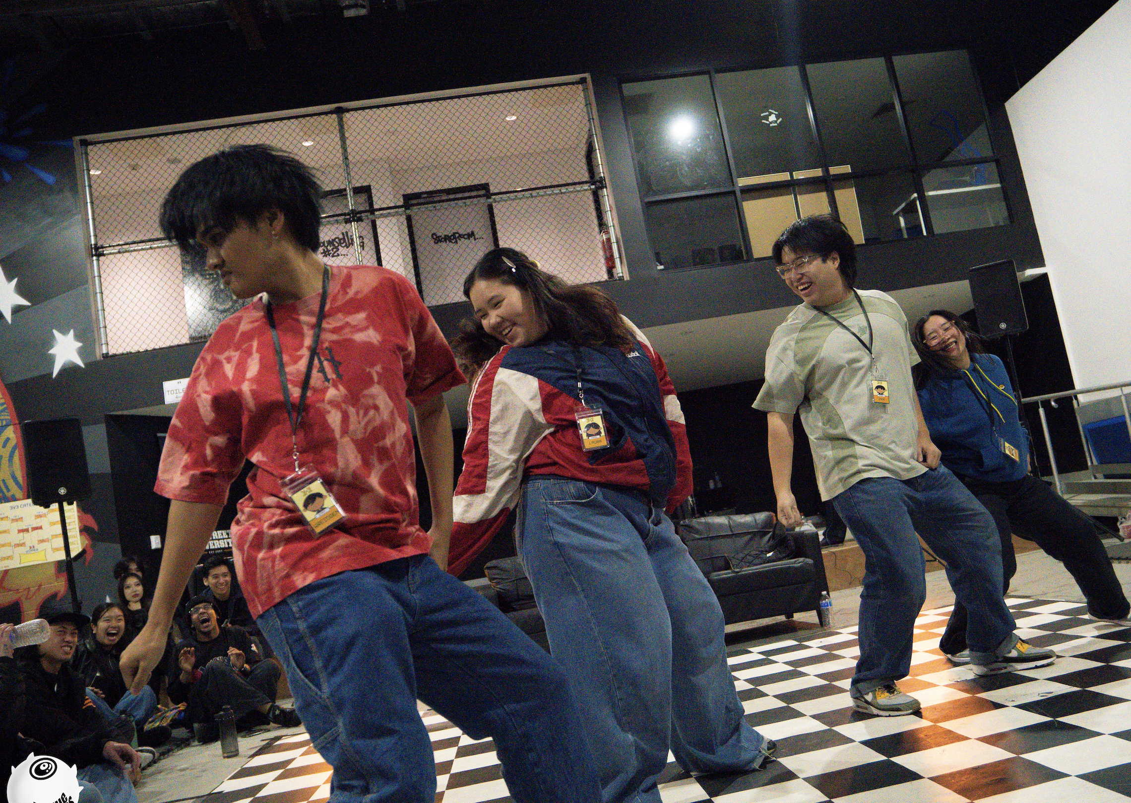
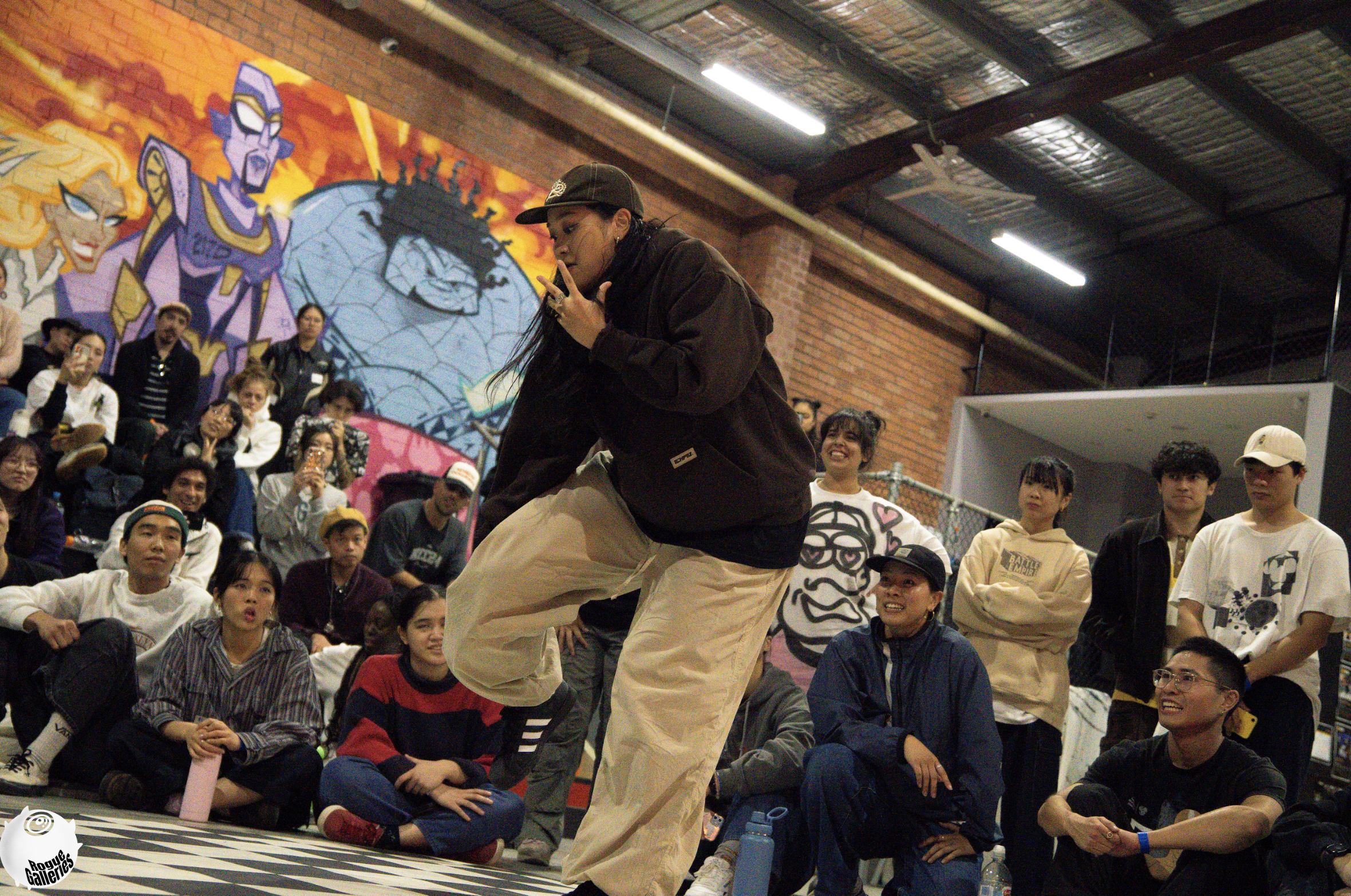
On April 27th, 2024, we had finally come together to carry out 3x3 Dance Battle’s very first edition! We had a total of 120 competitors and 50 audience members. It was an incredible fun and fulfilling day, full of dance and great hip hop music. We had dancers coming from Wollongong just to attend and support our event.
Many people had gave great feedback, including the Judges and DJ who were invited who had said that it was well organised and run, and that they felt looked after. We are super excited for the next edition to come next year, and for myself as a designer I am so excited to see what my design will bring in a years time with the next volume.
Feel free to check out our 3x3 event Instagram for more coverage and information!
And a big thanks to the team for trusting my design vision, as well as those who attended who enjoyed the nostalgic designs!
All photography on this page was taken by Rouge Galleries