Logo and Branding
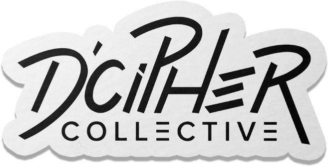
D’CIPHER COLLECTIVE
ABOUT
Adib, a prominent dancer and leader in the Adelaide street dance community, is launching a new brand, D’Cipher Collective. With ambitious aims, he envisions creating a vibrant hub for street dancers in Adelaide, offering comprehensive dance education and support to elevate the local dance scene. D’Cipher Collective will serve street dancers and anyone in Adelaide with a passion for dance, fostering a dynamic and inclusive dance community. Ultimately, the goal is to expand and establish the brand on an interstate level.
The Team:
Client: Adib
Logo Designer: Laura Huynh ☆
STAGE 1: RESEARCH
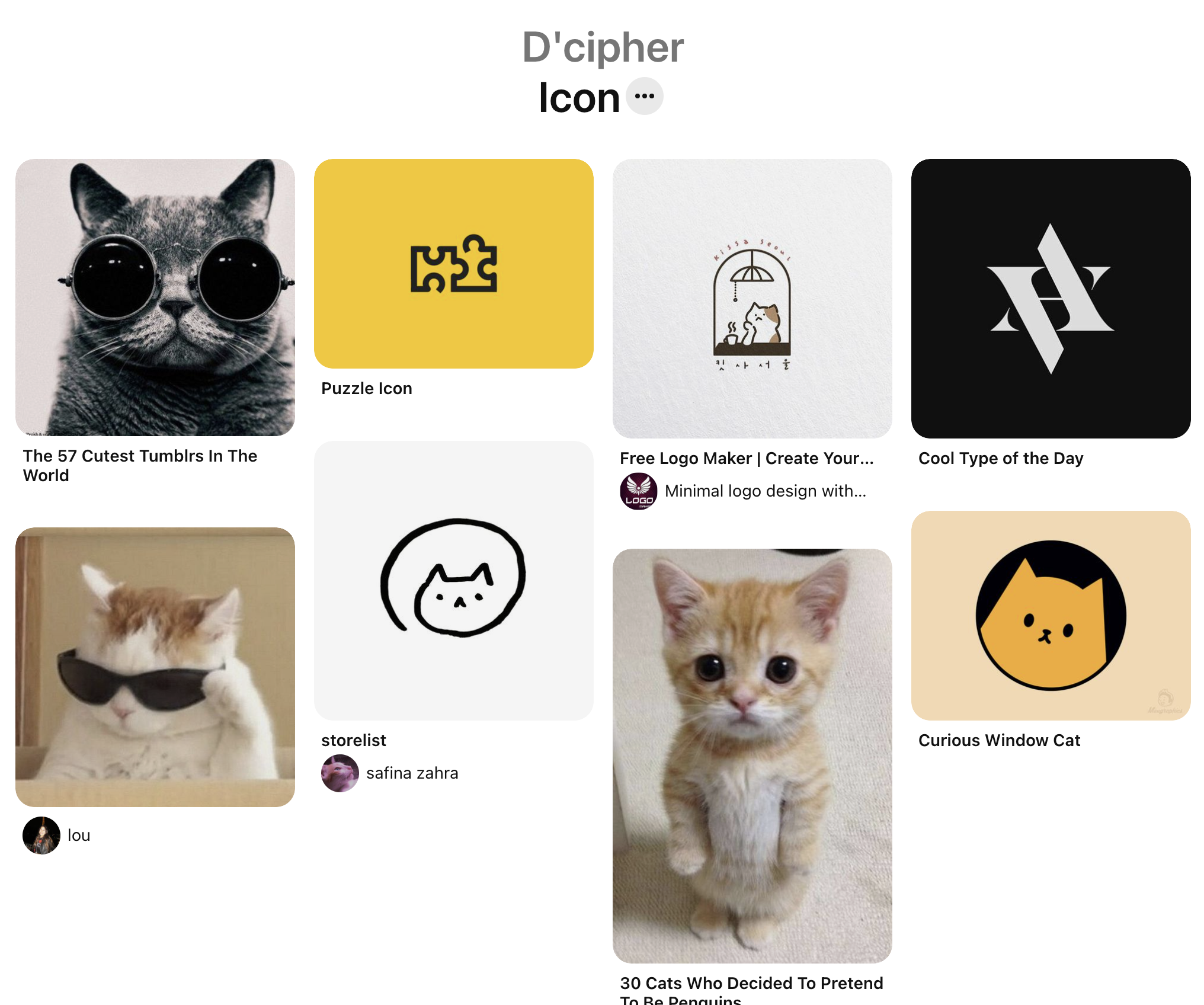
When designing a logo, I start by asking my client if they have any specific ideas or direction for their logo. This often involves creating a Pinterest board where they can include examples of logo designs, color palettes, fonts, typography, and icon designs that they like.
In this case, Adib had a clear vision for his logo, as demonstrated by the Pinterest boards provided below. This clarity significantly expedited the design process.
Adib also mentioned Jam on Toast (JoT), a collective based in Melbourne, Australia, as a source of inspiration. They host events, jams, and workshops to uplift the street dance community. Their name cleverly plays on the idea of dance jams and the pun of putting jam on toast. I thought this would be a great case study to further my research to begin my design process.
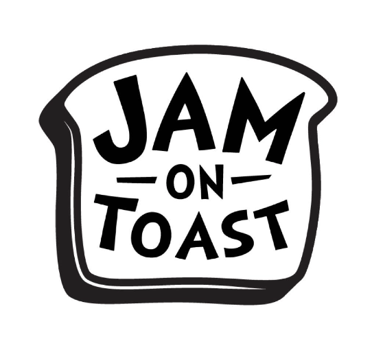
Jam on Toast Logo
Pinterest Board supplied by Adib
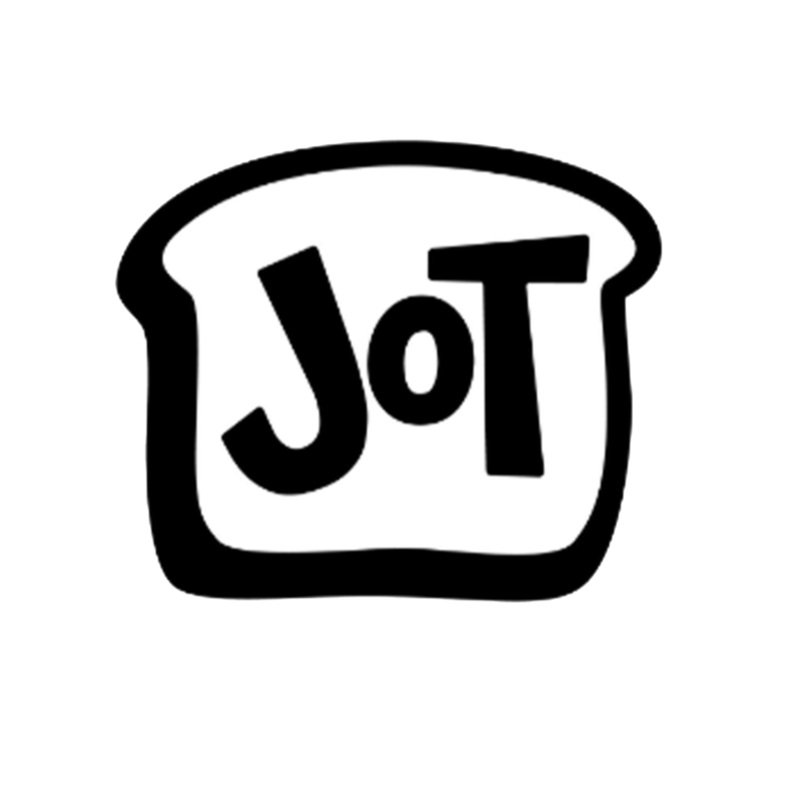
Simplified Jam on Toast “JoT” Logo
Jam on Toast has flourished over the years, hosting successful events. They offered weekly free jams, welcoming dancers of all levels in a judgment-free space, and hosted annual interstate battles with impressive participation. The collective's leaders, known for their kindness and generosity, invested their time and effort, often without charge, contributing to their success. Although the duo has now retired Jam on Toast, they played a pivotal role in shaping the Melbourne street dance community.
Double downing on their pun inspired name, their logo features a piece of toast, with the name “JoT” or “Jam on Toast” acting as the jam in the centre.
I found this approach fun, creative and effective, capturing the collective's fun, wholesome, and unified nature while remaining simple and recognizable from a distance. Inspired by this, I aimed for a simple icon for D’Cipher Collective, with more detail in the name due to its length.
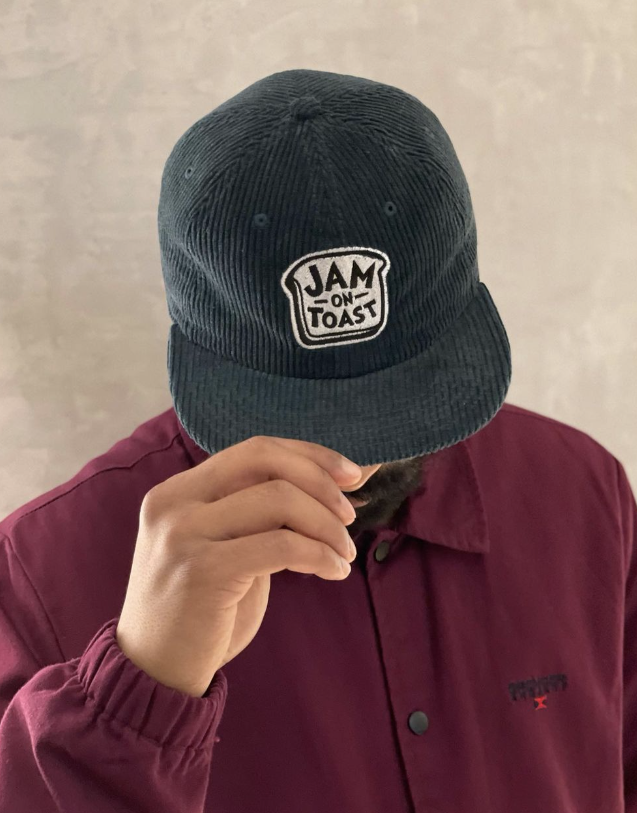
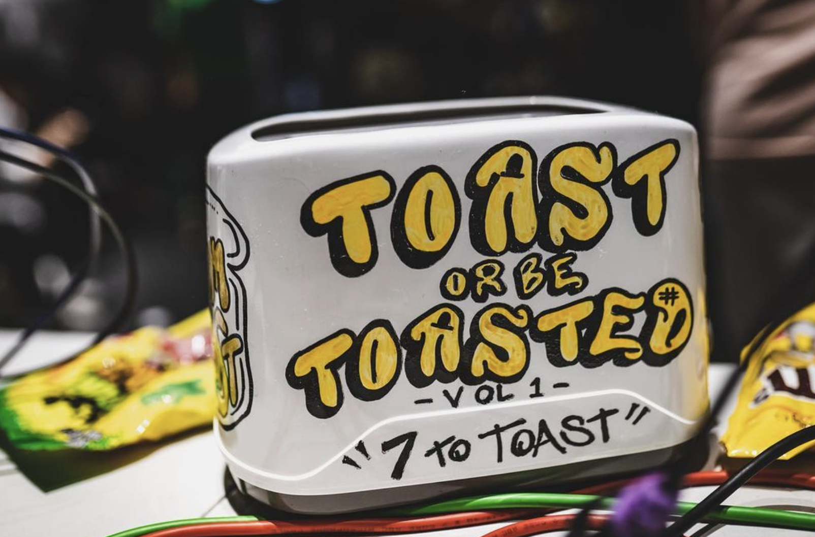
Jam on Toast Hat Merchandise
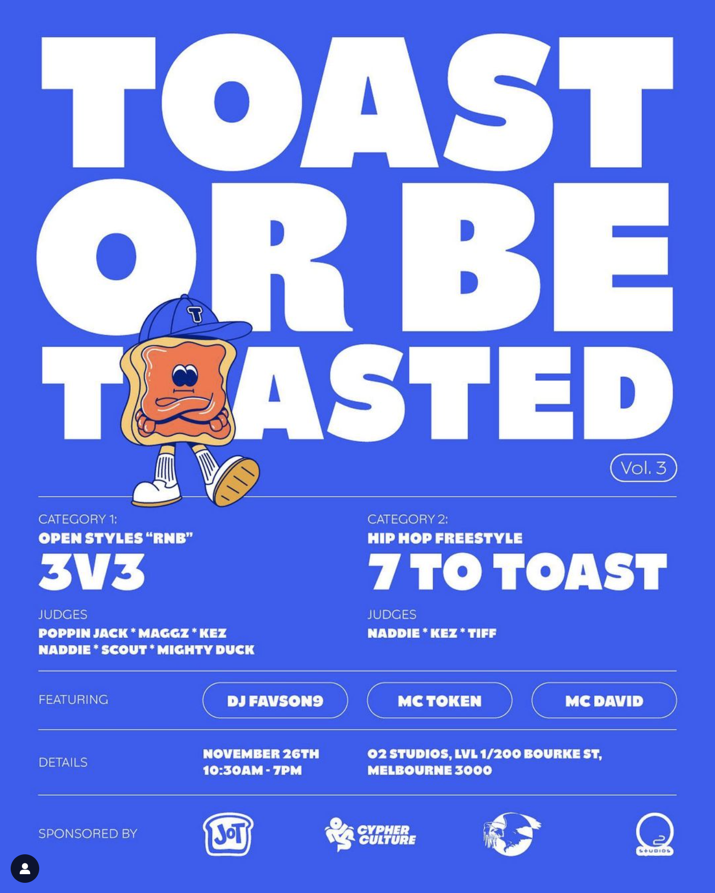
Jam on Toast Event Poster
Inspired by Jam on Toast's focus on promoting the street dance community, I felt free to be more creative with D’Cipher Collective’s logo. My goal is to incorporate fun, approachable, and engaging elements similar to Jam on Toast while capturing the unique essence of D’Cipher Collective in a simplistic manner.
Street dance elements could be incorporated, but I wanted the design to reflect the diverse and dynamic nature of dance itself. Just like dance comes in various shapes and forms, I wanted the logo to embody that freedom and creativity.
STAGE 2: CONCEPT DEVELOPMENT
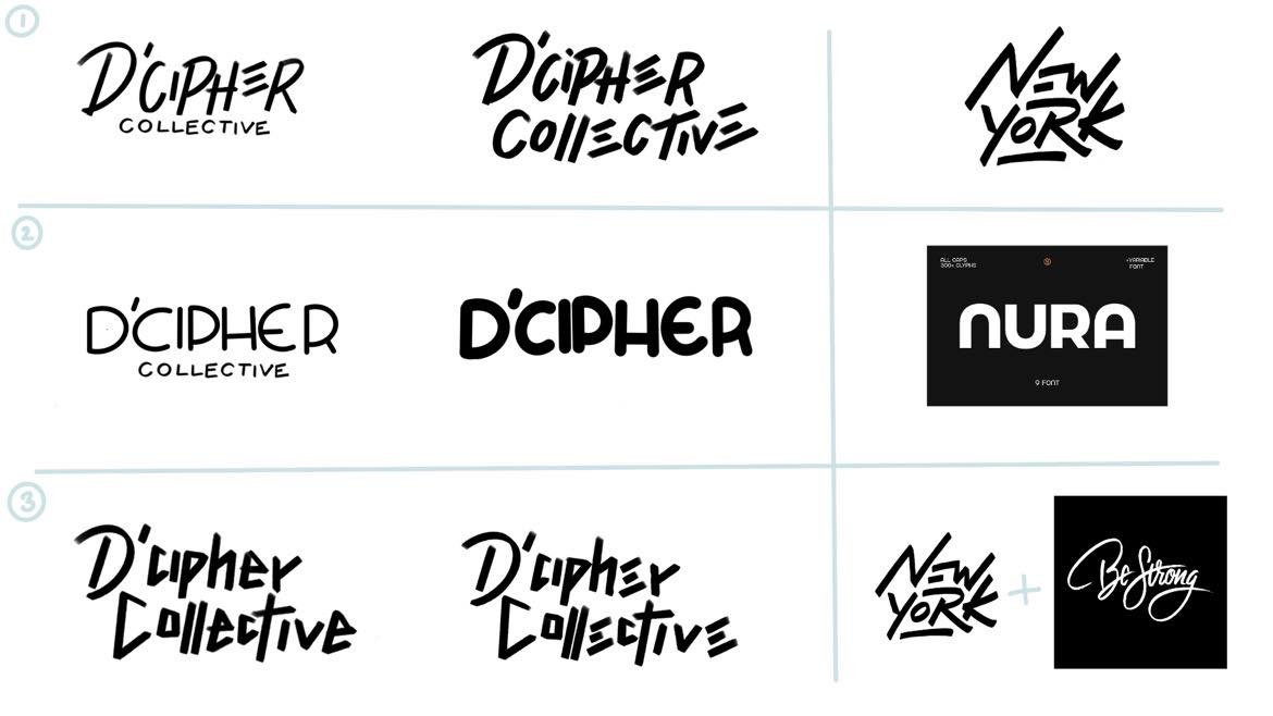
Logo Variations
Inspo from Pinterest
Later, I included a simplistic icon as the logo mark to to complement the logo type. The icon needed to maintain consistency with the logo type, ensuring that the strokes were similar despite the icon's distinctiveness, so it was vital for me to design the logo mark and logo type together as I worked through designing the logo.
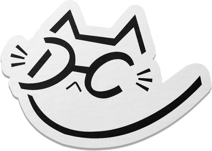
I regularly consulted the Pinterest board for inspiration, focusing on its simplicity. Inspired by one particular image of a cat wearing sunglasses, which reminded me of co-founder Adib who wears glasses, I aimed to subtly incorporate this characteristic into the logo design.
Logo Type
Logo Mark
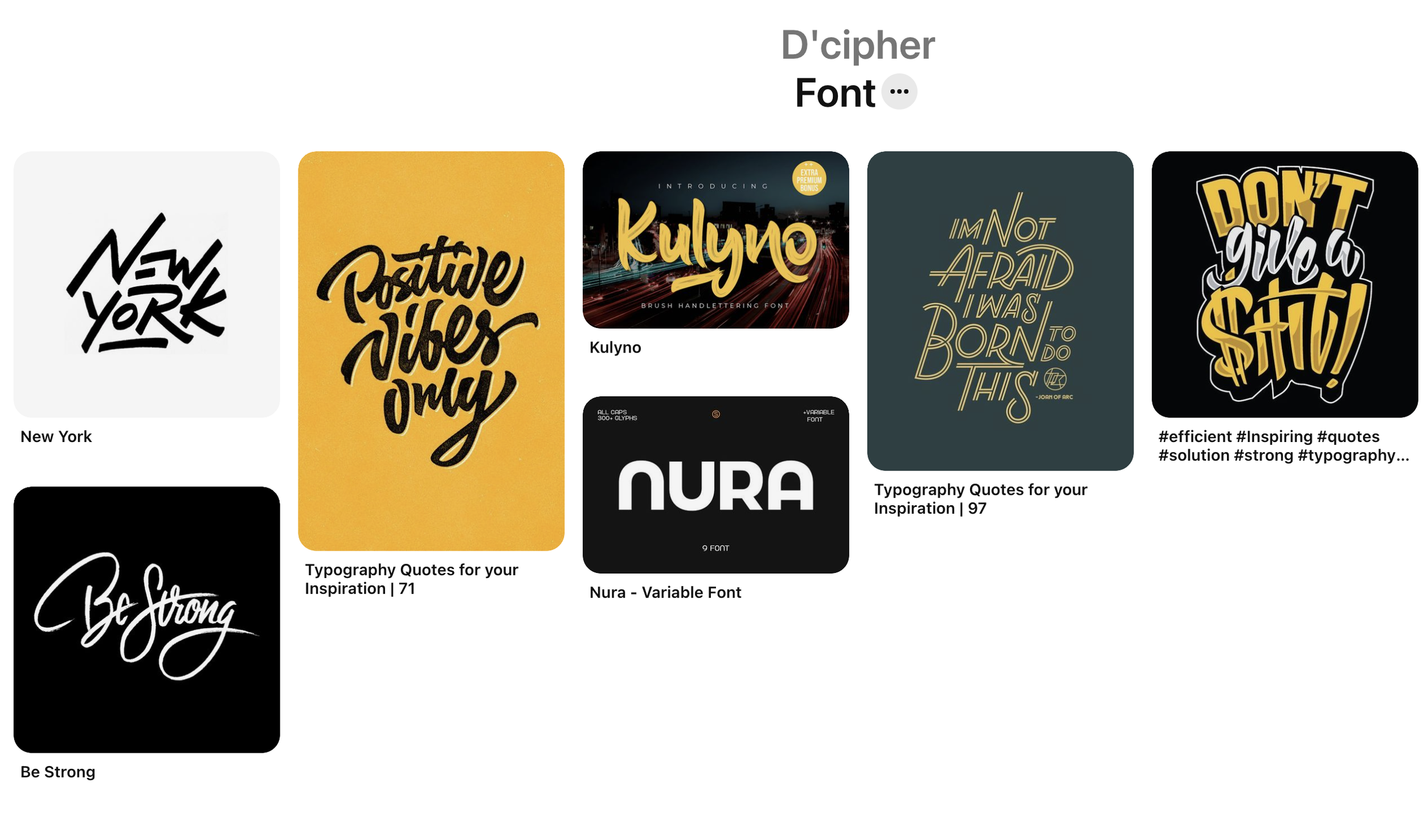
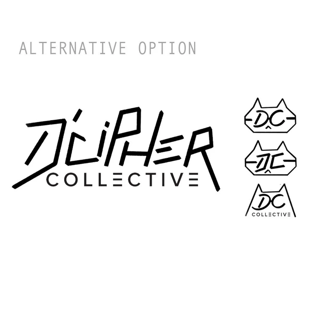
I started off working on the logo type. I selected three designs that resonated with me the most from the “Font” Pinterest board provided. I adapted the font ideas from these designs and created iterations of DiCipher Collective's logo.
I experimented with the sizes of the words 'D’Cipher' and 'Collective.' Initially, I wanted them to blend together like "New York," but it felt too long and cluttered. Instead, I decided to make 'D’Cipher' more prominent, placing 'Collective' underneath it while ensuring both words worked together in a cohesive and unified manner.
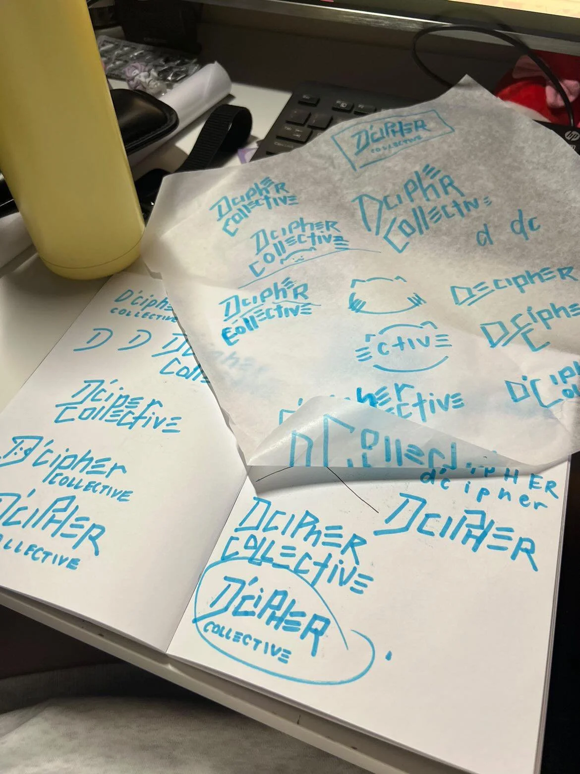
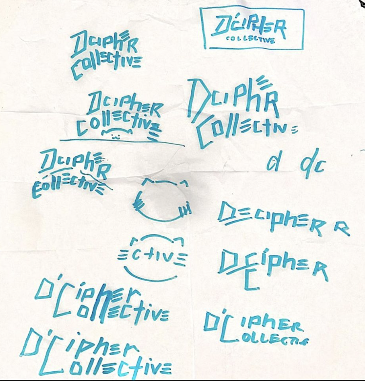
Sketches of the logo and connecting the word/lettering together.
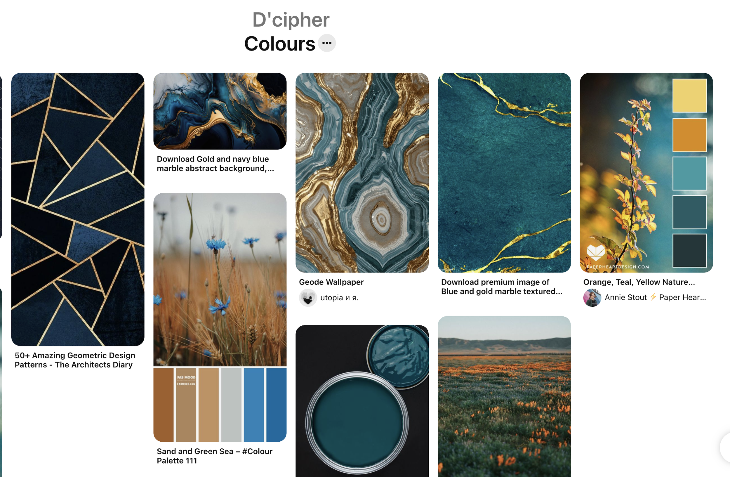
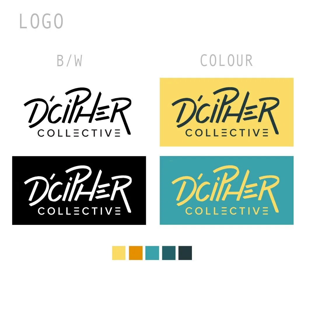
Adib provided a clear color palette, which I refined to select the most resonant colors for the brand: navy, light yellow, and a light and dark cyan. Using the colours to work together gave the logo a strong, solid feel while maintaining a serious tone.
As the design progressed, we engaged in a collaborative process, going back and forth to decide which design we connected with the most. Through this iterative process, we gradually refined the final design.
Pinterest Board Logo Mark Inspiration
Colour Palette
Moving forward, I continued refining my initial sketches and developed the design further. I collected pages and pages of sketches, exploring various logo variations and making subtle changes throughout. Adib identified #1 and #3 from the Logo Variations image as resonating with him the most, particularly liking the variation in size of the words.
Taking this feedback into account, I focused on keeping "Collective" in a simple font, which enhanced the logo's legibility and overall effectiveness.
Playing with the Colour Palette
STAGE 3: DESIGN EXECUTION
Logo Type and Logo Mark
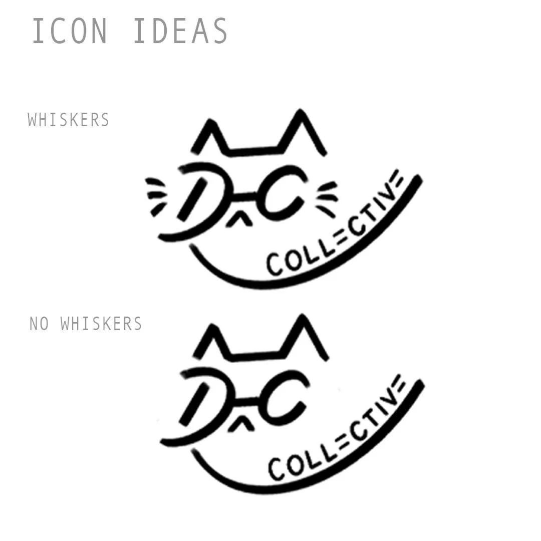
The Logo Type and Logo Mark were developed simultaneously to ensure cohesion between them. Below, you can see the progression of the cat icon's development. I wanted the cat to wear glasses, symbolizing Adib, the brand's owner, while keeping the design simple and cool. The glasses also served as the "DC" of DiCipher Collective, strengthening the connection between the two logos. I tested the logo at different distances to ensure it remained clear and easily identifiable.
We even debated whether the logo mark would be better with or without whiskers. Although I valued simplicity, whiskers were essential for helping audiences recognize the cat icon. Ultimately, I was inspired by a Pinterest image of a simple single line forming a cat's shape with tiny details added on top. I simplified it further, including just the cat's curvature, ears, glasses, and whiskers.

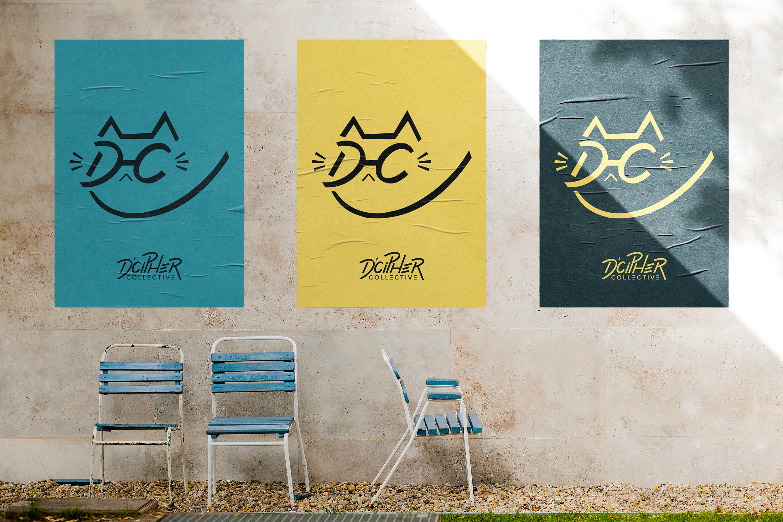
Mock-Ups
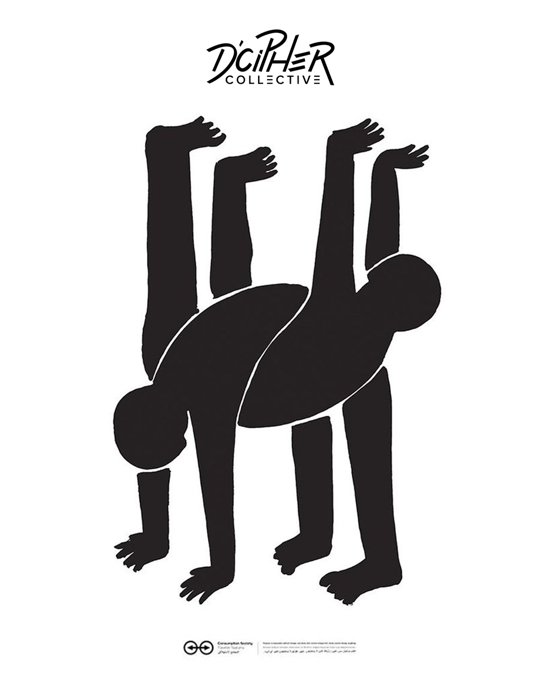
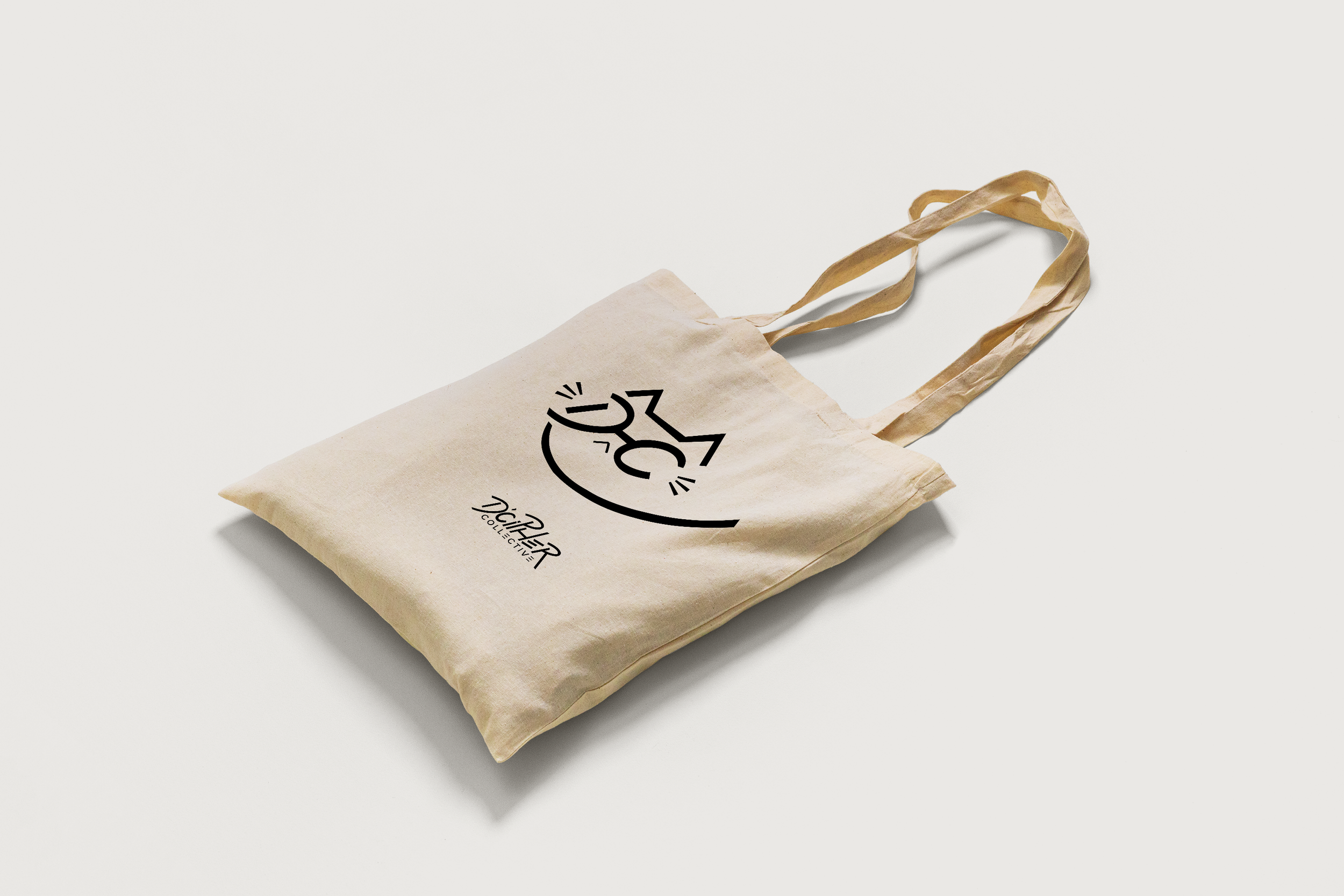
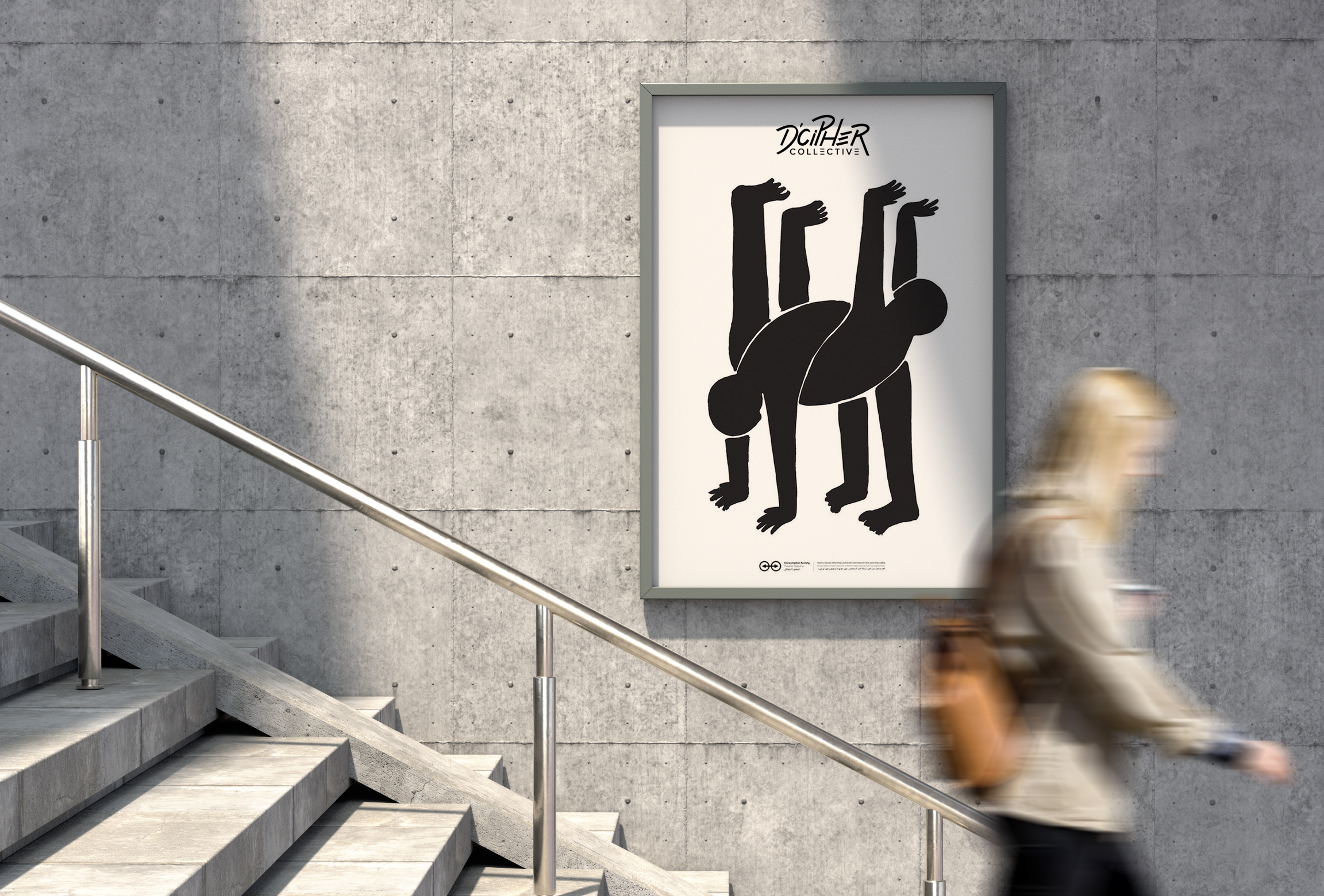
A crucial aspect of conveying the design direction, especially given Adib and I live in different states, was through mock-ups. These mock-ups were essential to illustrate how Adib could utilize the design and its practical applications. Anticipating Adib's interest in creating merchandise for his brand, I provided mock-ups showcasing the logo on t-shirts, tote bags, and dance-related posters.
Moreover, these mock-ups provided me with an opportunity to assess the logo's physical appearance and ensure its clarity and legibility, making any necessary adjustments as needed.
STAGE 4: IMPLEMENTATION AND LAUNCH
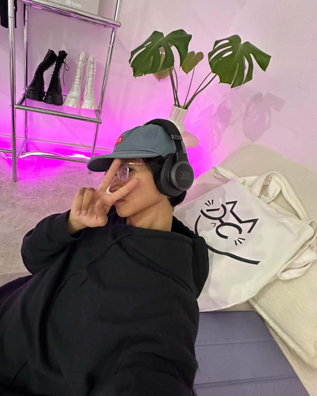
Adib with his D’Cipher Collective Tote Bag!
After reviewing my logo presentation with Adib, we finalized the designs. You can view the final presentation here.
I want to extend a heartfelt thank you to Adib for entrusting me with the opportunity to kickstart this significant project. Your belief in my work and vision means a lot, and I'm excited about the journey ahead and the positive impact D’Cipher Collective will have on the street dance community in Adelaide and beyond.
Adib, Founder of D’Cipher Collective